
1
Look, I love Figma. If you’re anything like me, you probably spend eight hours a day inside it, neatly organizing your component variants, color tokens, and beautifully nested frames. It’s snappy, it’s collaborative, and honestly, it’s a joy to use. We’ve built a massive global design community around it, and it feels like we’ve reached peak product design.
But I’m going to say something that might make you want to close this tab immediately: Figma is turning us into terrible web designers.
If you’ve been in the industry long enough to remember the early 2000s, you’ll remember a tool called Macromedia/Adobe Dreamweaver. It promised a beautiful, seductive lie: just drag, drop, and draw your boxes on our visual canvas, and we’ll handle the messy code reality underneath. It allowed a whole generation of us to completely ignore how HTML and CSS actually worked. The result? Horrific, unsemantic code that broke the second a user changed their screen resolution.
Eventually, we grew up, learned how fluid layouts worked, and laughed at Dreamweaver.
But right now, we are repeating history. Figma is doing the exact same thing to our brains that Dreamweaver did twenty years ago. It’s trapping us in a cozy, static canvas delusion, and it’s leaving us completely unequipped for where the web is actually heading.
The Auto Layout Lie
Whenever I bring this up with fellow designers, the defense is always immediate: “But what about Auto Layout? What about Variables?” We like to look at our resizing frames and feel like we’re practically writing code.
But let’s be real with each other: Auto Layout is a high-fidelity simulation of code, not the real thing.
Figma is, at its absolute core, an explicit vector space. It calculates everything down to exact X and Y coordinates on a fixed pixel grid. The web does not give a damn about your coordinates. The web is a wild, fluid environment governed by document flow, layout engines, and unpredictable content injection.
When we design a “responsive” site in Figma, what are we actually doing? We open a 375px frame for mobile, a 1440px frame for desktop, and we spend hours stretching boxes until they look perfect at those exact widths.
But code is a continuous, chaotic spectrum. By designing for rigid, isolated breakpoints, we completely ignore the massive “dead zones” and awkward scaling that real users experience in between our perfect artboards. We aren’t designing a responsive system; we’re designing a high-fidelity slideshow about a responsive system.
The Blindspot We’ve Been Handing Off to Developers
Because our favorite tool completely isolates us from how a browser actually builds a page, it creates massive blindspots for things that directly impact user experience—like Cumulative Layout Shift (CLS).
In our Figma workspace, everything loads instantly and flawlessly because it’s a local vector file. We draw a pristine hero layout with dynamic images, custom typography, and a sleek interactive widget. It looks beautiful, we get approval, and we proudly pass the spec document over the fence to engineering.
But in the real world, a website loads over a timeline:
- The raw HTML hits the browser.
- The CSS file finally downloads and parses.
- The custom web fonts load a few seconds late, causing a massive flash of unstyled text that completely shifts the line heights.
- Large images load asynchronously, aggressively shoving content down the page because we didn’t reserve an aspect ratio box in the layout structure.
Figma provides absolutely zero visual feedback for how a layout behaves while it is loading. It detaches us from asset weight, network latency, and layout stability. When the live site suffers from a terrible performance score because the font swap broke the hero layout, we tend to shrug and blame the developers. But it’s not their fault. The fault lies with a design culture that treats time and loading states as invisible.
The Reality Check: The Canvas is Evaporating
If you think this is just a minor annoyance, consider where the web is going. We are rapidly moving into an era of advanced AI infrastructure, agentic workflows, and personalized, dynamic rendering. The next generation of web software isn’t going to be a collection of hard-coded, static pages.
If an AI agent needs to dynamically assemble a unique UI component based on a user’s specific context at two in the morning, it doesn’t care about your meticulously aligned auto-layout constraints in a vector file. It cares about semantic data architecture, accessible DOM trees, and fluid component boundaries.
While Figma trains us to draw a static picture of a button, web reality requires an accessible, focusable state machinewith dynamic theme variables. Figma trains us to be obsessed with how an interface looks at one specific moment in time. But the future demands that we become obsessed with how an interface behaves across an infinite number of states. By treating the canvas as our absolute source of truth, we’re acting like graphic designers with a digital paintbrush, rather than systems architects.
Let’s Break Out of the Time Warp
Dreamweaver died because web standards matured and designers realized they needed to respect the medium they were actually building for. Figma doesn’t need to die, but our blind worship of it does.
If we want to avoid becoming assembly-line component pushers, we have to change how we work:
- Stop Prototyping Everything in High Fidelity: If a complex interaction relies heavily on dynamic data, loading states, or subtle micro-animations, stop trying to fake it with forty-seven connected Figma frames and smart-animate. Step out of the canvas. Build a quick-and-dirty prototype in raw code or a visual code sandbox. Test it where it actually lives.
- Start Designing for the Failure States: Let’s stop filling our portfolios with perfect layouts where every user has a professional model avatar, every headline fits perfectly on a single line, and the data is pristine. Let’s design for when the user’s connection drops, the API returns an error, the copy runs three times longer than expected, and the custom font takes four seconds to load over weak public Wi-Fi.
- Bridge the Code Gap for Real: A design system isn’t a collection of Figma components; it’s a live library of production code. If your UI kit doesn’t map directly to the semantic, accessible code tokens and component properties used by your engineers, it’s not a design system—it’s just a digital coloring book.
Figma is an incredible space for brainstorming, visual exploration, and getting aligned with your team. But the second we treat it as a perfect reflection of web reality, we repeat the exact mistakes of the past.
The web is alive, fluid, unpredictable, and fast. It’s time our design mindsets caught up to it.


Traditional Web Development is Dead…(and Honestly? Good Riddance.)
Every few years, the tech world loves to throw a massive pity party and declare something “dead.” Flash is dead. PHP is dead. SEO is dead. Usually, it’s just pure…
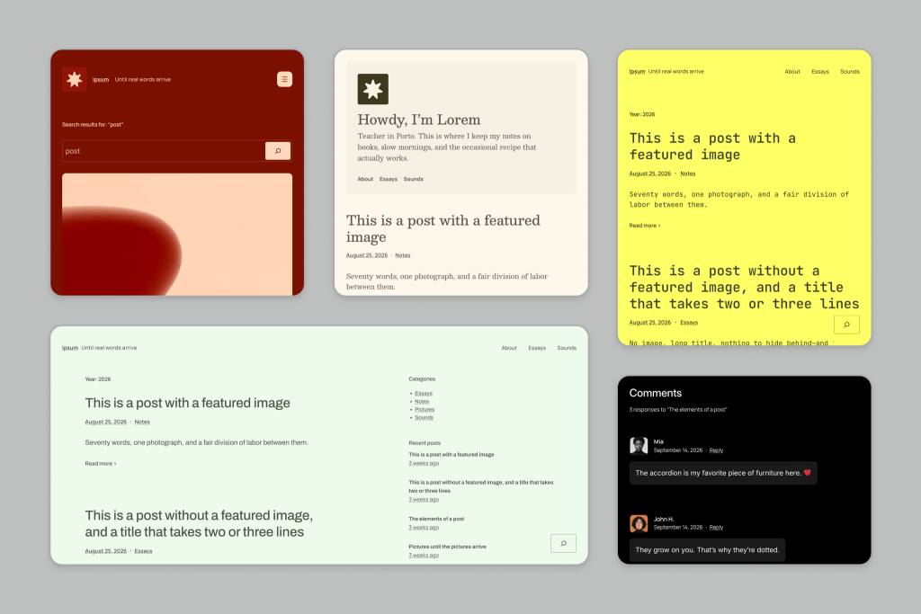
Today, WordPress Ended a 16-Year Tradition… Meet Ipsum!
WordPress just broke one of its longest-running traditions. Today, the WordPress team unveiled Ipsum, the proposed new default theme for WordPress 7.2. But the biggest news isn’t really Ipsum itself. WordPress…
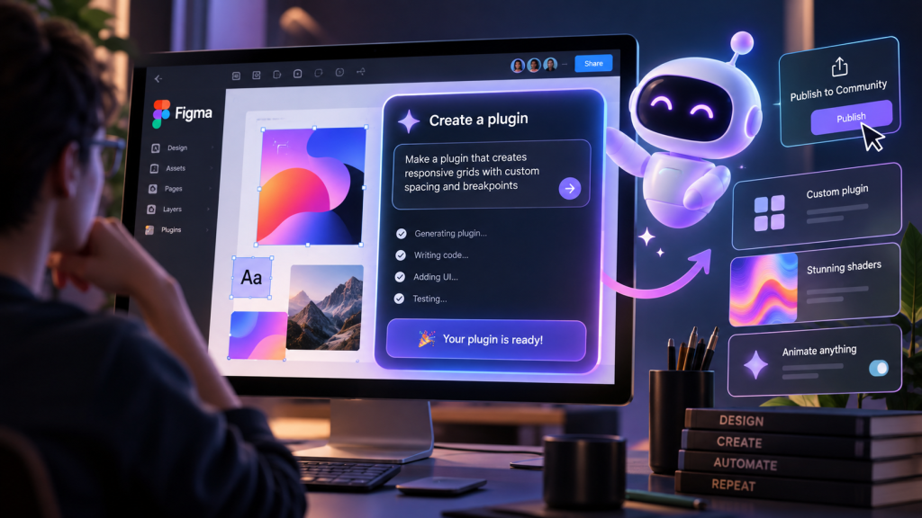
Figma Is Turning Designers Into Plugin Makers
For years, most designers looking to extend Figma followed a familiar software ritual: you had a problem, searched for a plugin, installed it, and hoped somebody had already built exactly…

TikTok Is Quietly Putting Web Apps Inside Its App
TikTok is already where millions of people go to watch videos. But buried inside its developer documentation is something considerably more interesting for web designers: TikTok has built a framework…

The 2-Second Rule: How to make your website feel like magic in 2026
In the digital landscape of 2026, we have reached a fascinating crossroads. For years, we treated web performance as a technical chore—something for the developers to fix in the basement…

The Digital Renaissance: Why 2026 is the Most Exciting Year to be a Web Creator
If you have been following the chatter on tech forums lately, you might think the web design and development industry is packing its bags. There’s a lot of talk about…