1
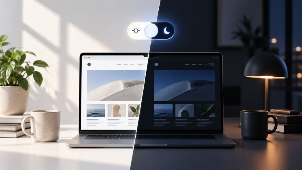
Somewhere along the way, the little sun-and-moon icon became practically mandatory.
Portfolio? Dark mode toggle. Documentation site? Dark mode toggle. SaaS landing page? Naturally, a dark mode toggle sitting proudly in the header alongside things people actually came to use.
But there’s a slightly uncomfortable question designers rarely ask: does this button really deserve to be there?
Web standards and UX expert Lea Verou argues that most websites probably shouldn’t have a persistent dark mode toggle at all. Her argument isn’t that dark mode is bad. It’s that designers may have given a relatively minor preference an awful lot of prime interface real estate.
And she may have a point.
Are We Designing This for Ourselves?
While exploring the issue, Verou noticed that the persistent dark mode toggles she encountered were overwhelmingly on developer-facing websites. That’s an observation rather than proof that ordinary users don’t care about dark mode, but it raises an interesting question: have designers embraced the toggle partly because other designers have?
Meanwhile, browsers have been able to detect a user’s system light-or-dark preference for years. A website can simply respect that preference automatically, while still offering an override somewhere less prominent for people who actually want one.
In other words, nobody is coming for your dark mode. We’re just questioning whether it needs its own seat at the table.
The debate has become surprisingly elaborate. Verou has argued for a simpler two-state approach rather than the familiar Light/Dark/System trio, and the discussion has inspired implementations ranging from sensible to deliberately ridiculous — including a joke 100-state dark mode control.
It’s funny, but it also exposes something web design does remarkably well: turning tiny problems into elaborate interface solutions.
Perhaps the real argument isn’t about dark mode at all. Every button we add asks for attention, and every fashionable UI pattern eventually deserves the question designers hate asking:
Is this here because users need it — or because other designers have it?

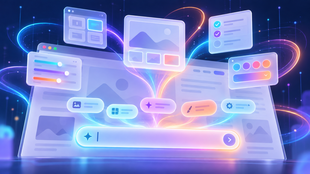
How the Prompt Box is Swallowing Website Interfaces Whole
I had a moment the other day where I stared at a software dashboard and realized I was completely exhausted. I was trying to run a relatively simple financial report….

Nobody Wants Your Damn App
I just wanted to check your website. I didn’t want to download 200MB of software. I didn’t want another icon on my home screen. I definitely didn’t want to create…
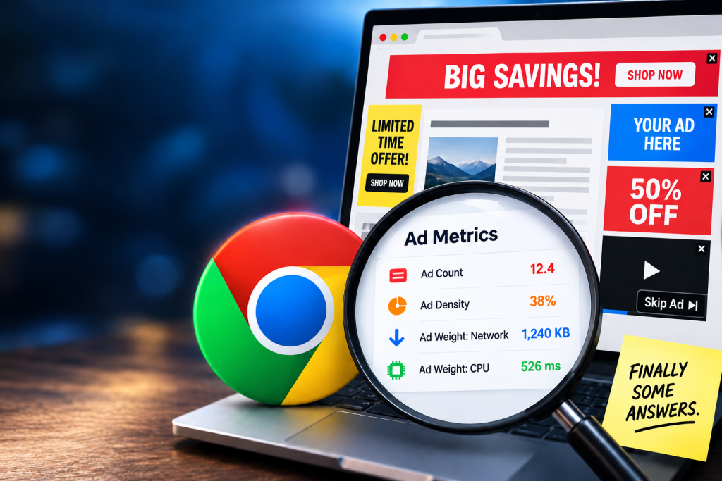
Chrome Can Now Measure Exactly How Obnoxious Your Website’s Ads Are
We’ve all opened that website: three ads before you reach the first paragraph, a giant sticky banner and a video desperately trying to follow you down the page. Now Chrome can actually measure…
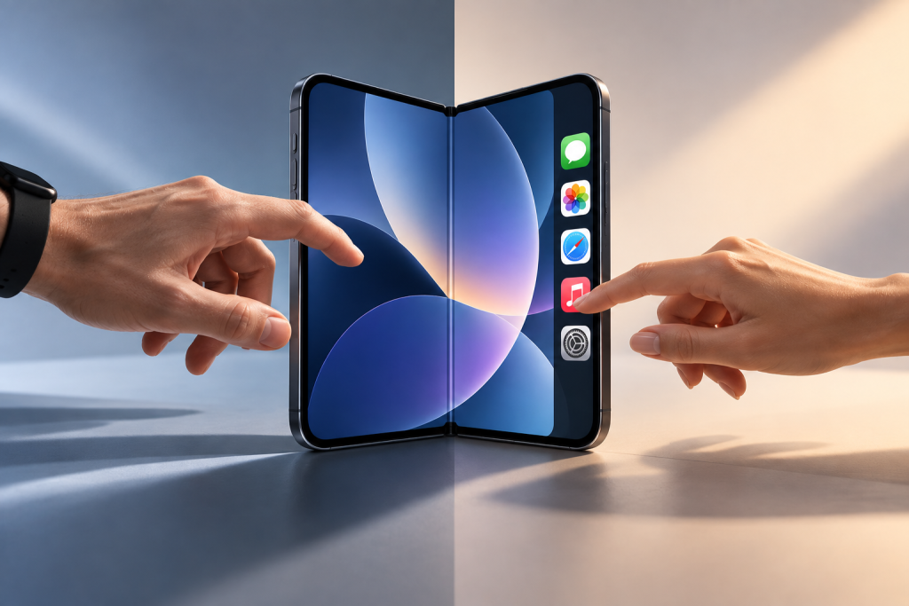
Apple’s Foldable iPhone Has a Left-Handed Problem
Apple’s new iPhone Duo moves some familiar controls from the top and bottom of the screen into a vertical bar along the side when its larger inner display is used…
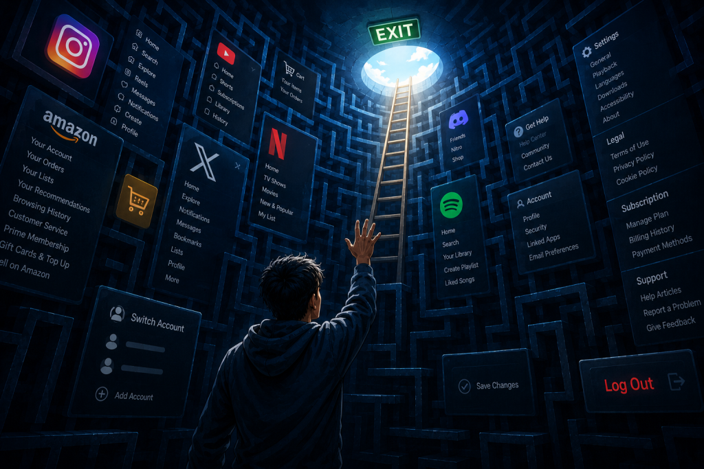
Why Tech Companies Hid the “Log Out” Button (And How to Win It Back)
Try to log out of Netflix on your TV right now. Go ahead. I’ll wait. If you’re like most people, you’ll end up aggressively mashing the left arrow key, accidentally…
The Infinite Scroll Was a Design Crime. Now Meta is Paying for It.
If you’ve ever sat down at 11:00 PM to check a single notification and snapped back to reality at 2:00 AM staring at a stranger’s video of a house renovation,…