1
Try to log out of Netflix on your TV right now. Go ahead. I’ll wait.
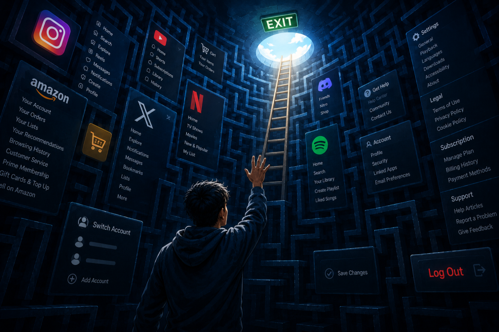
If you’re like most people, you’ll end up aggressively mashing the left arrow key, accidentally opening a profile selector, hunting through a “Get Help” menu that feels like an interrogation room, and finally finding the exit buried under a sequence that feels like entering a cheat code in an old Nintendo game.
It’s not just Netflix. Instagram hides it at the very bottom of a scrolling settings abyss. Amazon prefers you treat your account like a lifetime tenancy agreement. The “Log Out” button—once a proud, prominent fixture of the early web, sitting right next to your username like a polite “Goodbye” door handle—has been systematically hunted down, minimized, and buried alive.
This isn’t bad UI design. It’s a corporate hostage situation.
The Era of Permanent Inhabitation
In the early days of the web, logging out was standard hygiene. You went to a digital place, you did a thing, you clicked log out, and you shut the virtual door behind you. It was a clean break. The physical world and the digital world had a clear, un-smudged border.
Today, product teams view a user logging out not as a valid user preference, but as a catastrophic metrics failure. It’s treated as a “churn event.” Inside the product war rooms, if a user explicitly logs out, it means the spell is broken. If you log out, you might realize you didn’t actually want to scroll for another 45 minutes. You might experience a terrifying moment of clarity where you look at your reflection in a black screen and wonder what you’re doing with your life.
To prevent this existential awakening, tech giants weaponized friction.
They realized that if they can make logging out just painful enough, you’ll choose the path of least resistance: staying permanently logged in, permanently trackable, and permanently vulnerable to the next push notification. We went from using tools to inhabiting digital architectures we can never quite leave.
“Frictionless” UX is a One-Way Street
As designers and developers, we talk a lot about reducing friction. We streamline checkout flows, we automate sign-ins, and we boast about “one-click” experiences. But notice how friction is only removed when it benefits the platform’s bottom line?
- Logging in? Magic links! Face ID! One-tap Google sign-in! It’s seamless!
- Logging out? Are you sure? Please re-enter your password. Check your email for a 6-digit code. Navigate this labyrinth. Solve this captcha. Please don’t leave us, we love you.
This asymmetry exposes the hypocrisy of modern UX. When an interface makes it effortless to enter but requires a machete to hack your way out, it’s no longer a user-centric design—it’s a lobster trap.
Think about the standard software as a service (SaaS) dashboard or social app today. The profile dropdown used to be a standard pattern: Profile | Settings | Log Out.
Now? It’s Profile | Settings | Subscription | Billing | Dark Mode | Help | Legal | Terms of Service | … [Keep Scrolling] … | Switch Accounts | Log Out. They intentionally stack the deck to fatigue your eyes before you can hit the exit.
The Design Rebellion: What We Can Do as Creators
If you build things for the web, you have a choice. You don’t have to participate in the user-trapping arms race. We can design interfaces that respect human boundaries. Here is how we build a better, more respectful web:
1. Rehabilitate the Profile Dropdown
Stop using the profile menu as a junk drawer for compliance links and upselled features. Keep the exit visible. If a user clicks their avatar, “Log Out” should be instantly accessible, not requiring a secondary scroll view.
2. Design Explicit “Session Closures”
Instead of treating the end of a task as an invitation to autoplay the next piece of content, build an interface that celebrates completion. When a user finishes a lesson, prints a report, or closes a major workflow, offer a clear, elegant path to wrap up and step away.
3. Embrace “Smart” Expirations
Give users control over their session lifetimes. Imagine a setting that says: “Log me out automatically after 6:00 PM” or “Keep me logged in for this session only.” By putting the authentication timeline back in the user’s hands, you turn a passive addiction back into an intentional tool.
The User’s Counter-Attack: How to Force the Exit
If the platforms won’t give us a clean exit, we have to build our own backdoor doors. If you’re tired of being permanently trapped inside your apps, here is how you take back control of your digital borders:
- The Nuclear Option (Browser Auto-Delete): Stop letting your browser cache your digital existence forever. Set your desktop and mobile browsers to automatically clear cookies and site data every time you close the app. Yes, you will have to log back in next time. That is the point. It forces you to ask: “Do I actually want to go into this app right now, or am I just clicking out of muscle memory?”
- The “Burn After Reading” Extension: Use browser extensions that isolate your sessions or automatically destroy cookies for specific sites the moment you close the tab. If an app makes it a ten-click nightmare to log out, let your browser do it for you in a millisecond.
- App Offloading and Timer Locks: On mobile, use native operating system tools to aggressively limit access. Set hard limits, or better yet, use the “Offload App” feature on your phone for apps you want to quit using habitually. Removing the app icon from your immediate sight breaks the cycle of permanent residency.
Taking Back the Exit
When we hide the exit, we erode trust. A premium digital experience shouldn’t feel like a timeshare presentation where the salesman stands in front of the door until you sign something.
True user autonomy means respecting the exit. Excellent product design should treat a user’s departure with the same elegance and simplicity as their arrival. Giving someone a clear, dignified way to say “I’m done for now” doesn’t mean they’ll never come back; it means they’ll respect your app enough to return on their own terms.
It’s time to bring back the prominent, unashamed Log Out button. Let’s stop building digital hotels you can check out of anytime you like, but can never leave.

Web Designers Love Dark Mode Toggles. Users Might Not Care.
Somewhere along the way, the little sun-and-moon icon became practically mandatory. Portfolio? Dark mode toggle. Documentation site? Dark mode toggle. SaaS landing page? Naturally, a dark mode toggle sitting proudly…
How the Prompt Box is Swallowing Website Interfaces Whole
I had a moment the other day where I stared at a software dashboard and realized I was completely exhausted. I was trying to run a relatively simple financial report….

Nobody Wants Your Damn App
I just wanted to check your website. I didn’t want to download 200MB of software. I didn’t want another icon on my home screen. I definitely didn’t want to create…

Chrome Can Now Measure Exactly How Obnoxious Your Website’s Ads Are
We’ve all opened that website: three ads before you reach the first paragraph, a giant sticky banner and a video desperately trying to follow you down the page. Now Chrome can actually measure…

Apple’s Foldable iPhone Has a Left-Handed Problem
Apple’s new iPhone Duo moves some familiar controls from the top and bottom of the screen into a vertical bar along the side when its larger inner display is used…

The Infinite Scroll Was a Design Crime. Now Meta is Paying for It.
If you’ve ever sat down at 11:00 PM to check a single notification and snapped back to reality at 2:00 AM staring at a stranger’s video of a house renovation,…