1
We’ve all been there. You’re trying to submit a form, or simply close a stubborn pop-up, and the button just stays there. You click it again. Nothing. Within two seconds, you’ve hammered that button twelve times in a caffeinated frenzy.
This is the Rage Click—the digital equivalent of kicking a vending machine that swallowed your dollar.
In the early days of web design, we treated rage clicks as a “user error” or a funny anomaly in an analytics dashboard. But in 2026, we’ve realized that a rage click is actually a raw, honest cry for help. If your interface doesn’t acknowledge that frustration, you aren’t just failing at UX; you’re gaslighting your users.
1. The Anatomy of the Rage Click
A rage click is rarely a failure of the user’s intelligence; it’s a breakdown in communication. When a user hammers a button, they are signaling that their mental model of how the site should work has violently collided with the reality of how it actually works.
Usually, the culprit is a lack of Visual Feedback. If the system is busy on the backend but the UI stays static, the user assumes the input wasn’t registered. By monitoring for high-velocity clicking, designers can identify “dead zones” where users expect interactivity that doesn’t exist.
Beyond the technical failure, the psychological impact of an unresponsive button is significant. It erodes the user’s sense of agency, making them feel powerless. When you ignore these frantic clicks, you are effectively telling the user their input doesn’t matter, which is the fastest way to drive them toward a competitor.
2. Enter “Sympathetic” UX
Most modern sites are “emotionally deaf.” They treat a user clicking a button 50 times the same way they treat a single, calm click. This is a missed opportunity for Sympathetic UX.
Imagine if, after the fourth rapid click, your UI realized the user was frustrated. Instead of staying frozen, it could trigger an “Emotional Intervention”:
- Acknowledge the delay: A micro-copy update saying, “We’re on it! Just a few more seconds…”
- The “Calm State” shift: Automatically simplifying the visual hierarchy to remove distractions.
- The Escape Hatch: Surfacing a help icon or a “Cancel” button that wasn’t there before.
This approach transforms the interface from a cold wall into a helpful partner. By acknowledging the friction, you validate the user’s experience and lower their blood pressure. It turns a potential site exit into a moment of brand loyalty because the user feels seen and understood by the software.
3. From “Ghost Buttons” to Affordance Debt
We spent years obsessed with minimalism because it looked “premium.” However, we inadvertently created a massive amount of “Affordance Debt.”
When a button doesn’t look like a button, users don’t “explore”—they attack. This is why we are seeing a return to Tactile Maximalism and 3D depth. By giving a button a “squish” or a shadow, you provide a sensory promise.
A rage click is often just a user trying to find the “soul” in a sterile interface. If you provide enough visual affordance, the urge to rage-click often disappears. The user feels confident in the interaction from the first touch because the UI clearly communicates its “push-ability.”
4. Designing for the “Stress State”
In 2026, the most advanced designers are moving toward Adaptive Stress States. This is the idea that a UI should change its “personality” based on the intensity of user input.
If the system detects high-velocity clicking or erratic cursor movement, it should enter a “Calm State.” This means stripping away non-essential micro-interactions and muting vibrant colors. When a user is stressed, their cognitive load is maxed out. They don’t need your “delightful” animations; they need the path of least resistance.
Designing for the “Stress State” is the ultimate sign of a mature, human-centric design process. It acknowledges that users aren’t always in a patient headspace. By reducing sensory input during a rage-click event, you help the user refocus and navigate out of the frustration loop.
5. The “Illusion of Life” in Loaders
Sometimes the backend is just slow. But a static screen during a 5-second database query is an invitation for a rage-click festival.
The solution is to use Progressive Disclosures and active loaders that feel alive. Instead of a spinning circle, use skeleton screens that “grow” as data arrives. This gives the user a visual sense of progress, even if the final result isn’t ready. It tricks the brain into staying in “observation mode” rather than switching to “attack mode.”
When the loader itself responds to a click, you’ve won. If a user clicks a loading screen and it ripples or pulses in response, you’ve closed the feedback loop. This small bit of interactivity reassures the user that the site isn’t frozen, it’s just busy—dramatically reducing the impulse to start hammering the mouse.
6. Combatting Interaction Latency (INP)
A major technical driver of the rage click is Interaction to Next Paint (INP). If the browser is busy executing heavy JavaScript, it can’t update the screen to show the user that their click was registered.
This is the peak of “Digital Gaslighting.” The user did their part, but the UI is stuck in a main-thread traffic jam. To fix this, designers and devs must work together to prioritize visual updates over logic execution. Even a small delay in a button’s “active” state can be enough to trigger a second, frustrated click.
In 2026, we are moving toward Optimistic UI patterns. We show the “success” state immediately on the client side before the server even confirms the action. This creates a zero-latency feel that keeps the user’s emotional state stable. It’s better to occasionally have to “undo” a failed action than to let the user sit in a silent, unresponsive void.
7. The Ethical Trap of Rage-Baiting
We have to talk about the dark side: interfaces that are designed to be frustrating to force a certain behavior (like hiding the “Unsubscribe” button). This is “Rage-Baiting” UX.
When you intentionally make a high-value button hard to find or click, you are generating rage clicks as a form of dark-pattern compliance. Not only is this ethically bankrupt, but it’s also a long-term brand killer. Users remember how a site made them feel, and if the memory is one of frantic, angry clicking, they will likely churn.
Instead, use Transparent Intent. If a user is rage-clicking a “Cancel” button, make the cancellation process incredibly smooth. You might lose the subscriber today, but you’ll keep the brand’s integrity for tomorrow. Strategic ease in moments of frustration is a powerful trust-building tool.
8. Turning “Anger Data” into a Roadmap
Finally, every rage click is an unfulfilled feature request. If your analytics show that users are constantly rage-clicking a non-interactive image, they are telling you exactly what they want.
They aren’t “wrong” for clicking it; your design is “wrong” for not making it interactive. Use heatmap tools to identify these high-friction zones and turn them into shortcuts. If the crowd is trying to walk through a patch of grass instead of the paved path, don’t build a fence—pave the grass.
By treating rage clicks as data rather than errors, you turn a negative metric into a growth engine. You stop guessing what features to build and start responding to the literal physical demands of your users. This is the transition from a “top-down” design philosophy to a truly responsive workflow.
Conclusion: Every Rage Click is a Gift
A rage click is a direct line into the user’s subconscious. It tells you exactly where your design is lying to them.
The “Invisible Web” of the future isn’t just about removing buttons; it’s about removing the friction that leads to anger.
When we design sympathetic interfaces, we stop treating our users like “traffic” and start treating them like people.

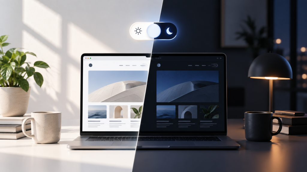
Web Designers Love Dark Mode Toggles. Users Might Not Care.
Somewhere along the way, the little sun-and-moon icon became practically mandatory. Portfolio? Dark mode toggle. Documentation site? Dark mode toggle. SaaS landing page? Naturally, a dark mode toggle sitting proudly…
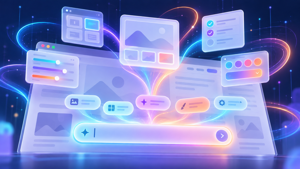
How the Prompt Box is Swallowing Website Interfaces Whole
I had a moment the other day where I stared at a software dashboard and realized I was completely exhausted. I was trying to run a relatively simple financial report….

Nobody Wants Your Damn App
I just wanted to check your website. I didn’t want to download 200MB of software. I didn’t want another icon on my home screen. I definitely didn’t want to create…

Chrome Can Now Measure Exactly How Obnoxious Your Website’s Ads Are
We’ve all opened that website: three ads before you reach the first paragraph, a giant sticky banner and a video desperately trying to follow you down the page. Now Chrome can actually measure…
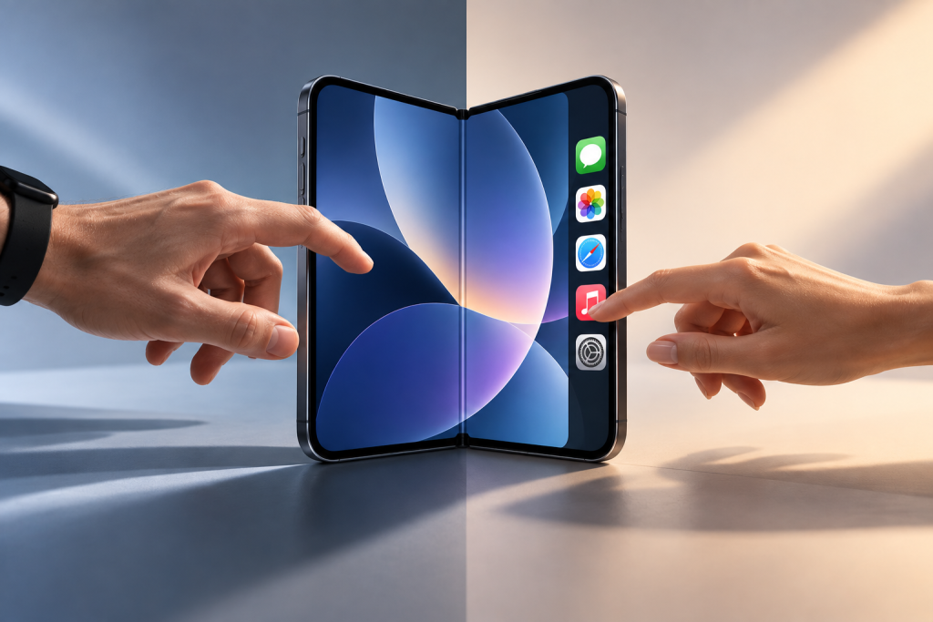
Apple’s Foldable iPhone Has a Left-Handed Problem
Apple’s new iPhone Duo moves some familiar controls from the top and bottom of the screen into a vertical bar along the side when its larger inner display is used…
Why Tech Companies Hid the “Log Out” Button (And How to Win It Back)
Try to log out of Netflix on your TV right now. Go ahead. I’ll wait. If you’re like most people, you’ll end up aggressively mashing the left arrow key, accidentally…