1
Spend enough time browsing award-winning websites and you start to notice something strange: many of them are remarkably unpleasant to actually use.
Your cursor becomes a mysterious floating blob. Navigation disappears until you discover the correct gesture. Text slides sideways while you’re trying to read it. Scrolling triggers animations instead of taking you where you expected to go. Pages take over your entire screen for transitions that nobody asked for.
And somehow, this is what we’re calling the best of the web.
We’ve started rewarding websites for getting in the way
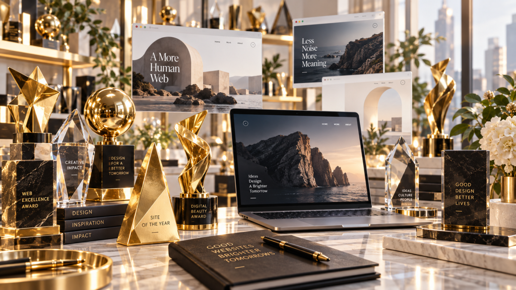
Web design awards are supposed to showcase exceptional design, but somewhere along the way, “exceptional” became confused with “look what we can make the browser do.”
A website that loads instantly, communicates clearly and lets visitors accomplish something without thinking rarely looks impressive in a 20-second showcase video. So designers pile on movement, oversized typography, custom cursors, unconventional navigation, WebGL effects and elaborate transitions because those are the things that get noticed.
The result is an increasingly bizarre corner of the web where making a website harder to use can actually make it look more award-worthy.
Scroll normally and nothing happens normally. Hover over something and the whole screen reacts. Want to go back? Good luck finding the button. Want to read a paragraph? First wait for every individual word to animate itself into existence.
That’s not innovation. Sometimes it’s just bad UX with an art director.
Designers aren’t the people most websites are designed for
The fundamental problem is that designers experience these websites completely differently from ordinary visitors. We deliberately move the cursor around looking for interactions. We appreciate unusual typography. We notice transitions, grids, shaders and clever animation techniques.
The average visitor couldn’t care less.
They’re trying to find the price of something, book a room, understand a product, read an article or figure out whether the restaurant is open tonight. If it takes them 30 seconds to understand how your navigation works, they aren’t thinking about how brave your design is.
They’re wondering why your website is broken.
Yet somehow we’ve created an industry culture where making familiar things unfamiliar is often treated as creativity. A normal cursor becomes a circle. A normal menu becomes three cryptic lines floating in a corner. A normal scroll becomes an interactive cinematic journey through somebody’s creative vision.
At some point, design stopped serving the website and the website started serving the designer.
Beautiful screenshots can hide terrible websites
This may be the biggest problem with how we celebrate web design: great websites and great screenshots aren’t necessarily the same thing.
A gigantic headline over a full-screen photograph looks fantastic in a gallery. So does an experimental menu captured at exactly the right moment. Nobody sees the visitor desperately moving their mouse around trying to figure out what is clickable.
We reward the spectacle, not the frustration.
That’s how we end up celebrating websites that break some of the most basic principles designers preach everywhere else: clear navigation, readable text, predictable interactions, fast access to information and interfaces that don’t force users to learn how they work.
If your website needs exploration before it can be understood, maybe you’ve created an interesting digital experience. You haven’t necessarily created a good website.
Creativity shouldn’t be an excuse for bad UX
None of this means the web should become a sea of identical corporate templates. We desperately need experimentation. Weird websites can be wonderful. Designers should absolutely push browsers, typography and interaction design into places we haven’t seen before.
But creativity isn’t automatically good design.
The truly impressive website isn’t one that forces visitors to admire how clever it is. It’s one that can be wildly original while still making everything feel obvious.
Anyone can hide a menu and call it minimalism. Anyone can hijack scrolling and call it storytelling. Anyone can make visitors chase their cursor around the screen and call it interaction design.
Making something genuinely different without making it worse to use takes considerably more skill.
So perhaps web design awards need to start asking a less glamorous question. Not “How impressive does this website look?” But “Would anyone actually enjoy using this thing?”

The “Rage Click” Manifesto: Is Your Design Making People Angry?
We’ve all been there. You’re trying to submit a form, or simply close a stubborn pop-up, and the button just stays there. You click it again. Nothing. Within two seconds,…
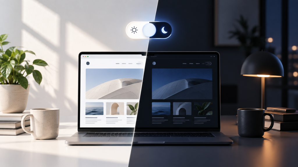
Web Designers Love Dark Mode Toggles. Users Might Not Care.
Somewhere along the way, the little sun-and-moon icon became practically mandatory. Portfolio? Dark mode toggle. Documentation site? Dark mode toggle. SaaS landing page? Naturally, a dark mode toggle sitting proudly…

How the Prompt Box is Swallowing Website Interfaces Whole
I had a moment the other day where I stared at a software dashboard and realized I was completely exhausted. I was trying to run a relatively simple financial report….

Nobody Wants Your Damn App
I just wanted to check your website. I didn’t want to download 200MB of software. I didn’t want another icon on my home screen. I definitely didn’t want to create…

Chrome Can Now Measure Exactly How Obnoxious Your Website’s Ads Are
We’ve all opened that website: three ads before you reach the first paragraph, a giant sticky banner and a video desperately trying to follow you down the page. Now Chrome can actually measure…
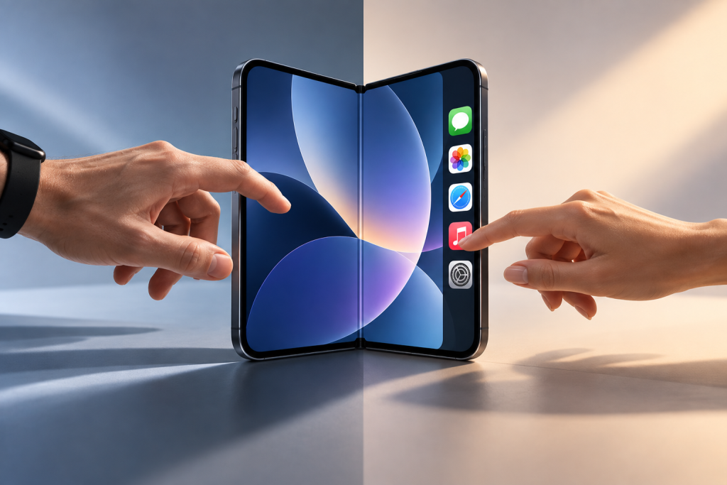
Apple’s Foldable iPhone Has a Left-Handed Problem
Apple’s new iPhone Duo moves some familiar controls from the top and bottom of the screen into a vertical bar along the side when its larger inner display is used…