1
Typography gets much more interesting once you wander beyond the familiar font libraries. These five independent foundries are producing typefaces with enough personality to completely change the character of a website—and in some cases, become the design itself.
1. Overlap Type — Fonts That Refuse to Behave
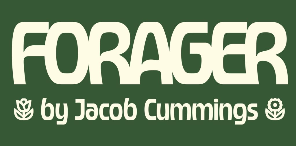
Overlap Type is an independent foundry run by Oakland-based type designer Kel Troughton. Its catalogue brings together work from Troughton and other designers, with an emphasis on type that has a strong visual personality.
Fonts like Forager, designed by Jacob Cummings, mix 1970s psychedelia, Art Nouveau and chunky geometric forms, while Troughton’s Gnar heads in a louder, more playful direction.
For web designers tired of another tasteful geometric sans, this is the opposite. These are fonts that can dominate a hero section, establish the personality of a site and reduce the need for much additional decoration.
Sometimes the font doesn’t need to fit the design. It can be the thing you design around.
2. Too Much Type — What If a Font Could Behave?
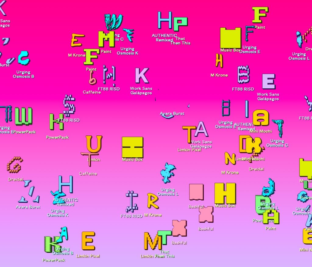
Too Much Type is an experimental open-source type project from designer and developer Gabriel Drozdov, whose studio No Replica works across web design, development and typography.
Instead of simply drawing unusual letters, the project explores experimental and variable typography and presents fonts in ways that encourage visitors to manipulate and play with them.
This feels particularly relevant to web designers because a font no longer has to be completely static. Variable typography can change weight, width and other characteristics—and those changes can potentially respond to the screen or interaction around them.
The interesting question becomes less “Which font should I use?” and more “What could the typography actually do?”
The font isn’t necessarily the finished product anymore. It can become part of the interface.
3. Velvetyne — The Punk-Rock Alternative to Commercial Fonts
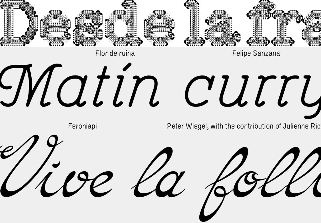
Velvetyne Type Foundry takes a radically different approach to type. The French collective produces experimental fonts that are libre and open source rather than locked behind conventional commercial licensing.
The results aren’t necessarily fonts you’d choose for a bank’s new corporate identity—and that’s exactly the attraction. The catalogue is filled with strange, expressive typefaces that can give experimental websites an identity before you’ve added a single graphic.
Some designs are relatively restrained; others push typography toward illustration. Typefesse, designed by Océane Juvin, is an especially memorable example, turning body-like forms into letters.
Think of Velvetyne as the indie record label of typography: unpredictable, occasionally weird and much more interesting because of it.
4. Blaze Type — Beautiful Type That Isn’t Afraid to Get Weird
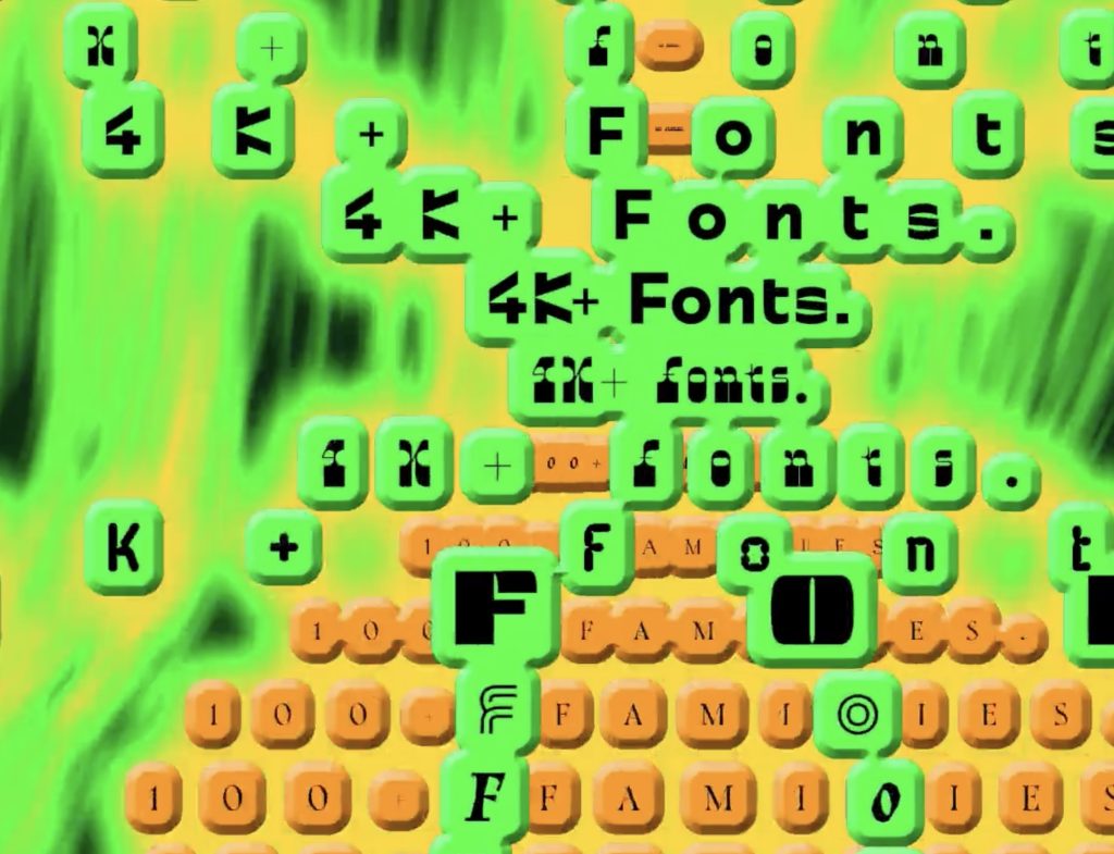
Blaze Type occupies an interesting middle ground: experimental enough to make you stop scrolling, but polished enough to actually use on a commercial website.
Founded in Marseille by Matthieu Salvaggio, its catalogue has grown to more than 100 typeface families and 4,000 individual fonts, covering serifs, sans serifs, stencils, display designs and variable families.
That’s what makes Blaze particularly useful for web designers. Some experimental fonts look fantastic at 100 pixels but become difficult once you need an entire functioning website. Blaze frequently manages to provide both personality and practicality.
A family can behave itself in smaller text and then become far more expressive when blown up into an enormous headline.
It’s a useful reminder that “usable” typography doesn’t have to mean invisible typography.
5. Arcane Type — Fonts Are Magic
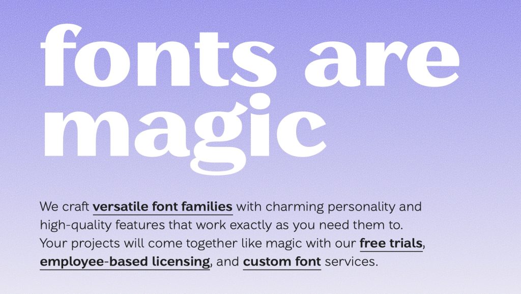
Vancouver-based Arcane Type literally describes its philosophy as “fonts are magic,” and its catalogue backs up the claim.
The independent foundry specializes in variable fonts and ranges from geometric sans serifs and neo-grotesques to blackletter, pixel and decorative display faces. It also places an emphasis on language support, including an expanding selection of Indigenous languages.
For web designers, Arcane demonstrates where contemporary type can get particularly interesting: one flexible font system capable of becoming many different things.
Variable typography also opens up possibilities beyond simply choosing between regular and bold. Width, weight and other characteristics can potentially adapt to different layouts and screen sizes, making typography itself more responsive.
The Bigger Shift
The interesting thing about these foundries isn’t simply that their fonts look different. They’re treating typography less like a box of static letterforms and more like a component of the interface itself.
Variable axes, interaction and unconventional shapes mean typography can increasingly respond to the screen around it. A strong display face can also do work that designers might otherwise hand over to illustrations, graphics or UI decoration.
And after a decade of websites that seem to use the same five sans serifs, perhaps a little typographic chaos isn’t such a bad thing.

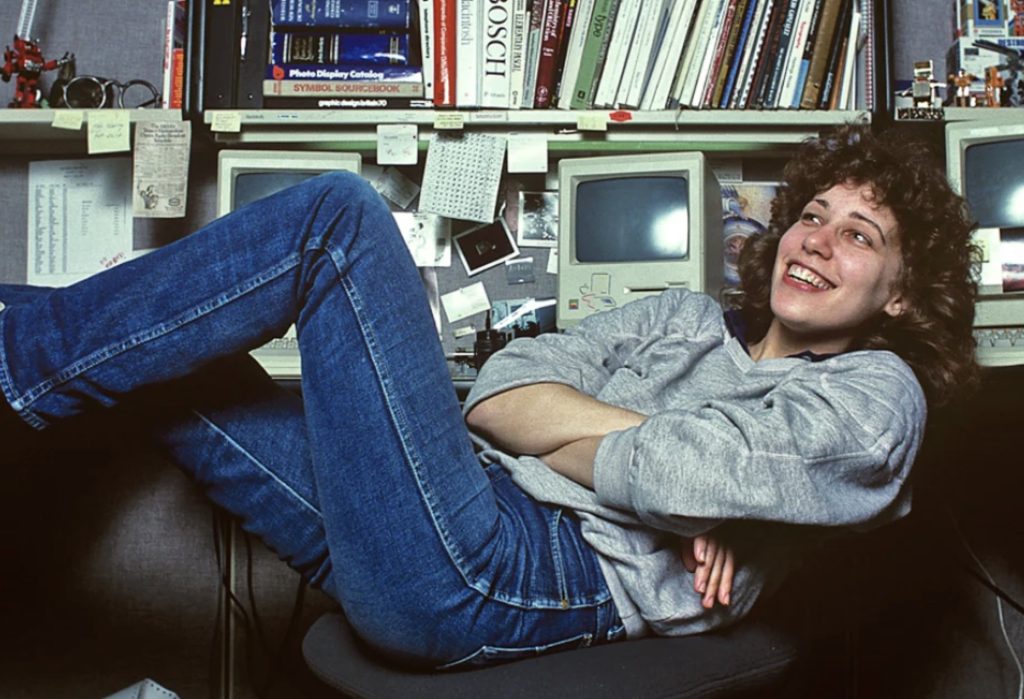
She Taught the Macintosh to Smile
The original Macintosh had a problem that had nothing to do with processing power: computers were intimidating. They spoke in commands and technical language, and there wasn’t much about them that…
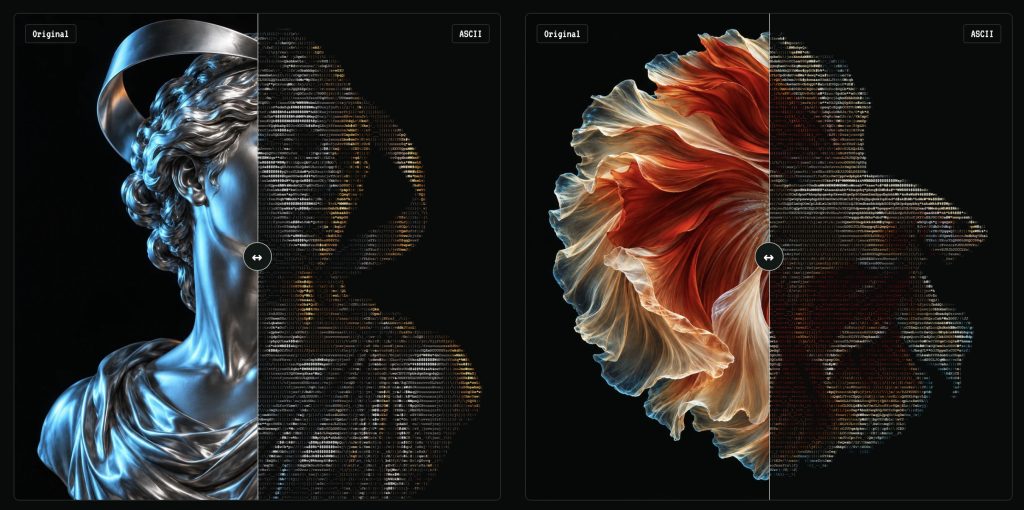
Turn Any Photo Into Retro ASCII Art in Seconds
What if your photo looked like it had escaped from a 1987 computer terminal? Image to ASCII turns JPGs, PNGs, WebPs, and GIFs into surprisingly stylish art made entirely from letters, symbols,…
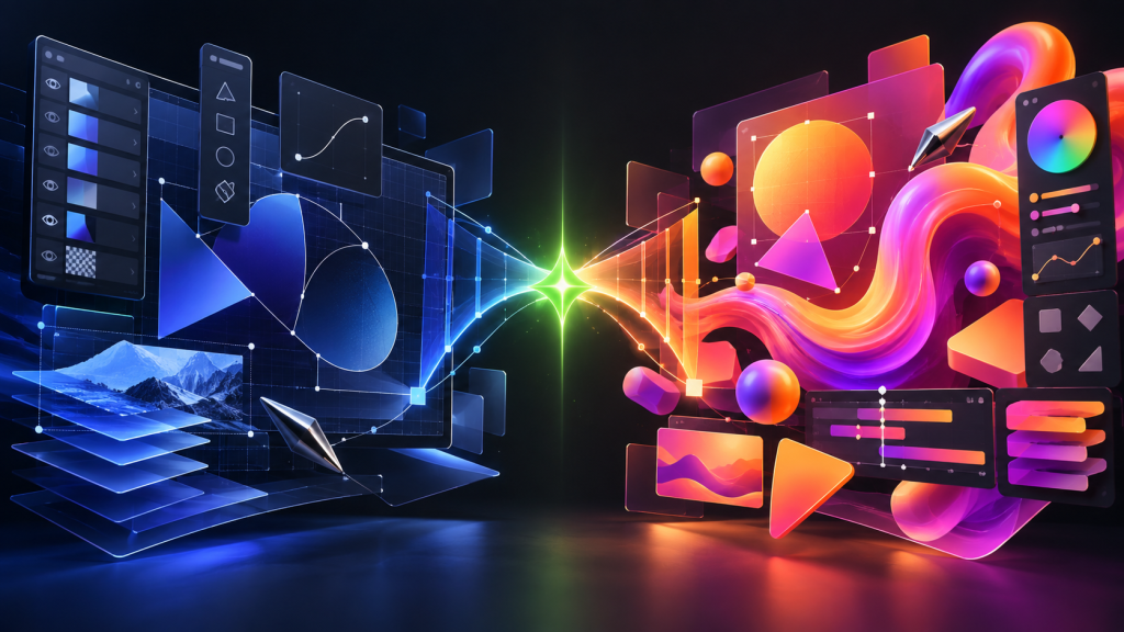
Canva Just Turned Affinity Into Adobe’s Biggest Free Problem
Canva has connected Affinity, Cavalry, Flourish, and Leonardo into a new pro-creative ecosystem—and it is keeping the core Affinity and Cavalry apps free. Adobe is not about to vanish in…
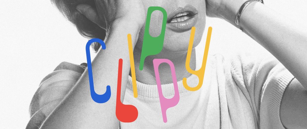
This Weird 1973 Typeface Just Came Back From the Dead
Some typefaces age gracefully. Others disappear for half a century and come back looking strangely perfect for the internet. Clippy definitely belongs in the second category. The wonderfully odd typeface…
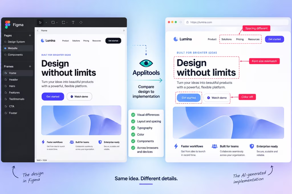
AI Can Build Your UI. Now Figma Can Tell It When It Screwed Up.
AI coding tools have become remarkably good at turning prompts into working interfaces. The awkward part comes afterward: does the thing they built actually look like the design? A new…
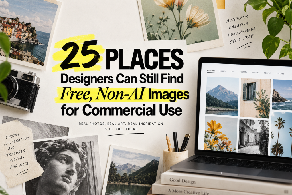
25 Places Designers Can Still Find Free, Non-AI Images for Commercial Use
Finding a free image used to be simple. Search Unsplash, download something tasteful, and move on with your life. Now there’s another question: Was this thing actually photographed? AI-generated imagery is…