1
Today is World Ampersand Day, which means designers finally have an excuse to celebrate the hardest-working squiggle on the keyboard.
The & is so familiar that we barely notice it, but it’s actually one of typography’s great survivors. Its story stretches back almost 2,000 years — and after all that time, type designers still haven’t agreed on what the thing should look like.
It Started With Two Letters
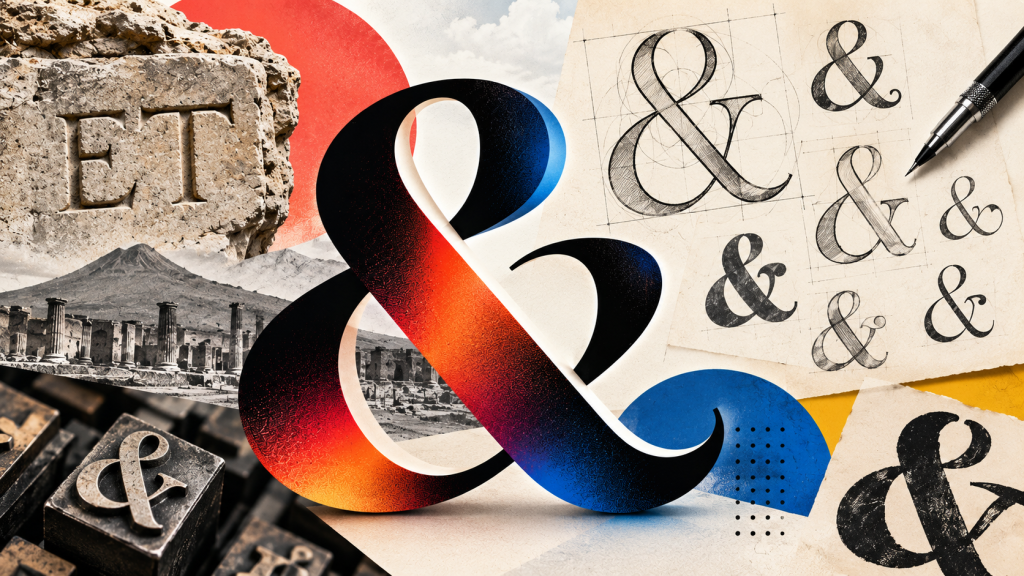
The ampersand wasn’t originally a symbol at all. It evolved from the Latin word et, meaning “and.” Roman writers began joining the E and T together into a single character — what we’d now call a ligature. One of the earliest surviving examples was scratched into graffiti in Pompeii before Mount Vesuvius buried the city in 79 AD.
Over the centuries, that simple et got twisted, curled and stylized until it became the & we recognize today. Except there isn’t really one ampersand.
Open a dozen fonts and you’ll find a dozen interpretations. Some clearly reveal the original E and T. Others resemble an 8, a knot, a treble clef or something you might doodle while pretending to pay attention during a meeting.
Wait, Why Is It Called an Ampersand?
This may be the best part. The & was once commonly taught after Z as a 27th character of the English alphabet. Because saying simply “and” would be confusing, schoolchildren ended their alphabet recital with “and per se and” — essentially, “& by itself means and.”
Say “and per se and” quickly enough and you’ll hear what happened.
Ampersand.
So we have Roman graffiti, centuries of typographic experimentation and generations of children accidentally inventing a word. Not bad for a character most of us reach by pressing Shift + 7.
World Ampersand Day itself is considerably younger: designer and typographer Chaz DeSimone created it in 2015 as an extension of his ampersand-focused AmperArt project. World Ampersand Day
Nearly two millennia later, designers are still drawing new versions. Apparently “and” was never quite enough…

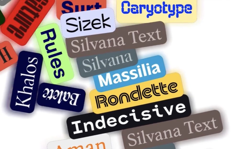
5 Creative Type Foundries You Should Know About
Typography gets much more interesting once you wander beyond the familiar font libraries. These five independent foundries are producing typefaces with enough personality to completely change the character of a…
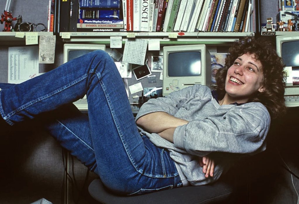
She Taught the Macintosh to Smile
The original Macintosh had a problem that had nothing to do with processing power: computers were intimidating. They spoke in commands and technical language, and there wasn’t much about them that…
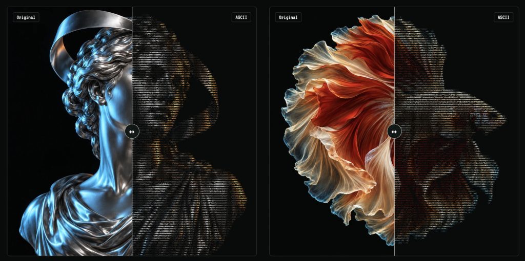
Turn Any Photo Into Retro ASCII Art in Seconds
What if your photo looked like it had escaped from a 1987 computer terminal? Image to ASCII turns JPGs, PNGs, WebPs, and GIFs into surprisingly stylish art made entirely from letters, symbols,…
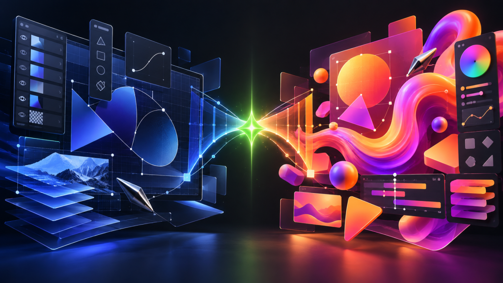
Canva Just Turned Affinity Into Adobe’s Biggest Free Problem
Canva has connected Affinity, Cavalry, Flourish, and Leonardo into a new pro-creative ecosystem—and it is keeping the core Affinity and Cavalry apps free. Adobe is not about to vanish in…
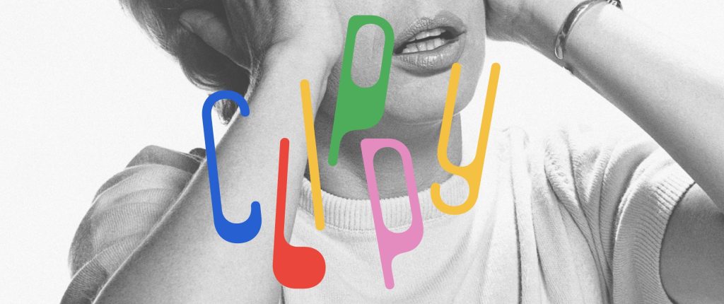
This Weird 1973 Typeface Just Came Back From the Dead
Some typefaces age gracefully. Others disappear for half a century and come back looking strangely perfect for the internet. Clippy definitely belongs in the second category. The wonderfully odd typeface…
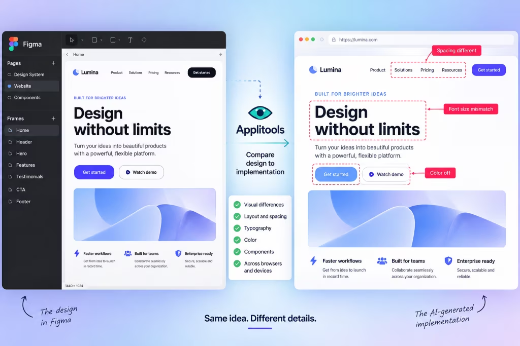
AI Can Build Your UI. Now Figma Can Tell It When It Screwed Up.
AI coding tools have become remarkably good at turning prompts into working interfaces. The awkward part comes afterward: does the thing they built actually look like the design? A new…