1
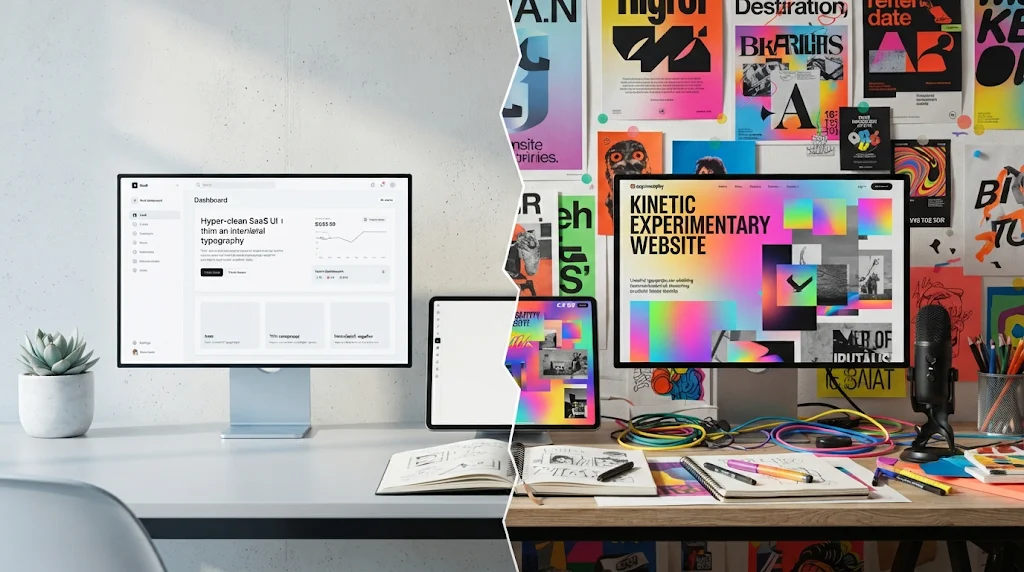
If you spend any time scrolling through design Twitter, Awwwards, or Dribbble, you’ve probably noticed something funny happening. The design world is caught in an endless tug-of-war.
On one side, you have the ultra-clean, whisper-quiet minimalists. Think stark white spaces, tiny grotesque typography,and layouts so breathable you feel like you need an oxygen tank. On the other side, the maximalists have burst back onto the scene like a confetti cannon—serving up chaotic kinetic typography, rich textures, brutalist layouts, and visual noise that screams for your attention.
For web designers, indie hackers, and frontend creators, this pendulum swing can feel exhausting. Do you strip everything down to a sterile SaaS-style grid, or do you turn the dial up to eleven and risk burning your users’ retinas?
Let’s take a closer look at why this battle is happening, where both styles shine, and how you can strike the right balance for your brand without losing your mind—or your conversions.
The Rise of the Two Extremes
To understand where we are today, it helps to look at how we got here.
For the past decade, digital product design was heavily dominated by corporate minimalism (often derisively called “Blanding”). Every startup landing page started looking the same: a centered headline in Inter or SF Pro, a glowing purple gradient blur in the background, a floating 3D illustration of a isometric dashboard, and a couple of pastel client logos. It was clean, safe, and utterly forgettable.
As a reaction to that sea of sameness, creators and boutique agencies rebelled. Maximalism roared back. Driven by better browser rendering capabilities, heavy WebGL experimentation, and a desire to inject raw human emotion back into the web, sites started embracing chaos. We saw brutalism, anti-design, messy overlapping layers, custom cursor trails, and bold, experimental typography.
The problem? Neither pure minimalism nor unbridled maximalism is a silver bullet.
- The Minimalist Trap: When you push minimalism too far, your site stops feeling like an experience and starts feeling like an instruction manual. It lacks a pulse. Users can’t tell your brand apart from the five other competitors using the exact same template.
- The Maximalist Trap: When you push maximalism too far, you sacrifice usability at the altar of aesthetics. Pages take three seconds too long to load, mobile layouts break under the weight of heavy assets, and users get dizzy trying to figure out where to click.
So, how do we solve this? The secret isn’t picking a team—it’s learning how to blend them.
When to Lean Into Minimalism (The Utility Zone)
Minimalism isn’t dead; it just needs to be used where it actually makes sense.
If you’re building a tool-heavy platform, a dashboard, a complex SaaS product, or a utility-driven site where users need to get in, get their work done, and get out, minimalism is your best friend. In these contexts, design shouldn’t be an obstacle course.
When designing for utility, keep these principles in mind:
- Whitespace is Oxygen: Don’t crowd your UI elements. Give buttons, text blocks, and data tables room to breathe so the user’s cognitive load stays low.
- Typography as Structure: Instead of relying on heavy graphic elements, let clean typographic hierarchy dictate the flow. A strong, well-weighted font family can carry the entire visual weight of a page.
- Intentional Color: Use a restricted color palette, and save your high-saturation accent colors strictly for primary call-to-actions (CTAs).
Minimalism shines when the goal is efficiency. It removes friction between the user and their objective.
When to Unleash Maximalism (The Emotion Zone)
On the flip side, if you’re building a portfolio, a creative agency site, a product launch page, or a brand that relies heavily on storytelling and emotional connection, minimalism will fall flat.
If your website feels like a utility bill, nobody is going to share it on social media. This is where maximalism saves the day. It injects personality, creates a memorable first impression, and makes a digital space feel tactile and alive.
To use maximalism effectively without destroying your UX, focus on these areas:
- Kinetic Typography: Instead of static headings, use fluid, responsive, or scrolling-triggered typography that behaves like a living element on the page.
- Rich Textures and Depth: Introduce subtle grain overlays, paper textures, or unexpected grid lines that break the sterile perfection of standard web layouts.
- Deliberate Asymmetry: Throw out the rigid 12-column safety blanket in specific sections. Let images overlap text blocks or offset your headers to create a sense of handcrafted pacing.
Maximalism shines when the goal is memorability. It turns a casual browser into an engaged fan.
The Sweet Spot: The Modern Hybrid Approach
The best digital experiences happening right now don’t choose a side. They borrow from both.
Think of it like a high-end fashion editorial or a modern architectural home: the core structure and layout are aggressively minimal, clean, and functional, but they are anchored by one or two jaw-dropping, maximalist focal points.
Here is how you can build this hybrid approach into your own projects:
- The Canvas is Clean, the Hero is Loud: Keep your navigation, body copy areas, and functional UI clean and minimalist. But let your hero section—the first three seconds of the user’s journey—be a maximalist explosion of kinetic type, rich color, or immersive imagery.
- Micro-Interactions as Texture: If your layout is minimal, use delightful, rich micro-interactions on buttons,toggles, and hover states to add warmth and tactile feedback.
- Prioritize Accessibility (Always): No matter how minimal or maximal your aesthetic is, WCAG guidelines aren’t optional. If your experimental maximalist font has terrible contrast ratios, or if your minimalist gray-on-gray text is unreadable for half your audience, the design fails. Period.
Finding Your Brand’s Voice
Ultimately, the debate between minimalism and maximalism isn’t about following a trend. It’s about alignment.
Before you open Figma or spin up your next project file, ask yourself: What is the emotional journey of the person landing on this page? Do they need calm clarity to solve a problem, or do they need to be swept away by an inspiring brand narrative?
Answer that honestly, and the right aesthetic balance will reveal itself.

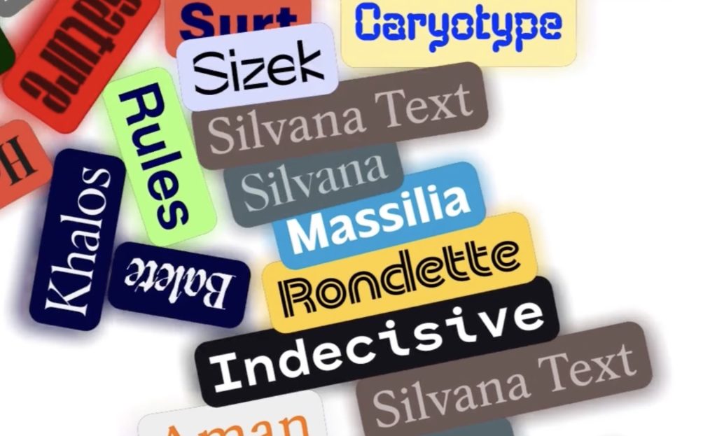
5 Creative Type Foundries You Should Know About
Typography gets much more interesting once you wander beyond the familiar font libraries. These five independent foundries are producing typefaces with enough personality to completely change the character of a…
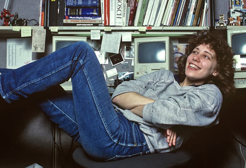
She Taught the Macintosh to Smile
The original Macintosh had a problem that had nothing to do with processing power: computers were intimidating. They spoke in commands and technical language, and there wasn’t much about them that…
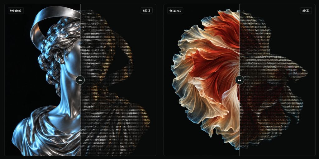
Turn Any Photo Into Retro ASCII Art in Seconds
What if your photo looked like it had escaped from a 1987 computer terminal? Image to ASCII turns JPGs, PNGs, WebPs, and GIFs into surprisingly stylish art made entirely from letters, symbols,…
Canva Just Turned Affinity Into Adobe’s Biggest Free Problem
Canva has connected Affinity, Cavalry, Flourish, and Leonardo into a new pro-creative ecosystem—and it is keeping the core Affinity and Cavalry apps free. Adobe is not about to vanish in…
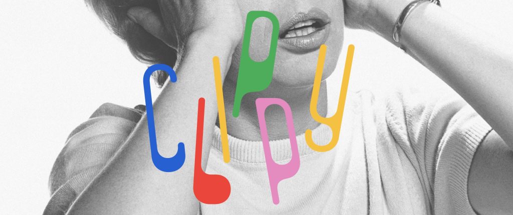
This Weird 1973 Typeface Just Came Back From the Dead
Some typefaces age gracefully. Others disappear for half a century and come back looking strangely perfect for the internet. Clippy definitely belongs in the second category. The wonderfully odd typeface…
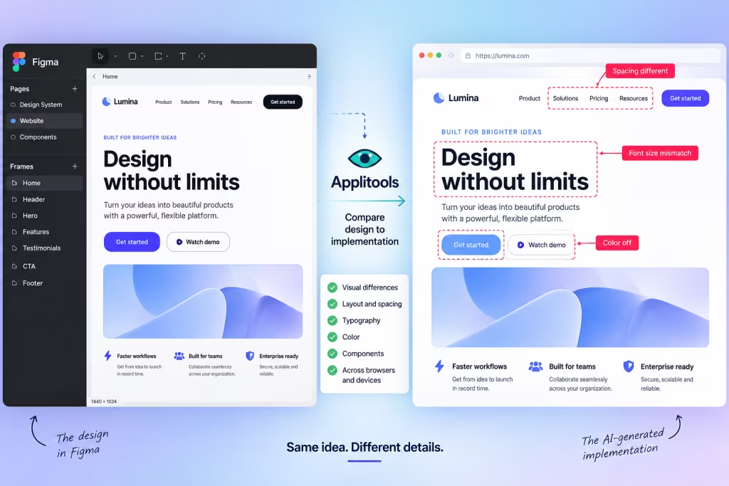
AI Can Build Your UI. Now Figma Can Tell It When It Screwed Up.
AI coding tools have become remarkably good at turning prompts into working interfaces. The awkward part comes afterward: does the thing they built actually look like the design? A new…