1
Some typefaces age gracefully. Others disappear for half a century and come back looking strangely perfect for the internet.
Clippy definitely belongs in the second category.
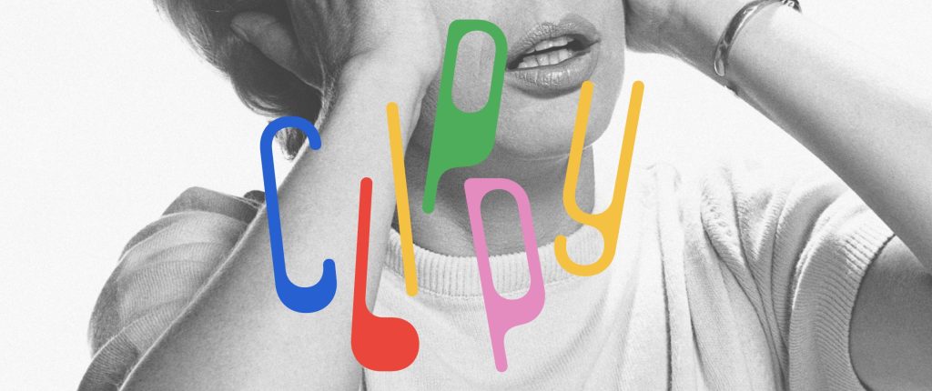
The wonderfully odd typeface from Kanon Foundry is based on Paperclip Contour, a 1973 design by Ad Werner. Type designer Tor Weibull took its rounded, looping letterforms and transformed them into a full digital type family — and somehow, more than 50 years later, it doesn’t feel particularly old.

The original Paperclip Contour was pretty limited: lowercase letters, numbers and basic punctuation, all in an outlined style. Clippy fills in those shapes, adds uppercase letters and expands the family to 530 glyphs and 219 supported languages.
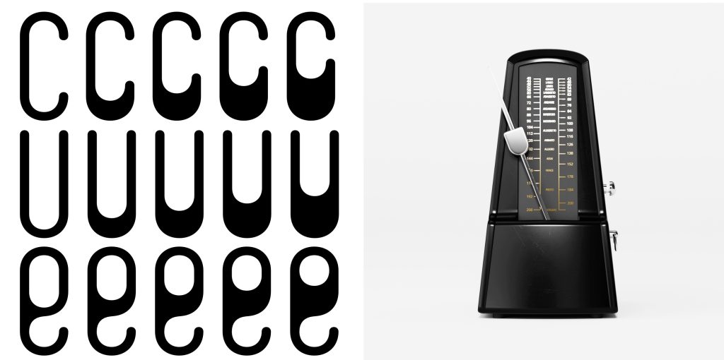
But the fun part is what happens when it moves.
Clippy uses variable-font technology to shift between upright and slanted forms, allowing the letters to rock backwards and forwards rather than simply falling into a conventional italic.
It’s typography with a mild balance problem.
And perhaps that’s why it feels so timely. After years of extremely polite geometric sans serifs dominating digital design, weird typography is fun again.
Would we use Clippy for the body text of a banking app? Probably not.
Would we build an enormous homepage headline around it?
Absolutely.
More than 50 years after Paperclip Contour appeared, its wonderfully strange letters may finally have found the technology they were waiting for.

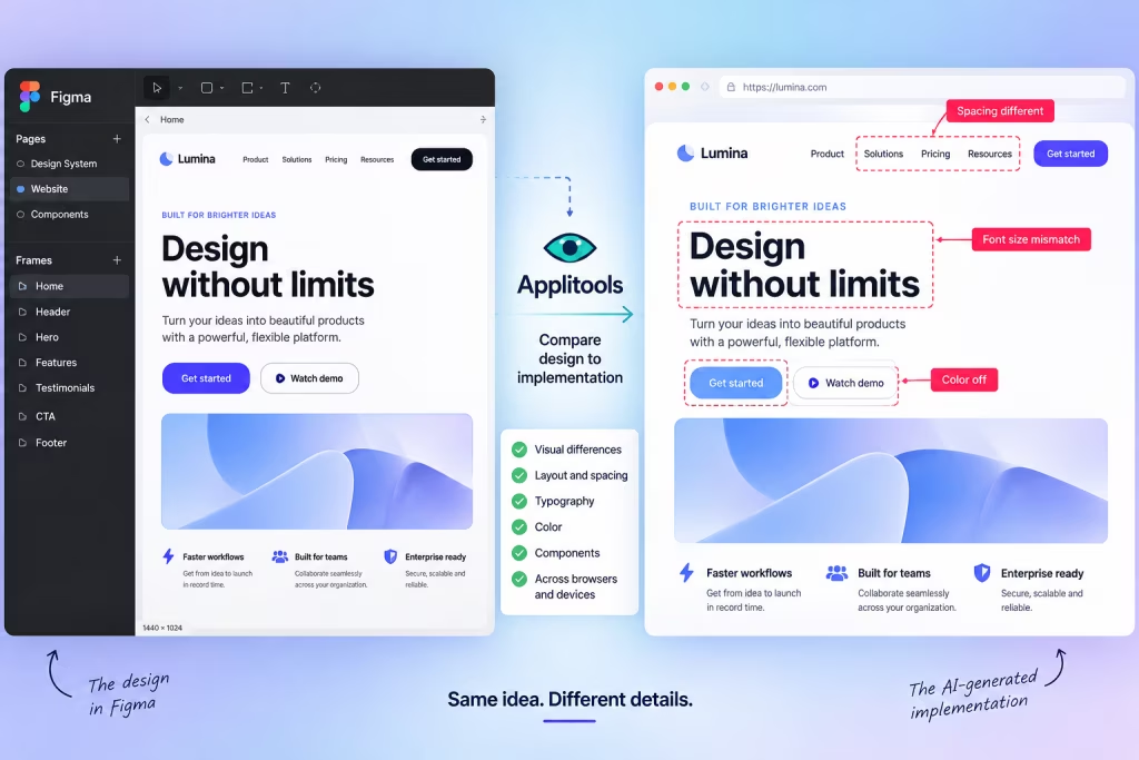
AI Can Build Your UI. Now Figma Can Tell It When It Screwed Up.
AI coding tools have become remarkably good at turning prompts into working interfaces. The awkward part comes afterward: does the thing they built actually look like the design? A new…

25 Places Designers Can Still Find Free, Non-AI Images for Commercial Use
Finding a free image used to be simple. Search Unsplash, download something tasteful, and move on with your life. Now there’s another question: Was this thing actually photographed? AI-generated imagery is…

Photoshop Elements 2027 Adds AI Assistant, Generative Expand, and Upscale
Adobe today announced Photoshop Elements 2027, bringing a new wave of generative AI features to its simpler alternative to Photoshop. The update adds Generative Expand, Generative Upscale and a beta AI…

Firefox Is Getting Its Biggest Redesign in Years. Then Mozilla Got Cold Feet.
Firefox is about to look very different—or at least, it was supposed to… Mozilla’s long-in-development Project Nova redesign is expected to roll out broadly with Firefox 157 on September 29, giving the…
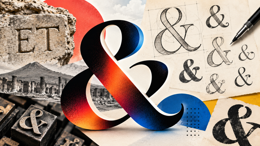
The Ampersand Is Nearly 2,000 Years Old — And Designers Still Can’t Agree How It Should Look
Today is World Ampersand Day, which means designers finally have an excuse to celebrate the hardest-working squiggle on the keyboard. The & is so familiar that we barely notice it, but it’s actually…

Canva Is Quietly Publishing Nearly 1 Million Websites a Month
Canva is best known for presentations, social posts and making everyone in the office think they’re a graphic designer. But it has quietly become something else: a surprisingly huge website platform….