1
For years, the unwritten rule of e-commerce growth hacking was painfully simple: if a clever design trick gets someone to tap “buy,” ship it. That mindset is how the web got flooded with dark patterns—those subtle, manipulative UI choices engineered to push shoppers into decisions they’d never make on a completely honest website.
We decided to look under the hood of 100 major global online stores, going through their checkout flows, cart drawers, and subscription models. Here are 10 key takeaways on how deceptive design operates in the wild, why it backfires, and how the best product teams are fixing it.
1. Fake Urgency Is Losing Its Magic
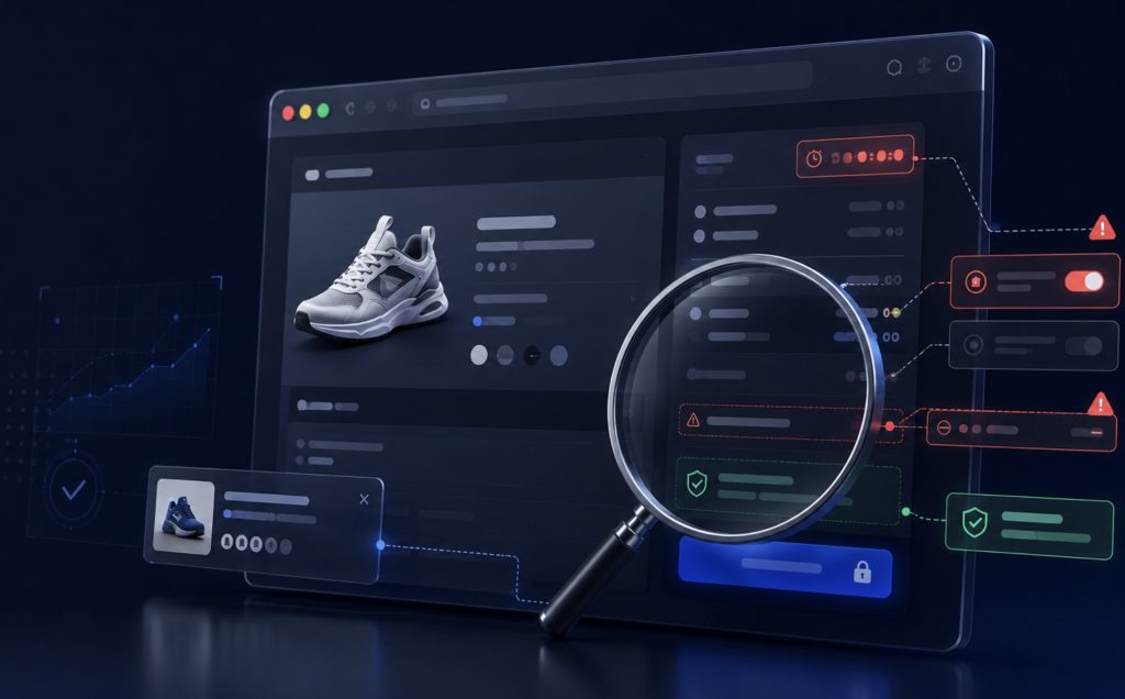
An eye-opening 68% of the stores we audited relied on manufactured pressure—think bright red banners warning that a sale ends in 04:12, or little tags claiming Only 2 items left!. The catch? When we refreshed those exact same product pages from fresh IP addresses with cleared cookies, almost every single countdown timer just reset right back to the top.
A landmark Princeton University study on dark patterns uncovered thousands of these deceptive setups, showing that low-stock alerts and ticking clocks are frequently generated by simple automated scripts rather than live warehouse inventory. The exact second a customer realizes your countdown timer is fake, their trust in your brand’s pricing—and your integrity—is gone for good.
2. Sneaky Add-Ons Are Secretly Killing Your Conversions
In 42% of the stores we checked, we found pre-checked boxes for optional extras—like shipping insurance, extended warranties, or carbon offsets—hidden near the bottom of long mobile checkout pages. Retailers are banking on default bias, hoping you’ll either assume the extra $4 fee is mandatory or miss it entirely before hitting “Place Order.”
This tactic might net a few sneaky extra dollars, but it hurts sales in the long run. Extensive checkout usability research from the Baymard Institute shows that unexpected extra costs added late in the process remain the single biggest cause of cart abandonment, pushing global abandonment rates close to 70%. When people feel like they’re being quietly pickpocketed at checkout, they close the tab and head straight to a competitor.
3. Insulting Your Users Isn’t a Growth Strategy
Over half of the audited sites used emotional guilt trips in their exit pop-ups and newsletter sign-up boxes. Instead of giving you a normal “close” button, these interfaces force you to click condescending links like “No thanks, I prefer paying full price” or “No, I don’t care about saving money.”
Marketers started doing this “confirmshaming” because it gave a tiny temporary boost to sign-up rates, but the long-term vibe it creates is terrible. A sweeping audit by the European Commission on deceptive design called out this kind of manipulative choice framing as a major source of consumer frustration. Snarking at your visitors’ intelligence leaves a bad taste in their mouth, turning away high-intent buyers who might have otherwise stuck around.
4. Trap Subscriptions Are Dragging Brands into Legal Trouble
Nearly 31% of stores made signing up for a recurring subscription effortless with Apple Pay, but made canceling that same subscription an absolute nightmare. To get out, you had to initiate a live support chat, navigate a five-page survey, or call a phone number during narrow weekday hours.
These one-way “Roach Motel” flows—easy to get into, painful to escape—have finally pushed users and regulators past their breaking point. Authorities are cracking down hard, most notably through the FTC’s Click-to-Cancel rule, which requires businesses to make canceling a subscription just as fast and easy as signing up. Relying on forced retention isn’t just bad design anymore; it’s a massive legal liability.
5. Quick Conversion Bumps Routinely Destroy Customer Lifetime Value
The reason deceptive UI patterns won’t die is that they do give you a quick, satisfying spike in your analytics. A sneaky pre-checked box or a fake inventory warning can net you an immediate 8% to 14% boost in checkouts. But focusing only on that initial win misses the bigger picture.
Stores that rely on dark patterns suffer from painfully low repeat purchases, high single-order churn, and bad reviews. On top of that, customers who realize they were tricked end up filing credit card chargebacks at over triple the normal rate. Any extra cash you make from a sneaky checkout trick gets eaten up fast by customer support headaches, refunds, and lost repeat business.
6. Hidden Price Hikes in the Final Step Destroy Shopping Joy
A frustrating 38% of audited stores withheld fundamental price components—like service fees, handling charges, or regional processing costs—until step three or four of the checkout funnel. Instead of seeing the true total in the cart drawer, shoppers only discovered the inflated final price after filling out their shipping and contact details.
This practice, known as “drip pricing,” weaponizes sunk cost fallacy: the store hopes you’ve invested too much time typing out your home address to walk away over an extra $8 fee. However, modern users are acutely sensitive to this friction. Drip pricing is a top driver of negative trust reviews, and regulatory bodies across North America and Europe are actively issuing fines against retailers who fail to display all mandatory fees upfront.
7. Forced Account Creation Creates Unnecessary Drop-off
Despite years of UX research proving guest checkout is essential, 29% of online stores still forced first-time buyers to create a full password-protected account before letting them complete a purchase. Adding password requirements, email verification steps, and account creation screens right before payment acts as a massive roadblock to impulse purchases.
Shoppers don’t want to create their 50th store account just to buy a single item. Offering a seamless, friction-free guest checkout option—and giving users the option to save their info after the order is confirmed—remains one of the fastest, easiest ways to recover lost sales.
8. Fake Social Proof Banners Are Backfiring
On 24% of the audited stores, little notification pop-ups constantly flashed in the bottom corner of the screen: “Sarah from Chicago just bought a leather jacket 2 minutes ago!” When we inspected the network traffic and source code of these sites, we discovered that the majority were driven by random notification generators cycling through pre-set names and locations.
While real-time social proof can build confidence, artificial notification widgets ruin the user experience. They clutter the mobile viewport, slow down site performance with third-party tracking scripts, and feel cheap. Once a buyer realizes the pop-ups are running on a loop, the entire site loses credibility.
9. Visual Disguises Are Making UI Interactions Confusing
We found that 19% of stores used deceptive visual design to manipulate user clicks. This includes styling optional promo offers to look like mandatory system alerts, making the “decline” button low-contrast so it blends into the background, or placing a massive primary action button on an add-on while hiding the “skip” option in tiny grey text.
Interface design should strive for clarity, not confusion. When users feel tricked into clicking something they didn’t mean to, it triggers immediate buyer’s remorse. Clear visual hierarchy—where primary actions are obvious and opt-outs are easy to spot—reduces accidental clicks and builds confidence during payment.
10. Honest, Frictionless UX Is the Ultimate Competitive Advantage
The era of reckless growth-hacking through interface tricks is coming to an end. Forward-thinking product teams are realizing that treating users like reasonable human beings is actually the most profitable retention strategy out there.
The online stores winning right now are moving toward complete transparency—showing full taxes and shipping costs upfront in the cart, leaving optional add-ons unchecked, and making account cancellations a single click. When customer acquisition costs are as high as they are today, building real trust isn’t just a nice design sentiment—it’s the single best way to keep people coming back.


Some of the World’s “Best” Websites Are Actually Terrible
Spend enough time browsing award-winning websites and you start to notice something strange: many of them are remarkably unpleasant to actually use. Your cursor becomes a mysterious floating blob. Navigation disappears…
The “Rage Click” Manifesto: Is Your Design Making People Angry?
We’ve all been there. You’re trying to submit a form, or simply close a stubborn pop-up, and the button just stays there. You click it again. Nothing. Within two seconds,…
Web Designers Love Dark Mode Toggles. Users Might Not Care.
Somewhere along the way, the little sun-and-moon icon became practically mandatory. Portfolio? Dark mode toggle. Documentation site? Dark mode toggle. SaaS landing page? Naturally, a dark mode toggle sitting proudly…
How the Prompt Box is Swallowing Website Interfaces Whole
I had a moment the other day where I stared at a software dashboard and realized I was completely exhausted. I was trying to run a relatively simple financial report….

Nobody Wants Your Damn App
I just wanted to check your website. I didn’t want to download 200MB of software. I didn’t want another icon on my home screen. I definitely didn’t want to create…
Chrome Can Now Measure Exactly How Obnoxious Your Website’s Ads Are
We’ve all opened that website: three ads before you reach the first paragraph, a giant sticky banner and a video desperately trying to follow you down the page. Now Chrome can actually measure…