1
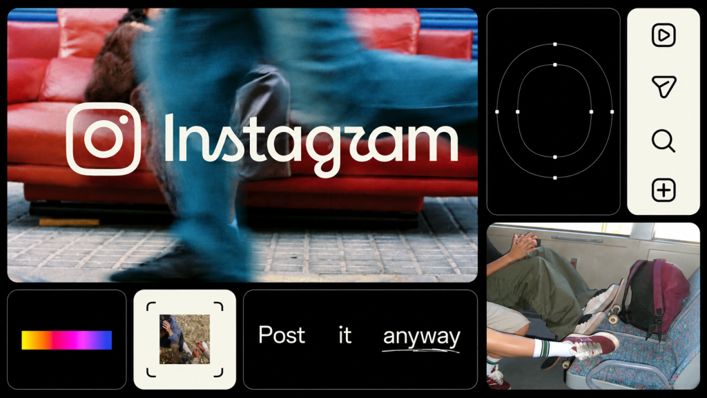
Instagram has redesigned its wordmark for the first time in a decade. The company says it’s cleaner, sharper and more modern.
There’s just one problem: people keep reading it as “Instagzam.”
And once you see it, it’s remarkably difficult to unsee. Congratulations, Meta: you’ve accidentally launched another social network.
Instagram unveiled the new wordmark in August as part of a broader refresh of its visual identity. The familiar gradient camera icon remains, but the handwritten Instagram name used inside the app has been redrawn. The company says its designers explored hundreds of possibilities before eventually returning to script because of its connection to Instagram’s history.
The result is supposed to be “bolder and simpler.”
Bolder? Definitely. Simpler? Well… welcome to Instagzam.
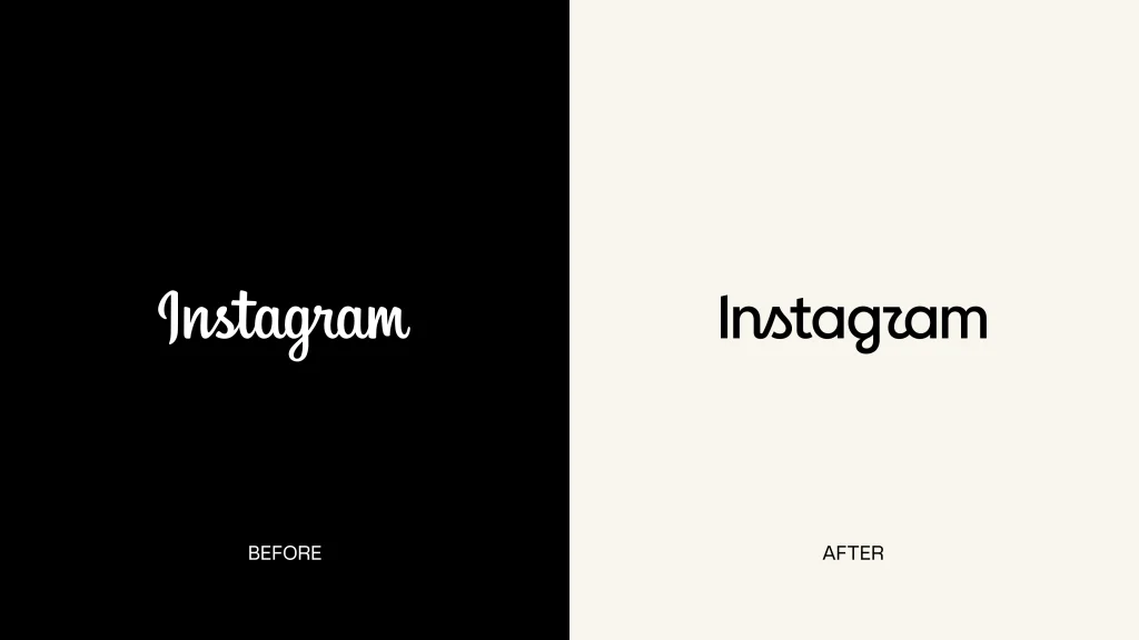
Can You Read It?
Look at the new wordmark without consciously reminding yourself that it says Instagram. The beginning is easy enough, but things get considerably more adventurous toward the end.
The biggest culprit is the r. Its exaggerated stroke can look remarkably like a z, while the surrounding script helps turn one of the world’s most recognizable brand names into something that sounds like a social network for magicians.
Once your brain finds “Instagzam,” good luck finding Instagram again!!
And that’s what makes the redesign interesting. This isn’t a logo for an obscure kombucha startup where nobody is quite sure whether the name is “Bloom,” “Broom” or “Bløøm.” This is Instagram. We have been staring at the name for years.
Yet the lettering can still make your brain hesitate.
Instagram Has a Superpower
Of course, nobody seriously thinks Meta has renamed Instagram. We know what the logo says because we already know what it says.
Put the wordmark inside the app, surround it with Instagram’s familiar gradient and interface, and our brains quietly fix the typography for us. Brand recognition is doing some fairly heavy lifting.
Instagram can afford that. A company with billions of users doesn’t really need to introduce itself. Your client’s new startup does.
Give an unknown company similarly ambiguous lettering and people may genuinely get its name wrong. That’s considerably less amusing when you’ve just spent $40,000 on a brand identity.
Instagram can afford a confusing letter. Most brands can’t.
Is It Actually a Bad Logo?
Not necessarily. Instagram could have avoided the whole problem by switching to a perfectly legible geometric sans serif. It would also risk looking like approximately 97% of the technology industry.
Instead, the designers preserved the handcrafted personality of Instagram’s old identity. That’s a reasonable goal, but it exposes one of the hardest problems in wordmark design: remove too much personality and the logo becomes generic; add too much and letters start becoming tiny pieces of abstract art.
Instagram has clearly chosen personality.
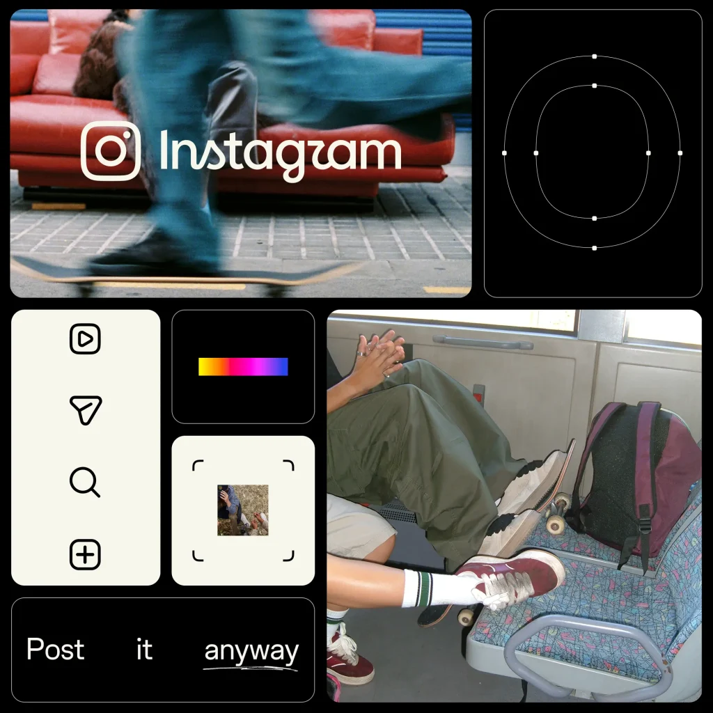
And strangely, Instagzam may actually help. A perfectly competent redesign could have appeared, received a few approving nods from designers and disappeared by lunchtime. Instead, people are stopping to look at the lettering closely enough to argue about what it says.
That’s not necessarily bad branding.
See you on Instagzam! 📸

5 Creative Type Foundries You Should Know About
Typography gets much more interesting once you wander beyond the familiar font libraries. These five independent foundries are producing typefaces with enough personality to completely change the character of a…
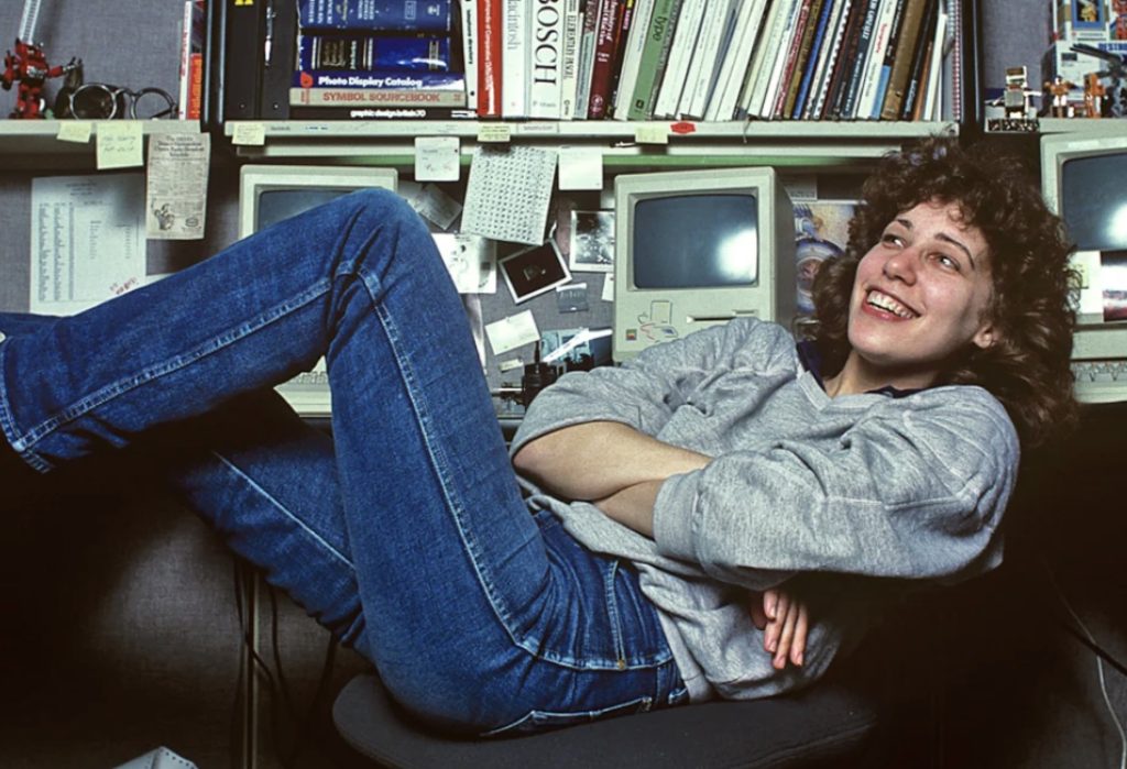
She Taught the Macintosh to Smile
The original Macintosh had a problem that had nothing to do with processing power: computers were intimidating. They spoke in commands and technical language, and there wasn’t much about them that…
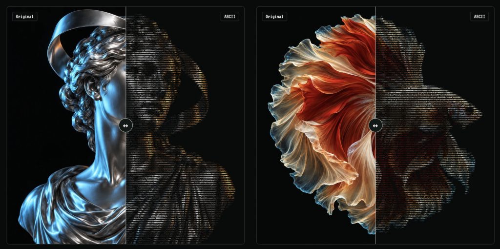
Turn Any Photo Into Retro ASCII Art in Seconds
What if your photo looked like it had escaped from a 1987 computer terminal? Image to ASCII turns JPGs, PNGs, WebPs, and GIFs into surprisingly stylish art made entirely from letters, symbols,…

Canva Just Turned Affinity Into Adobe’s Biggest Free Problem
Canva has connected Affinity, Cavalry, Flourish, and Leonardo into a new pro-creative ecosystem—and it is keeping the core Affinity and Cavalry apps free. Adobe is not about to vanish in…
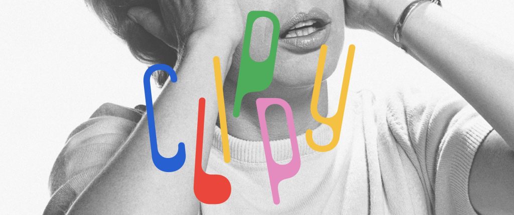
This Weird 1973 Typeface Just Came Back From the Dead
Some typefaces age gracefully. Others disappear for half a century and come back looking strangely perfect for the internet. Clippy definitely belongs in the second category. The wonderfully odd typeface…
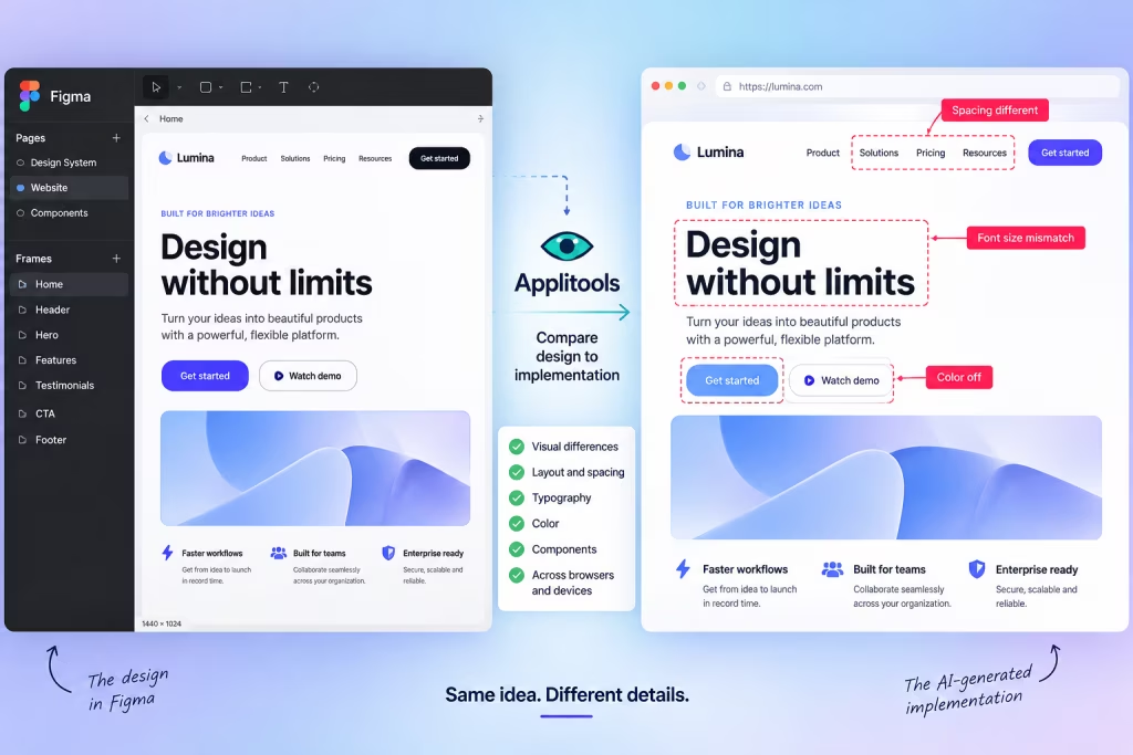
AI Can Build Your UI. Now Figma Can Tell It When It Screwed Up.
AI coding tools have become remarkably good at turning prompts into working interfaces. The awkward part comes afterward: does the thing they built actually look like the design? A new…