1
I had a moment the other day where I stared at a software dashboard and realized I was completely exhausted.
I was trying to run a relatively simple financial report. To do it, I had to click a sidebar menu, open a nested dropdown, select a date range from a finicky calendar widget, check three different custom filtering boxes, and hit “Apply.” It took eight clicks, a lot of squinting, and a non-zero amount of patience.
Right next to that massive wall of menus was a tiny, unassuming text box that read: “Or, just ask me.” I sighed, clicked it, and typed: “Show me Q3 revenue from Northwest clients, grouped by month.” A fraction of a second later, the exact chart I needed popped onto the screen.
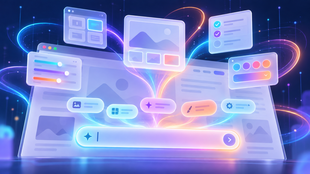
It was incredibly satisfying. But as I sat there, it hit me: the traditional user interface we’ve spent the last three decades perfecting is quietly dying. The nested menus, the sidebars, the tabs, and the endless dropdowns that define how we navigate the web are being swallowed whole by a single, empty rectangle: the prompt input box.
We are rapidly moving away from a web where you click what you want, and moving toward a web where you simply askfor it. And honestly? It’s completely changing how it feels to use the internet.
Goodbye “Hide and Seek” UI
For as long as we’ve had websites, UI design has been a massive game of digital hide-and-seek. Product designers spend millions of hours trying to figure out where to hide complex features so they don’t clutter the screen.
We got the “Hamburger Menu” (those three little horizontal lines in the corner), cascading hover menus, and settings pages that require five clicks to find. To be a power user of any modern website—whether it’s your banking portal, a project management app, or a flight booking engine—you had to learn the geography of the site. You had to memorize where the buttons lived.
The prompt box completely blows up that entire map.
Instead of forcing you to navigate a digital maze, the interface becomes entirely flat. The learning curve vanishes. You don’t need to know where the “Export to CSV” button is hidden in the settings menu; you just type “Download this as a spreadsheet.” The interface adapts to you, rather than forcing you to adapt to the interface.
The Friction of the Blank Page
On paper, this is a massive win for user experience. It’s friendlier, faster, and democratizes complex software for people who aren’t tech-savvy.
But as the web trades its dropdowns for text boxes, we’re starting to run into a completely new kind of user frustration: the tyranny of the blank page.
When a website gives you menus and buttons, it’s giving you clues. A dropdown menu tells you exactly what the website is capable of doing. If you click a “Filter” menu and see options for Price, Color, and Size, you instantly understand the boundaries of the system.
A prompt box gives you absolutely nothing. It’s an empty void staring back at you.
When an interface relies entirely on a text box, the mental burden shifts from the designer to the user. Suddenly, I have to figure out how to phrase my command perfectly. If I type “Show my top clients,” does the website define “top” by total revenue, number of orders, or profit margin? If the system misunderstands me, I don’t get an error message; I just get the wrong data, often without realizing it.
Instead of a smooth, predictable click, using a website becomes a game of psychological negotiation with a text box. You find yourself trying three different variations of the same sentence, desperately hoping you trigger the right backend command.
The Vending Machine Internet
There’s also a subtle loss of serendipity when we replace navigation with prompts.
Think about browsing an e-commerce site or a streaming platform. Half the fun is clicking through categories, stumbling onto a weird sub-menu, and discovering something you didn’t know you were looking for. The friction of clicking around leads to discovery.
The prompt box turns the web into a vending machine. It demands that you know exactly what you want before you type it. If you don’t know the right magic words, that content or feature might as well not exist.
The Shapeshifting Web
We aren’t going to see buttons and links disappear entirely by tomorrow. For quick, binary actions—like liking a post, adding an item to a cart, or toggling between light and dark mode—clicking a button will always be faster than typing a sentence.
But the shift is undeniable. The website layout of the future likely won’t be a static grid of menus. It will be a conversational partner. The UI will start as a blank slate, and morph into whatever layout you ask it to become.
It’s an exciting, slightly unsettling frontier. The web is becoming much easier to talk to, but a lot harder to truly see all at once. As we trade our dropdowns for prompt boxes, we’re gaining incredible speed—but we might want to make sure we don’t forget how to just look around and explore.


Nobody Wants Your Damn App
I just wanted to check your website. I didn’t want to download 200MB of software. I didn’t want another icon on my home screen. I definitely didn’t want to create…
Chrome Can Now Measure Exactly How Obnoxious Your Website’s Ads Are
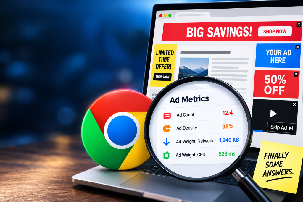
We’ve all opened that website: three ads before you reach the first paragraph, a giant sticky banner and a video desperately trying to follow you down the page. Now Chrome can actually measure…
Apple’s Foldable iPhone Has a Left-Handed Problem
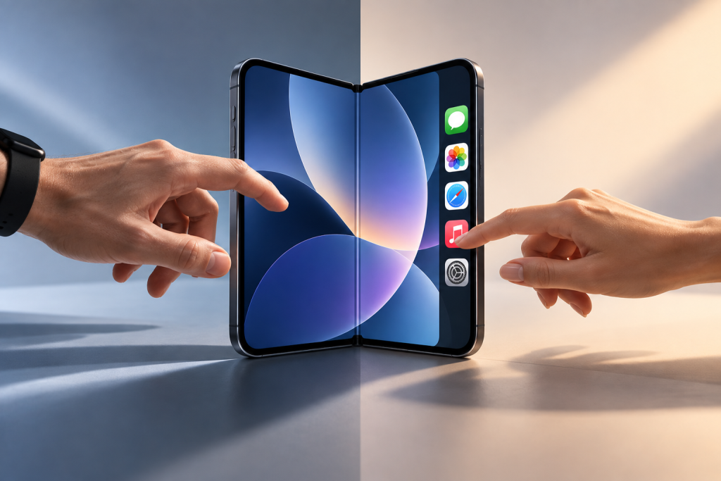
Apple’s new iPhone Duo moves some familiar controls from the top and bottom of the screen into a vertical bar along the side when its larger inner display is used…
Why Tech Companies Hid the “Log Out” Button (And How to Win It Back)
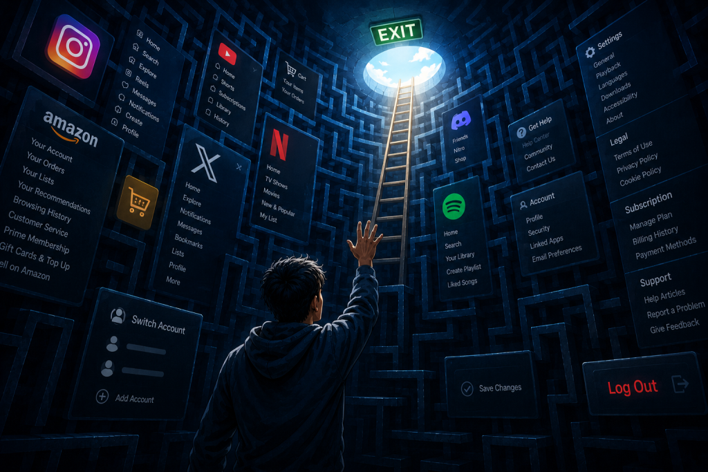
Try to log out of Netflix on your TV right now. Go ahead. I’ll wait. If you’re like most people, you’ll end up aggressively mashing the left arrow key, accidentally…
The Infinite Scroll Was a Design Crime. Now Meta is Paying for It.
If you’ve ever sat down at 11:00 PM to check a single notification and snapped back to reality at 2:00 AM staring at a stranger’s video of a house renovation,…
Why Your Favorite Websites Look Like 2005 (And Why You Secretly Love It)
The internet of the mid-2020s is a visual battlefield. As brands scramble to capture dwindling human attention spans, many have turned to “high-concept” design: parallax scrolling, auto-playing video backgrounds, experimental…