1
Cards are one of the most enduring UI patterns in digital design. They promise modularity, clarity, and adaptability—containers that can hold anything from product listings to social posts, news articles, or entire interface modules.
Yet, beneath that simplicity lies a crucial design decision that affects everything from scanning behavior to cognitive load: should cards be vertical or horizontal?
What may seem like a visual choice is actually a structural one. The orientation of a card dictates hierarchy, rhythm, and even how users move through content. Understanding these tradeoffs is vital to designing systems that scale gracefully across devices and contexts.
Why Card Orientation Matters
Cards are more than aesthetic wrappers; they embody the logic of modular design. They communicate a hierarchy of information within a constrained rectangle, balancing image, text, and action in a way that feels both predictable and dynamic.
Orientation is not a superficial concern—it influences:
- Visual hierarchy: How users prioritize image versus text.
- Information density: How much content can fit without overload.
- Interaction rhythm: How users scroll, swipe, or scan through lists.
- Responsiveness: How cards reflow between mobile, tablet, and desktop.
- Content type: How well media or text-driven content performs in different layouts.
Each orientation—vertical or horizontal—creates its own cognitive tempo. Designers who grasp these nuances don’t just make cards look better; they make interfaces feel coherent.
The Anatomy of a Card
Before comparing orientations, it’s worth breaking down what a card is: a self-contained content unit composed of three layers—visual, informational, and interactive.
- Visual layer: Image or thumbnail that draws attention.
- Informational layer: Text content—titles, metadata, descriptions.
- Interactive layer: Buttons, icons, or gestures (hover, tap, save, share).
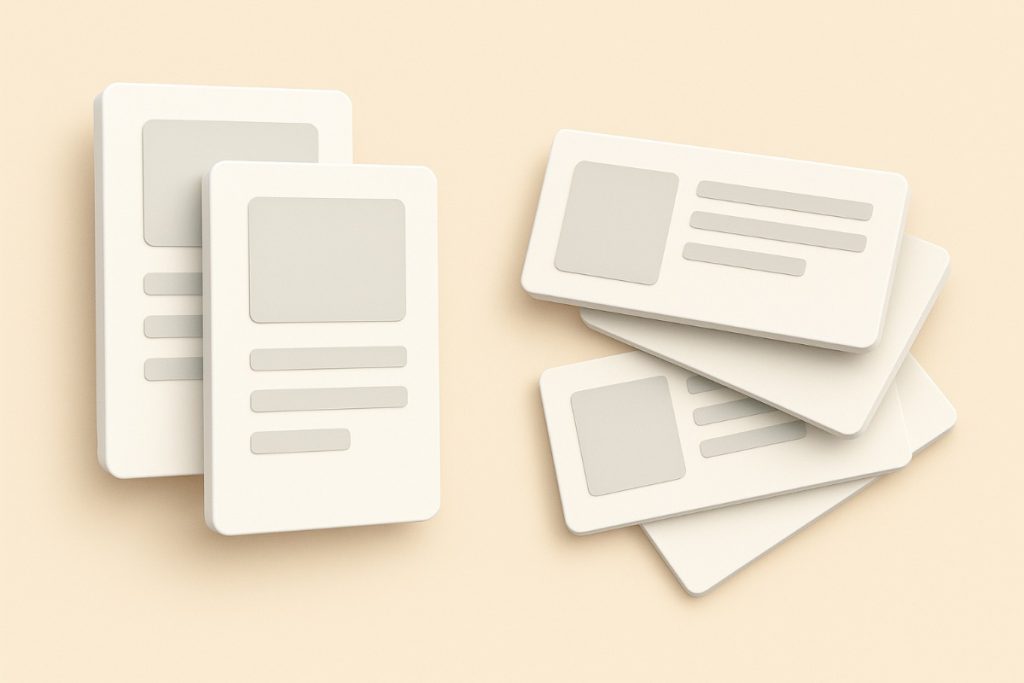
In vertical cards, these layers stack top-to-bottom; in horizontal cards, they align side-by-side. This basic shift in flow changes the user’s reading pattern, visual anchoring, and interaction cues.
Vertical Cards: The Default of Modern Interfaces
The vertical card has become the default choice across the web. Instagram, Airbnb, and Dribbble all rely on vertically stacked cards because they map naturally to human scanning patterns and mobile ergonomics.
1. Natural Eye Movement
Western reading patterns follow an F-shaped or Z-shaped flow—top to bottom, left to right. Vertical cards align with this rhythm. The image sits atop, the title beneath, followed by a snippet or CTA. Each layer reinforces the one above it. This makes vertical cards intuitive and predictable, which is why they dominate feed-based interfaces.
On a psychological level, vertical cards feel familiar. They resemble printed posters, book covers, and news clippings—media we’ve been scanning for decades. This makes them low-friction for comprehension.
2. Consistency Across Devices
Vertical cards are responsive by nature. They maintain proportion as width decreases, compressing gracefully for mobile screens without major reflow issues. The stacking order—image on top, text below—remains intact from desktop grids to single-column feeds.
In contrast, horizontal cards often require layout reconfiguration when squeezed into narrow viewports, creating inconsistencies or awkward truncation.
3. Better for Image-Led Content
When visuals carry the story—like in Pinterest, Behance, or travel listings—vertical cards excel. They allow images to take center stage without compressing them. The taller aspect ratio feels immersive, encouraging engagement through scrolling rather than lateral scanning.
This makes them particularly suited for visual storytelling—design portfolios, recipes, property listings, product galleries.
4. Cognitive Flow and Predictability
Vertical cards excel at pattern predictability. Each card looks and behaves like the next. This uniform rhythm builds scanning momentum—users move fluidly from one card to another. It’s not just consistency; it’s momentum design.
However, this predictability can also create visual monotony. Without strong typographic hierarchy or varied image ratios, vertical cards risk blending into a blur—especially in dense grids.
5. Limitations
Vertical cards can struggle when space is constrained horizontally (e.g., dashboard widgets). They often require more vertical scrolling, which can reduce at-a-glance visibility of multiple options. On desktop, they may leave empty horizontal space that could otherwise be used more efficiently.
In short, vertical cards trade variety for clarity. They are structurally simple, cognitively efficient, but spatially limited.
Horizontal Cards: The Conversational Format
Horizontal cards take a different approach. Instead of stacking elements, they juxtapose them—often placing imagery on the left and text on the right.
This layout mirrors how people read magazines or browse lists of conversations (think Slack, Spotify, or Gmail). The result is a design that feels more dialogic, like a snippet of an ongoing exchange.
1. Emphasis on Text and Hierarchy
Horizontal cards prioritize information over imagery. Because text occupies one half of the card, designers can expand metadata, include longer summaries, or stack multiple CTAs. This makes them ideal for news articles, messaging apps, dashboards, and content with complex metadata (e.g., author, date, category).
The spatial division supports typographic hierarchy. Designers can emphasize the title and secondary text without visual competition from a towering image. The result is better semantic balance between visuals and copy.
2. Efficient Use of Wide Viewports
On desktops and tablets, horizontal cards leverage unused width effectively. They reduce scrolling fatigue by fitting more readable content per viewport. This layout is especially powerful in data-dense contexts—project management tools, music libraries, or admin dashboards.
The side-by-side structure also enables scannability through alignment. When titles and descriptions are left-aligned, users can scan vertically through consistent anchor points.
3. Alignment with Real-World Patterns
Horizontal cards resemble conversation snippets—like emails or chat threads—which subtly influence how users interpret content. This conversational metaphor lends itself well to chronological or contextual data, where relationships between items matter more than visual hierarchy.
For example, Gmail’s message cards or Slack’s thread previews feel naturally horizontal because they mimic human conversation: image (sender) + text (message) + metadata (time).
4. Limitations
Horizontal cards falter in narrow viewports. When width shrinks, either the image collapses to a tiny thumbnail or the layout must stack vertically—defeating the point. They also require more design decisions: image cropping, text wrapping, responsive breakpoints, and spacing.
Additionally, they can disrupt scanning rhythm in grid layouts. Unlike vertical cards, which align symmetrically in both axes, horizontal cards often vary in height depending on text length, breaking grid harmony.
In essence, horizontal cards trade consistency for expressiveness. They convey more information per card but demand more design control.
Comparing Orientation Across Key UX Dimensions
Visual Hierarchy
Vertical cards anchor attention through top-down flow; horizontal cards distribute attention laterally. The former reinforces sequential storytelling; the latter encourages quick comparisons.
Vertical cards lead the eye predictably—from image to title to metadata—while horizontal cards let designers manipulate emphasis using proportion and spacing.
Content Density
Horizontal cards support denser text layouts; vertical cards favor larger imagery. The choice depends on the information architecture: if users need to read, go horizontal; if they need to browse, go vertical.
Cognitive Load
Predictable stacking (vertical) reduces cognitive overhead. The user decodes one pattern and applies it repeatedly. Horizontal layouts introduce variation that demands re-interpretation but can also reduce boredom. The key is rhythmic variation without chaos—alternating vertical and horizontal orientations can create narrative pacing.
Responsiveness
Vertical cards win on adaptability. Their stacking logic translates naturally to any screen width. Horizontal cards often require reflow logic—switching orientation or truncating text below certain breakpoints.
Interaction and Motion
Vertical cards support infinite scrolling and flick gestures; horizontal cards align with carousel or swipe-based interfaces. The motion axis should complement the card’s geometry: vertical scrolling for vertical cards, horizontal swiping for horizontal ones. Mismatched motion breaks cognitive expectation.
Accessibility
Screen readers and keyboard navigation often perform better with vertically structured layouts due to predictable DOM order. Horizontal cards may introduce semantic complexity, especially if images precede text in source order.
Case Studies: Real-World Orientation Logic
Pinterest: Vertical for Discovery
Pinterest’s vertical masonry grid is the textbook example of image-first vertical cards. Each card is minimal, image-dominant, with metadata secondary. The vertical orientation amplifies endless scroll discovery, matching how users “hunt” for inspiration.
Airbnb: Vertical for Product Consistency
Airbnb’s listing cards follow a vertical pattern—large image, concise title, price, and rating. The structure is uniform, optimized for scanning dozens of listings. The layout’s predictability enhances trust and comprehension.
Spotify: Hybrid Logic
Spotify uses both orientations contextually. Album and playlist cards are vertical; track lists and podcast previews are horizontal. This hybrid logic reflects content type: visual identity (albums) vs. textual metadata (tracks).
LinkedIn: Horizontal for Narrative Flow
LinkedIn’s feed cards are mostly vertical, but its message previews and job listings skew horizontal. The design supports quick parsing of text-heavy content and emphasizes metadata over imagery.
Medium: Vertical for Reading, Horizontal for Lists
Medium’s homepage mixes vertical “feature” cards with horizontal “list” cards. This blend balances storytelling (hero posts) and efficient browsing (article lists).
Designing for Orientation Flexibility
The most resilient design systems don’t lock into one orientation—they design for fluidity. A well-architected card component can pivot between vertical and horizontal configurations through responsive rules or content type mapping.
1. Aspect Ratios as System Variables
Define image aspect ratios that adapt to context: 1:1 for grids, 4:3 for listings, 16:9 for media. Treat ratio as a variable rather than a fixed property, controlled by the container or breakpoint.
2. Progressive Disclosure
Use orientation strategically to control information density. Vertical cards for discovery, horizontal cards for evaluation. This mirrors user behavior: first browse visually, then compare details.
3. Conditional Layout Rules
Define logic such as:
- If viewport < 768px → vertical stack
- If content type = article → horizontal layout
- If interaction type = browse → vertical masonry
This approach unifies UX intent with layout logic.
4. Consistent Interaction Language
Even if orientations differ, maintain interaction consistency—hover states, CTA placement, and spacing rhythm should follow shared design tokens. Orientation should change form, not behavior.
The Psychology of Orientation
Orientation subtly influences perception. Vertical cards emphasize individuality—each card feels like a standalone item. Horizontal cards imply continuity—a connection between items in a flow.
From a cognitive perspective:
- Vertical layouts suggest hierarchy and order.
- Horizontal layouts suggest relationship and conversation.
Designers can leverage this psychology deliberately: vertical for galleries and feeds (independent items), horizontal for threads and timelines (connected items).
The Future: Orientation as Adaptive Language
In the age of variable interfaces—responsive, AI-generated, context-aware—the binary choice between vertical and horizontal will fade. Instead, orientation will become data-driven. Systems will choose based on user intent, screen ratio, or content semantics.
Imagine a design system where:
- Portrait screens default to vertical discovery cards.
- Landscape tablets switch to horizontal comparison cards.
- The same dataset automatically reflows orientation depending on context.
This is already emerging in design tools like Figma’s Auto Layout or component-driven frameworks like Material 3. The next evolution of card design isn’t about choosing one direction—it’s about teaching systems when to use each.
Guidelines for Choosing Orientation
To summarize orientation strategy:
| Factor | Vertical Card | Horizontal Card |
|---|---|---|
| Ideal content type | Image-led, visual browsing | Text-heavy, metadata-rich |
| Best for | Feeds, galleries, storefronts | Lists, dashboards, messaging |
| Scanning pattern | Top-to-bottom | Left-to-right |
| Device optimization | Mobile-first | Desktop/tablet-first |
| Pros | Predictable, adaptable, visual | Informational, expressive, space-efficient |
| Cons | Monotony, wasted width | Complex reflow, inconsistent grids |
In practice, most robust systems employ both orientations depending on use case. The key is semantic mapping—match orientation to intent.
Designing Beyond Geometry
Ultimately, the debate isn’t about shape—it’s about communication. Vertical and horizontal cards are two dialects of the same visual language. They serve different narrative goals: discovery versus evaluation, imagery versus detail, exploration versus focus.
When done thoughtfully, orientation becomes invisible—it simply supports the story the user is trying to read. The true test of a card layout isn’t whether it’s vertical or horizontal, but whether it amplifies clarity, hierarchy, and rhythm.
A mature design system doesn’t choose sides. It orchestrates them.
Closing Thoughts
Card orientation is a quiet force in interface design—often overlooked, yet foundational. Every scroll, click, and glance is shaped by how content is boxed and aligned. The best interfaces don’t make orientation a stylistic choice; they make it a narrative decision.
The goal isn’t symmetry—it’s semantic harmony. When designers treat orientation as part of the storytelling toolkit, not just layout preference, they create systems that scale, adapt, and communicate with elegance.
The question isn’t “Which is better?” It’s “Which tells the story best, here, now, for this user?”
And that’s what good design has always been about.


Facebook’s Design Didn’t Evolve—It Regressed
There was a time when using Facebook felt completely effortless. You didn’t think about the interface because you didn’t need to, which is exactly what great UX is supposed to…
UX Hierarchy: How Users Actually Scan Pages in 2026
The year 2026 has ushered in a behavioral revolution in web design. For decades, designers relied on the reliable F-pattern and Z-pattern, which were essentially static maps of where eyes fell on…
Not Useless: Why Experimental Websites Matter More Than You Think
Every once in a while, a site comes along that makes you pause, grin, and think: Wait—websites can do that? Maybe it’s a portfolio where the cursor morphs into a liquid blob,…

The UX Case Study of a Refrigerator
The refrigerator may be the most widely used interface on earth, yet it continues to operate with the quiet confidence of a product that has never once run a usability…

Stop Designing for Delighted Users (and Start Designing for Cognitive Strain)
For the last decade, the mantra of the UX industry has been a variation of the same theme: “Delight the user.” We have been obsessed with reducing friction, eliminating clicks,…
How Aspect Ratios Define Perception, Rhythm, and Flow
Designers talk about color, typography, and hierarchy constantly. But proportion—the silent structure beneath everything—rarely gets the same respect. Every card, photo, video, and module in an interface lives within a…