1
Every generation of designers seems to rediscover the same paradox: the more information we can display, the less anyone can process.
The web is bursting with pixels that compete for attention, yet clarity—the ability for a user to simply understand what’s going on—is in shorter supply than ever.
Somewhere between Apple’s sparse whitespace and Bloomberg Terminal’s data deluge lies the unresolvable tension of modern UI design: density vs. clarity.
The pendulum of design taste
If you’ve been designing interfaces for more than five years, you’ve watched the pendulum swing. Around 2010, the industry was obsessed with minimalism—“clean” meant “good,” and whitespace was a moral value.
Flat design, ghost buttons, and monochrome iconography became the shorthand for modernity. Then came the backlash: designers and users alike realized that minimalism had stripped interfaces of cues, affordances, and even warmth.
Today, the pendulum is swinging back toward density. Productivity apps like Notion, Linear, and Figma aren’t afraid of showing you a lot. Dashboards, complex filters, and nested hierarchies are back in fashion. But the question isn’t which direction is “right”—it’s how to balance the competing truths of cognitive load and visual economy.
The illusion of clarity
Clarity isn’t just about fewer elements. In fact, over-minimalism often reduces clarity. When designers strip away everything that feels redundant, they also remove what guides comprehension: context, hierarchy, and expectation.
A sparse interface might look calm, but a user’s brain can still be frantic—wondering what to click, what’s safe, what’s next.
Clarity comes from meaningful structure, not from emptiness. A dense design can be clear if relationships are visually encoded—through contrast, grouping, or rhythm. That’s why Google Maps, despite being absurdly dense, still feels navigable: it uses motion, layering, and color to manage chaos. Clarity isn’t about less; it’s about organization.
Density as a virtue
Let’s be honest—real-world users are not browsing art galleries. They’re managing projects, tracking metrics, or editing video timelines. Dense UIs exist because density is efficient.
There’s a reason professionals still love tools like Excel or AutoCAD: when you know what you’re doing, density accelerates cognition. You don’t want to click through seven screens just to find a setting; you want it right there.
The problem is not density itself—it’s uncurated density. It’s when everything screams at the same volume.
Modern design systems often oversimplify this tension by assuming that “clarity” means “emptiness.” But the best UIs (think: Figma’s layer panel, or Photoshop’s toolbar) use visual language to let density breathe—through subtle grouping, alignment, and rhythm.
The tyranny of the fold
One reason density feels like a rebellion is that we’ve been conditioned to fear scrolls and folds. Marketing sites taught us to optimize for single screens, but products aren’t ads. In a workspace tool, scrolling is navigation—it’s not failure.
Designers still conflate vertical space with user burden, so they compress everything into compact panels, dropdowns, or hover states. Ironically, this “efficiency” often backfires: the UI becomes cognitively dense while visually flat, like a suitcase overpacked with socks and wires.
A better lens: clarity of interaction, not just clarity of appearance.
The Figma paradox
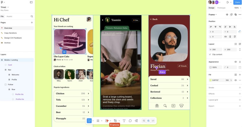
Figma is a fascinating case study. It’s arguably one of the densest design tools ever created, yet most people find it pleasant. Why? Because Figma handles density like a jazz musician handles complexity: it’s structured improvisation.
Panels collapse and expand predictably, focus shifts with intent, and the hierarchy is visually obvious. It doesn’t pretend to be simple—it embraces complexity while keeping it legible.
Compare that to modern “clean” SaaS dashboards that hide everything under icons or hamburger menus. You click, click, click just to reveal what used to be obvious. That’s not clarity; that’s concealment.
The aesthetic of effort
Another cultural force driving this debate is what we might call the aesthetic of effortlessness. Designers are told their work should look invisible—“it just works.” But true clarity often shows its structure.
Information-dense interfaces can look intimidating at first, but that’s because they’re honest. They expose the architecture of the tool, the way a cockpit exposes flight systems. A clean, minimalist UI might feel soothing, but it can also infantilize the user—pretending that everything is simple when it isn’t.
Designing for literacy, not laziness
Here’s the uncomfortable truth: clarity scales with literacy. A dense interface is unreadable to a novice, but liberating to an expert. We can’t design every product as if the user has never seen a computer before. There’s a difference between bad usability and expert tooling.
A future-facing design philosophy would recognize this: clarity and density are relative.
Instead of flattening everything to a one-size-fits-all simplicity, we should design adaptive systems that grow with user expertise—progressive disclosure done right.
Where this leaves us
We are living through a post-minimalist era, where purity of form has given way to pragmatic chaos. Clarity is no longer achieved through subtraction—it’s achieved through orchestration.
Interfaces must carry more responsibility now: they’re dashboards for data, creativity, communication, and AI co-pilots. The challenge isn’t to make them “simple.” The challenge is to make them legible.
So maybe the tension between density and clarity isn’t something to fix. Maybe it’s the design equivalent of tension in music—the dissonance that makes the piece alive.
Our job as designers isn’t to silence one side. It’s to make the tension sing.


Facebook’s Design Didn’t Evolve—It Regressed
There was a time when using Facebook felt completely effortless. You didn’t think about the interface because you didn’t need to, which is exactly what great UX is supposed to…
UX Hierarchy: How Users Actually Scan Pages in 2026
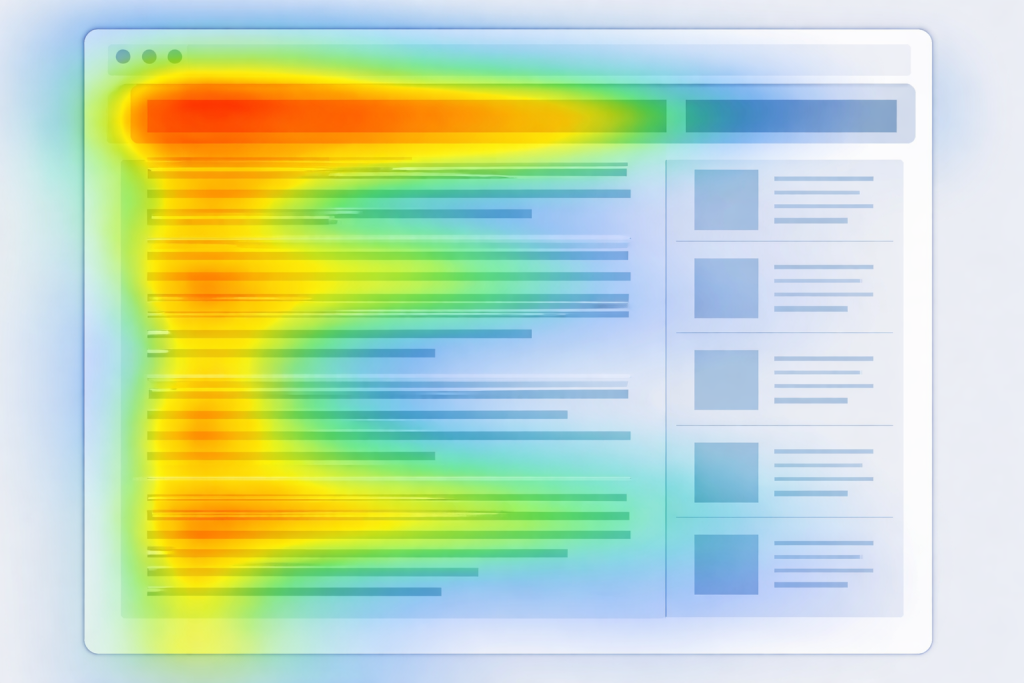
The year 2026 has ushered in a behavioral revolution in web design. For decades, designers relied on the reliable F-pattern and Z-pattern, which were essentially static maps of where eyes fell on…
Not Useless: Why Experimental Websites Matter More Than You Think
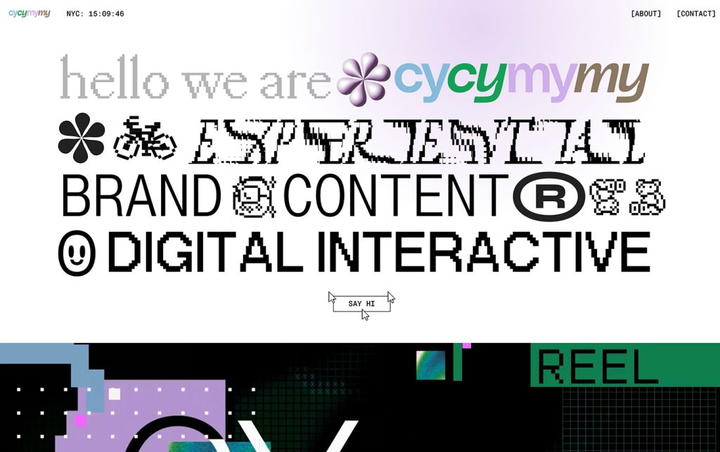
Every once in a while, a site comes along that makes you pause, grin, and think: Wait—websites can do that? Maybe it’s a portfolio where the cursor morphs into a liquid blob,…

The UX Case Study of a Refrigerator
The refrigerator may be the most widely used interface on earth, yet it continues to operate with the quiet confidence of a product that has never once run a usability…

Stop Designing for Delighted Users (and Start Designing for Cognitive Strain)
For the last decade, the mantra of the UX industry has been a variation of the same theme: “Delight the user.” We have been obsessed with reducing friction, eliminating clicks,…
How Aspect Ratios Define Perception, Rhythm, and Flow
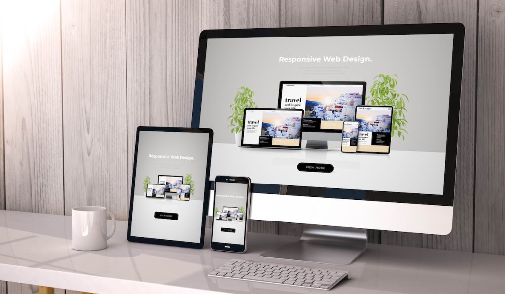
Designers talk about color, typography, and hierarchy constantly. But proportion—the silent structure beneath everything—rarely gets the same respect. Every card, photo, video, and module in an interface lives within a…