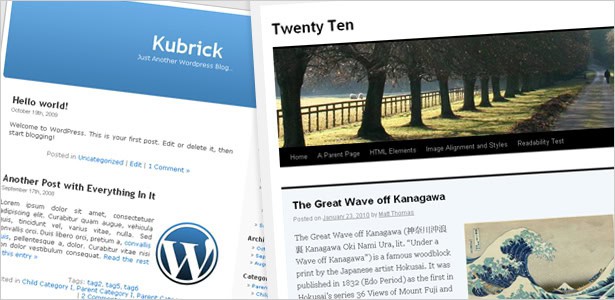
Kubrick, the default theme for WordPress since 2005, got many Web and open-source enthusiasts through some pretty tough times.
Developers have modified it, bloggers have learned HTML and CSS on it, and designers have made it their go-to template for designing blogs of all sizes for clients.
But let’s face it: five years on the Web is like a hundred years anywhere else, and Kubrick, even according to its creators, is due for an update.
Enter “Twenty Ten” the new default theme for WordPress 3.0, which is scheduled for an imminent release. Not only does it address general changes in Web standards and style guides, it takes into account the clamoring of designers who love WordPress but have had a hard time applying new principles to an older theme.
It’s got meatier CSS, more functionality, increased abstraction and a few other deviations from Kubrick that every theme developer should know about.
These changes should ensure that designers who are already WordPress fans will embrace it, and its flexibility increases the likelihood that WordPress itself will continue its march across the CMS arena.
A Quick Look
- Kubrick: 26 files and 1 folder (87.4 KB)
- Twenty Ten: 42 files and 3 folders (547 KB)
As you can see, Twenty Ten is a heavier theme than Kubrick. Much of the extra weight comes from a different (and markedly improved) way of abstracting the functions and page types that designers once had to change by hacking them or rewriting the code.
Charting the Changes
editor-style.css (new)
One basic yet exciting change is the above style sheet, which gives designers a way to define the styles of the WYSIWYG editor in the WordPress admin. By matching the styles of your templates and blog in this file, the WYSIWYG editor offers a truer representation of what gets published.
style.css (new)
Another surprising statistic, like the difference in the sizes of files and folders, is the increase in lines of CSS. They have almost doubled: from 719 lines to 1343. What’s all that extra code doing there? Well, the additions include a “Print Media” section that defines styles for website visitors who want to read posts while on the go; a mobile Safari section to accommodate iPhone and iPad users; and a section dedicated to custom navigation styling (a new feature in WordPress 3.0). The code is well organized, but you’ll still have to do a typical search for all instances of, say, a hover or accent color.
author.php
Another great new function in WordPress 3.0 is the ability to make author-specific templates. This paves the way for files like author-john.php and author-bob.php, so that everyone who publishes on a blog can have their own visual style.
category.php, tag.php
The archive.php file has lost the functions if (is_category()) and if (is_tag()) in exchange for the added flexibility of abstracting these templates to separate files. This makes customizing easier than ever, especially with the increased functionality of taxonomies.
loop.php
If you look in Twenty Ten’s index.php file, you’ll notice something is missing: no loop! That’s because many frequently used loops have been relocated to the loop.php file so that they can be called from multiple files without having to copy and paste code. This also reduces the weight of some new pages, such as category.php and tag.php. But be warned: if you’re looking to create a custom loop for, say, index.php, don’t mess with loop.php. Create a new file called loop-index.php, and put your custom loop in there. That’s what the get_template_part( 'loop', 'index' ) is for; it lets you make these changes non-destructively.
onecolumn-page.php
Have you ever wanted to leave the sidebar off of just one page? Twenty Ten’s admin option has you covered and it’s got a convenient template to boot!
sidebar-footer.php
A recent trend among Web design gurus is to create an expanded footer area with information that is more useful and compelling than the usual contact info and copyright. The sidebar-footer.php file accommodates an expanded footer by allowing you to style sections in such a way that widgets can be injected in the footer area.
attachment.php
This template file replaces the image.php file and does a much better job of accommodating all of the different types of files we’re now used to publishing in WordPress.
The changes above may look minor to the untrained eye, but they’re a reason to rejoice if you’ve ever created or modified a WordPress theme or been frustrated by its lack of control or extensibility.
By scrapping Kubrick and listening to the concerns of developers, WordPress has managed to incorporate in Twenty Ten the changes needed to bring the now-flourishing CMS into the new decade.
We’re pretty excited, as are most designers and developers who love WordPress, to see 3.0 up and running, and a major reason for that excitement is the flexibility and personalization offered by Twenty Ten.
Written exclusively for Webdesigner Depot by Blue Derkin, a project a social media lead for webhosting company InMotion Hosting. He also blogs at Web Hosting Help Guy.
What do you think of the upcoming changes in WordPress? What features are you looking forward to the most?
