Somewhere around 18% of the web is powered by WordPress. The humble blogging platform has grown into a web-titan of monster proportions.
Substantially fewer sites are hosting on WordPress.com — Automattic’s free, hosted solution for WordPress blogs — but it’s still a very dominant player.
Whilst the codebase behind WordPress.com is updated everyday, with bug fixes, performance enhancements and feature tweaks, the appearance of the dashboard has, until now, remained largely unchanged for some time.
The redesign of WordPress.com’s dashboard that was announced in April and previewed this week is a superb revision. There are a number of significant changes, and all of them are an improvement on the old version.
The biggest change is that the new WordPress.com dashboard is flat-design; not an extremist flat-design — there are a few drop shadows and pseudo-drop shadows here and there — the new dashboard is an evolved version of flat-design, a grown up version.
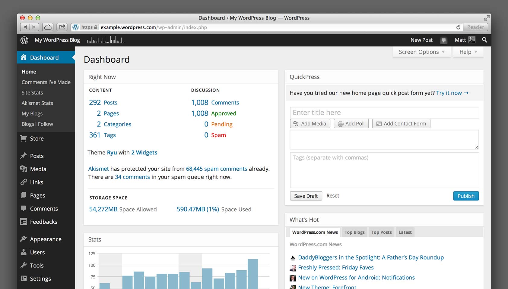
The change in color scheme from the dull all over grey of the previous version is the most notable change, and it works really well to create a greater sense of hierarchy. I particularly like the orange notifications that leap out at you.
The new design isn’t yet responsive, but that will be added in the coming months to allow blog owners easier access on the go. (If you’d like to trial the responsive dashboard you can enable it by ticking “Enable experimental responsive design” in your personal settings.)
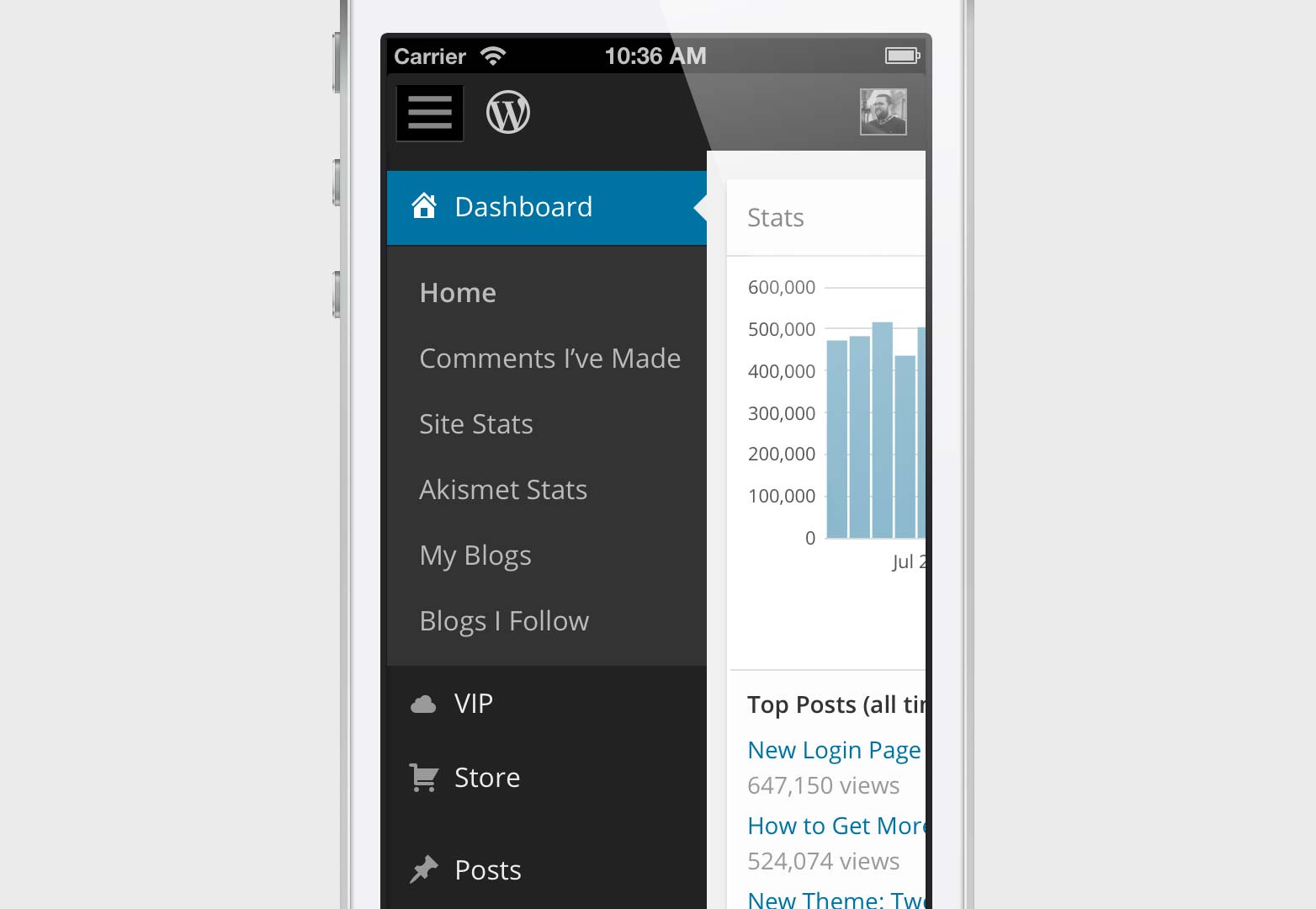
As well as completely redrawn icons, the new dashboard has a change of typeface: Open Sans, designed by Steve Matteson, is available free via Google Fonts if you like the way it looks.
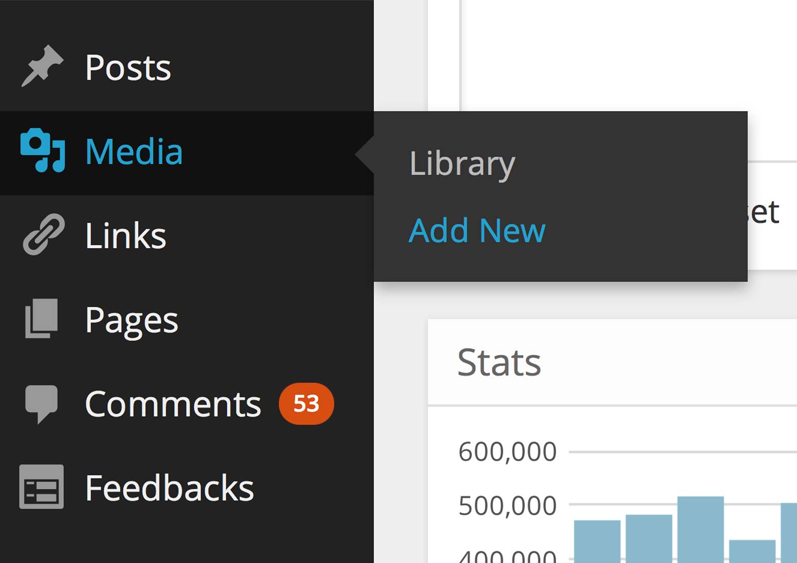
The new dashboard design is a fantastic revision, the increased contrast, improved hierarchy and cleaner type make the site more usable, all while retaining a familiarity for users of WordPress.com. I only hope a similar update is pushed to WordPress.org users as soon as possible.
What do you think of the new WordPress.com dashboard? Was the grey on black type a mistake? Let us know in the comments.


