1
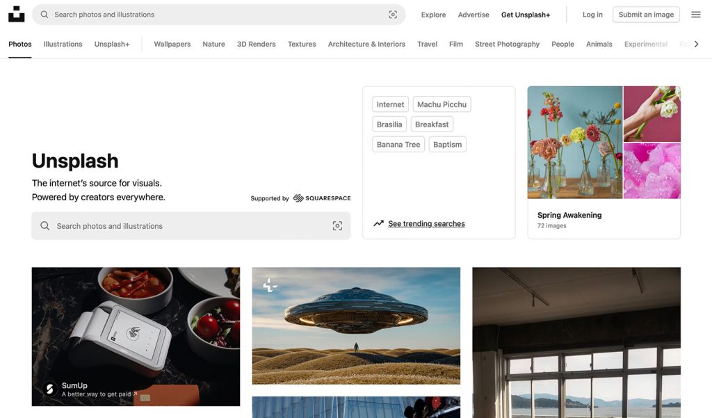
Have you ever visited Unsplash, that go-to treasure trove of beautiful, free stock images, and wondered why on Earth they’ve decided to clutter their homepage with two search bars?
If you’re like me, the moment you land on the page, you’re hit with the digital equivalent of a double shot of espresso: an overwhelming redundancy that adds absolutely no value to the user experience. In the world of web design, where simplicity reigns supreme, Unsplash’s homepage is guilty of a rare offense – excessive complexity in the form of two almost identical search bars.
Before we dive deep into why this is problematic, let’s be clear about one thing: Unsplash’s image library is incredible. The free, high-quality photos are a game-changer for designers, creatives, and marketers alike.
But just because you’re winning at one thing doesn’t mean you should get a free pass on all things design-related. And this double-bar fiasco? It’s a design misstep that needs a little bit of a deep dive.
One Search Bar is Better Than Two – Unless You’re Designing for Confusion
Here’s the thing: simplicity is a fundamental principle of great web design. No one likes a cluttered homepage, and no one likes hunting through a page to figure out where the information they need is located.
In fact, studies have shown that people make decisions about a website’s quality within mere seconds of landing on it, and one of the first things they’ll judge is how easy it is to navigate. So, what message does it send when the user’s very first interaction with the homepage is a confusing interface that’s trying to shove two search bars in their face?
Now, I know what you might be thinking: “But they’re different! One’s says “Supported by Squarespace” however, the results are exactly the same…. hmmm… why?! The difference is subtle enough to confuse anyone who’s not already familiar with the platform, and for those first-time visitors, it’s just plain frustrating.

The result? A cluttered, overcomplicated homepage that fails to deliver a clear path to the content the user came for in the first place.
The Real Problem: A Lack of Prioritization
The unsung hero of web design is prioritization. We don’t need ten buttons for five actions. We need clarity.
And by creating not one but two prominent search bars, Unsplash is essentially saying, “We’re not sure which search you want, so here are both!” This doesn’t make the site more user-friendly—it just adds ambiguity.
How Did This Happen?
How does something like this even make it past the design phase? Unsplash is known for being innovative with its image-sharing platform, so how did they miss the mark on something as simple as homepage design?
One could argue that in their desire to make everything accessible, they’ve ended up with a design that feels scattered and incoherent.
Perhaps they’ve been leaning a bit too heavily into the idea of “options for everyone.” Sure, we all love options, but there’s a point where options become unnecessary complexity. If we’re really talking about user experience, two search bars on the homepage isn’t an option—it’s a distraction.
Is It Really That Big of a Deal?
You might be thinking, “It’s just two search bars. Who cares?” But when you’re designing for an audience that’s likely made up of designers, developers, and other highly discerning creatives, details matter.
We get nit-picky about things like spacing, typography, and yes—navigation. It’s the little things that can either elevate a website to the next level or send it crashing back into the dark ages of amateur design.
And let’s face it, in an industry where simplicity is king, Unsplash is sending mixed signals. On one hand, they’re telling us, “We want to help you find what you need easily,” and on the other, they’re throwing a double-barred search at us. Do they really think we need two different search bars when one could easily do the job?
The Bottom Line: Streamline, Don’t Overwhelm
Unsplash has a beautiful, user-friendly platform… that is, until you hit their homepage. Two search bars not only add clutter, they complicate what should be a simple and straightforward task: searching for images.
Let’s put it this way: If you’re going to offer two search bars, at least make them feel different. Give one the power of specificity, and the other the power of flexibility. Or, better yet, streamline the experience and make one search bar do all the work—since, realistically, that’s all users need.
So, to Unsplash, here’s the challenge: Less is more. Clean up the homepage, ditch the redundancy, and embrace the simplicity that so many of us design nerds know and love. After all, in the world of design, there’s really no room for this much unnecessary complication. At the end of the day, less search bar clutter, more user joy.
The solution is simple.. the homepage should have a different design than the rest of the site with only ONE search bar…. easy! Fix it…

The Death of the Double Click: How UX Finally Buried a Relic of the Desktop Era
Let’s be honest: double-clicking is dead. And if it isn’t, it should be. What began as a clever way to differentiate between selection and activation in the ‘80s desktop environment has somehow…

Intent-Based UI Is Replacing Navigation—Are We Designing Ourselves Out of the Interface?
We spent decades perfecting the art of navigation: breadcrumbs, sidebars, hamburger menus, sticky headers, site maps. We crafted taxonomies and ran heatmaps. We obsessed over the user journey like it…
Dear Designers: Stop Using System Fonts Like It’s 2005
Remember system fonts? Good old Times New Roman, trusty Arial, and the unkillable Courier New. Fonts so baked into operating systems, they felt like infrastructure—like sidewalks and salt. For a…
The 10 Foundational UX Principles Every Designer Should Know
If you’ve ever rage-closed an app because it wouldn’t let you “go back” or stared at a form that made you feel like you were applying for citizenship in three…
Designing for Dribbble Killed Real Web Creativity
It started with a shot. Not a launch. Not a live site. Not even a prototype. Just a shot — a single, glossy rectangle of design, cropped, polished, and posed for applause….

What Is Web Design in 2025?
Let’s start with a gentle truth: web design in 2025 no longer means what it used to. And that’s okay. Once, it meant Photoshop mockups and pixel-perfect slices handed to a…