It’s just four years until the Tokyo Summer Olympics and Paralympics, and while the eyes of the sporting world may currently be set on Brazil, attention will turn to Tokyo once the torch is (literally) passed in 5 months.
For any city, even bidding to host the biggest sporting event in the world is a huge expense. To justify the investment, a city needs the event to showcase it to the world, and at the center of that process is the games’ branding.
After the original logos for Tokyo 2020, designed by Kenjiro Sano, were — probably unfairly — dropped amid claims of plagiarism, the Tokyo 2020 Emblems Selection Committee decided to hold a public competition that any Japanese resident could enter. (To protect the event from further potential accusations of copying, entrants have signed guarantees that their designs are original, and have had to submit working documents to show their creative processes.)
In the grand tradition of crowd-sourcing, most of the 14,500 designers who entered the competition will get nothing; the winning designer will only receive $9,200 (approx) and tickets to the opening ceremonies of the Olympic and Paralympic Games. It’s especially galling when designs commissioned for events such as these are often billed well into six-figures.
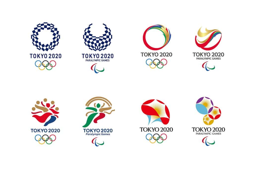
The competition has however, produced some interesting designs:
Design “A” is a checkerboard pattern that references the Ichimatsu Moyo pattern popular in Japan in the Edo period between the 17th and 19th centuries. The denim-blue it uses is also considered to be traditionally Japanese. Graphically it’s very strong, but the type has a distinctly European flavor.
Design “B” is a circle, and a swirl, designed to represent both “mental and physical strength” and “dynamic movement and speed”. They look very much like a traditional Olympics logo, and this safe option may swing it for the committee who have already weathered enormous criticism over their handling of the original logos.
Design “C” represents the gods of wind and thunder. More figurative than the other entries, this design shows athletes breaking the tape at the end of a race, or perhaps someone running away with 5 gold medals. There is something Olympic about it in spirit, but it’s very close to the Rio 2016 branding. In this instance the type feels far more Japanese.
Design “D” is the most distinctly Asian. Inspired by the morning glory flower which was popular in the Edo period (again) it represents athletes striving to attain their personal best. It suggests growth, development, and optimism. In this case also, the type has a distinctly Japanese feel.
The overall winner will be announced later in the Spring, once the committee have sounded out public reaction to the designs.
