There was a time—it’s hard to imagine now—when most businesses did not have a website. In the early days of the Web, almost every business that wanted to commission a website was taking its first steps into the online world.
As time moves on it’s inevitable that virgin ground is harder to find.
It’s rare that a startup is able to fully invest in design—even if they would like to—and the less they invest in design, the sooner they’ll need to redesign. There certainly are new companies, new projects, new promotions that need designing; but the vast majority of design work is redesigns.
Redesigns can be fraught with difficulty; the client may be carrying misconceptions left by the previous designer, the current site may be tied into the company infrastructure, most difficult of all it’s common that your point of contact at the company will be responsible for the earlier design.
As well as the problems, redesigns carry with them one intractable benefit: they provide an objective point of embarkation.
When is a redesign not a redesign?
Answer: when it’s a design.
Most redesigns, despite the name, are in fact simply designs. By this, I mean a designer has assessed the problem posed by a client and provided a solution.
Where redesigns differ, is that a designer assesses the problem posed by a client, and also assesses the existing solution, before providing his or her own solution.
Webdesign is a unique discipline in that we possess an unrivalled ability to monitor and quantify almost every aspect of our design decisions. Or, in the case of a redesign, someone else’s decisions. The benefit of a redesign (as opposed to a design) is that there is a focussed direction to take. Much of the legwork has been done. Even if the client’s current site is a total failure, you can get ahead of the game by finding out exactly why.
The aim of any redesign is broadly the same regardless of the project in question: a redesign seeks to reassess a problem and make improvements on prior solutions. A redesign is more extensive than a design, it takes account of more and it digs deeper. The essence of the redesign philosophy is that there is a problem underlying the project that is in a state of flux so that it surpasses any single solution.
A design tends to be less successful than a redesign, because a design takes one of two approaches: it either finds a solution to the original problem—in which case previous lessons learnt are ignored— or more commonly, it finds a solution to the existing solution—bypassing the problem altogether.
Ted’s redesign
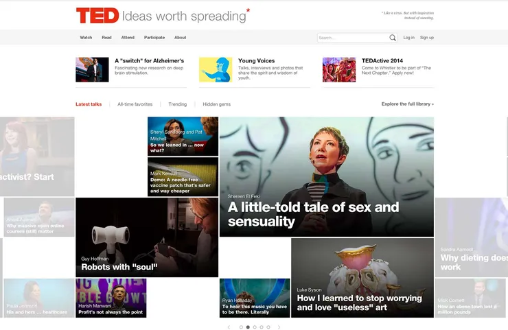
Last month, ted.com, the Web’s supremo site for innovative presentations released a redesign.
Ted talks are one of the premier sources of cutting edge ideas and in the last seven years Ted has grown from half a dozen videos to more than 1600. For many people, delivering a Ted talk is the pinacle of public speaking and Ted’s brand reflects the forward-looking nature of the organization.
However in the last few years, the hub for cutting-edge ideas has started to look distinctly dated. Confined to a restrictive grid too small for desktops and too rigid for mobile. A redesign was essential for Ted’s continued progression.
ted.com’s old homepage (left) and the redesign (right).
The redesign that is currently in public beta is a superlative example of intelligent and sophisticated design, produced by a team that clearly has an in-depth understanding of both of the history of Ted’s site and a vision of where it might proceed.
ted.com’s old talks page (left) and the redesign (right).
The first thing you’ll notice is that the restrictive 960px grid is gone. In its place is an expanding slider that fills the available screen real estate, whilst maintaining the egalitarian approach to content hierarchy. The site is now fully responsive and vitally its content is accessible on mobile devices, maintaining pace with technology and in-keeping with Ted’s brand image as a progressive force.
ted.com’s old ‘mobile’ version (left) and the mobile friendly redesign (right).
The ted.com redesign is an exceptional example of how a site can reassess not only its current problems, but the problems that lead to its current solutions.
Twitter’s ‘redesign’
It seems inevitable that every major website will eventually redesign—or more accurately, reskin—itself inline with the flat-design trend that has steam-rollered the Web over the last year or so.
Falling into line last week is twitter.com, whose designers have now rolled out the latest version of the insanely popular social network, worldwide.
A quick glance will tell you that little has changed: the basic layout is still in place; there’s a main panel containing a timeline of messages, and a column on the side featuring various information panels. Infinite scrolling is still in use, as is the sticky header. The only appreciable change is on the header, which has lost most of its gradients and adopted a flat-friendly color palette—purportedly to bring it inline with Twitter’s mobile offerings.
The design is a let down at best, at worst a half-hearted gesture made for its own sake. It fails spectacularly because rather than reassess the original problem, the team have mistaken the previous solution as a problem in its own right.
The new twitter.com.
Instead of asking, “How can we solve this problem?” the team at Twitter asked, “How can we modify this solution?” They have, in effect, provided an answer to an answer, a superficial process of restyling elements best reserved for Dribbble rebounds.
Despite the fact that the majority of users access their Twitter timeline via dedicated applications such as Tweetdeck and Tweetbot (in 2013 75% of users chose to access Twitter via a smart phone) the team have retained the focus on the user’s timeline, a feature no longer central to the site’s main usage (account management).
99% of good design is redesign
Design is about solving problems, but it’s rare that your first solution is your best. Quality is achieved through iterations: designs are redesigned and redesigned; concepts receive incremental improvements; solutions evolve.
Ted.com redesigned by focussing on their core problem—the need to display videos on the devices their audience favors—and then assessing where their existing solution fell short. Twitter.com redesigned by focussing on their existing site, and applying a new skin.
The single largest error you can make when redesigning is to mistake the current solution for a problem to be solved.
The secret of a really great redesign, is examining not just the existing solution, but the problem that it was devised to solve. That’s the only way to objectively gauge the changes that are needed and provide a measured and considered solution of your own.
Have you worked on a redesign lately? Do you prefer to start from a blank canvas? Let us know your thoughts in the comments.


