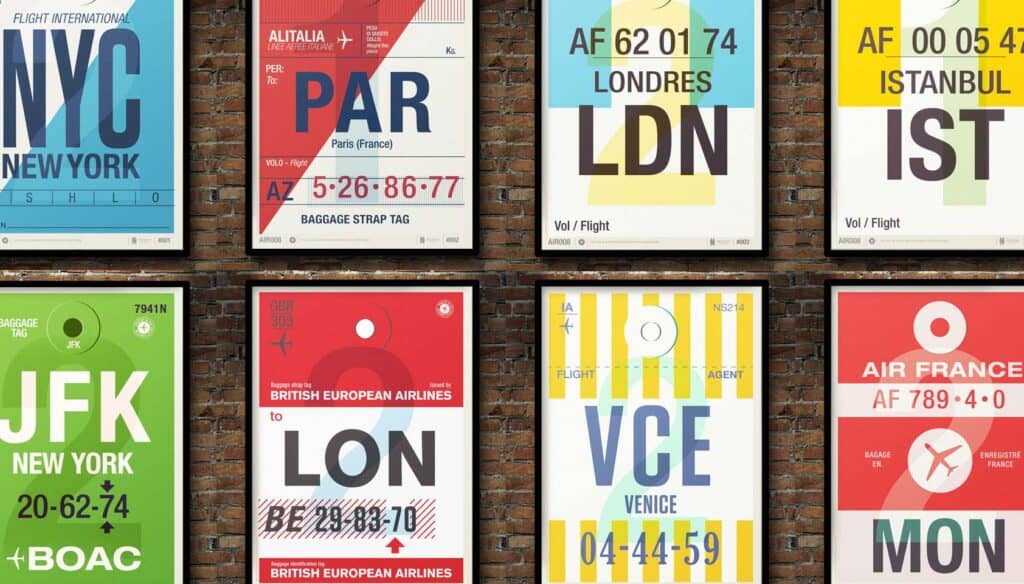
While airline travel in recent years has become a mundane exercise in getting from point A to B, it was merely a few decades ago that flying the friendly skies was full of glamour and prestige. It’s little wonder, then, that today’s functional baggage tags look nothing like they did in the 1950s — in fact, luggage labels of the past could be considered near works of art.
Enter illustrator, designer and all-around image-maker Neil Stevens, who spotted a series of vintage bag tags and smartly decided to turn them into full-blown prints. These simple, uncluttered typographic beauties hold a certain statement-making nostalgia.
There was something about the now iconic, easily recognizable three letter abbreviations of the city destinations, and the small surrounding details that I thought would look great blown up… They often avoided logos, had no advertising, and were purely just the information you needed. — Neil Stevens
A far cry from the black-and-white mass-generated labels of today, these colorful, designer destination tags are a reminder that sometimes simple beauty is sacrificed in favor of technological efficiency. It’s up to us to determine which is more important.
What other day-to-day design was better in the past? Do we value design less than we used to? Let us know your thoughts in the comments.
