Mac-based typophiles rejoice! Bohemian Coding have smiled on you in the form of a new Sketch update. Where before there were inconsistent baselines and sadness, there shall now be great-looking text, and joy.
Now you can really get some mileage out of your Helvet… Oh, we’re not doing that anymore? Okay.
The point is that Sketch has gotten a pretty extensive set of improvements to the way it handles text in general. Since Sketch is about designing for the Web, and the Web is mostly text, this is a pretty vital thing to get right.
It’s all about the baseline
According to the guys at Sketch, the biggest improvement they made had to do with making text baselines behave the way users expect. To accomplish this, they had to delve into the way fonts are constructed and displayed in the first place.
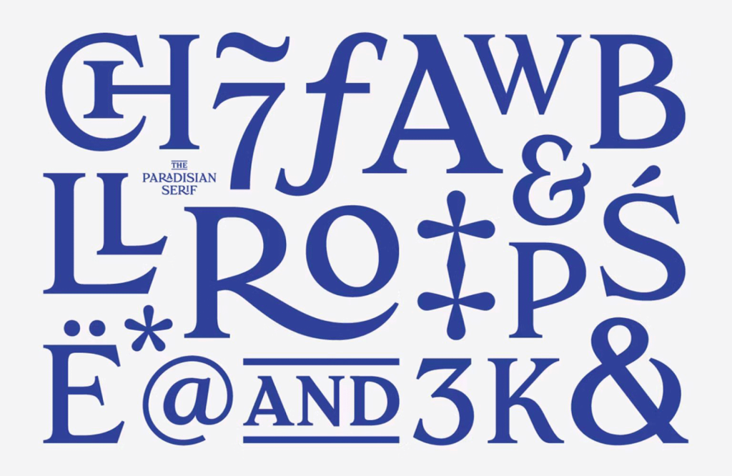
In the fonts themselves, they had to deal with ligatures, and swashes. Then there are diacritical marks: the carons, cedillas, accent marks, and more. Basically, measuring the space between lines isn’t as simple as looking at the capital letters and saying, “Yeah, but that’s all we need, right?”
Then there’s the fact that different fonts handle all of those different things… well… differently. And sometimes, you want to use more than one font in a paragraph; at least, you want to be able to, even if you don’t actually want to do it.
Turns out that Apple’s text system doesn’t do uniform baselines on its own. Even if you set a specific line-height, the actual line-height gets calculated differently based on every font. When mixing and matching fonts, that can go wrong.
The people at Sketch have taken each and every one of these factors into consideration in their new update to make typographical baselines work right.
Lastly:
when changing fonts for text layers, we’ve gone to some lengths to preserve the position of the first baseline, so your text layers will no longer jump around vertically when changing between fonts.
Though the type system of Sketch has been improved, the devs have asked us to remember that they can’t replicate the way type looks on every browser or operating system. They’re all different, so that’s just never going to happen. Their focus has mainly been on making making their software more pleasant and useful.
This is reportedly only the first of several type improvements this year, let’s hope they’re all as useful.


