1
It’s 2025. Your site loads, your API chokes for a split second, and boom: shimmering gray boxes cascade across the screen like a UX prayer. We call it skeleton loading.
Users call it “more of the same.” And somewhere deep down, you know what it really is.
Skeleton screens (loading screens) have become the digital equivalent of elevator music—meant to pacify, not engage.
And we’ve been overusing them to cover up a much bigger problem: slow, bloated, poorly-architected apps masquerading as modern experiences.
Let’s get honest about what skeleton loading actually does in 2025—and more importantly, what it doesn’t.
The Original Idea Was Good—Really Good
Skeleton screens didn’t start out as a gimmick. They were a direct response to a long-standing UI problem: the uncanny silence of an empty screen.
Before skeletons, the fallback was a spinner—just a lonely rotating circle with zero context. It told the user, “Wait,” but not what they were waiting for. Skeletons changed that. They hinted at the layout. They gave structure. They said, “Don’t worry, the content is coming right here.”
Users were less likely to bounce because the experience felt faster, even if it wasn’t. That’s a win. In fact, early A/B tests (especially on mobile) showed better engagement and lower perceived wait times when skeleton loading was used well.
But like all good things in UX, it got overused. Then abused. Then templated.
The 2025 Reality: They’re Not Fooling Anyone Anymore
The magic is gone.
Users aren’t wowed by skeletons anymore—they’re trained. They know the gray boxes aren’t real content. They’ve seen them on Instagram, YouTube, every e-commerce platform, every dashboard, every blog. It’s not a clever illusion anymore—it’s UI wallpaper.
Worse, it now reads as: “We knew this was slow, but we’d rather make it look busy than make it fast.”
Skeleton loading has gone from psychology to choreography. Every app mimics the same shimmering skeleton dance, but nobody stops to ask: why are we still loading so slowly in the first place?
Skeleton Screens as a Crutch for Bad Performance
Let’s dig into the real issue: most skeleton screens today are not a UX enhancement—they’re a mask for performance debt.
When your product relies on five microservices stitched together through a slow GraphQL pipeline, and your Next.js app is hydration-heavy and barely cached—guess what? It’s going to be slow. And instead of fixing the data layer, optimizing SSR, edge caching, or just reducing the JavaScript payload, teams reach for the quick visual fix: a skeleton screen.
It looks like progress. But it’s fake progress. And users are picking up on the disconnect.
Even worse: some teams now delay real content just to make the skeleton “feel smooth.” Think about that. We’ve reached a point where performance theater is more important than actual performance.
Where Skeletons Still Work (Barely)
Okay, so are skeletons always bad? No.
Used intelligently, skeleton screens can still be valuable—especially when:
- The user already knows what kind of content to expect (e.g. a Facebook post, a product card).
- The layout is consistent across views (e.g. in a news feed or e-commerce grid).
- You’re streaming partial data and need to maintain spatial structure while key elements render.
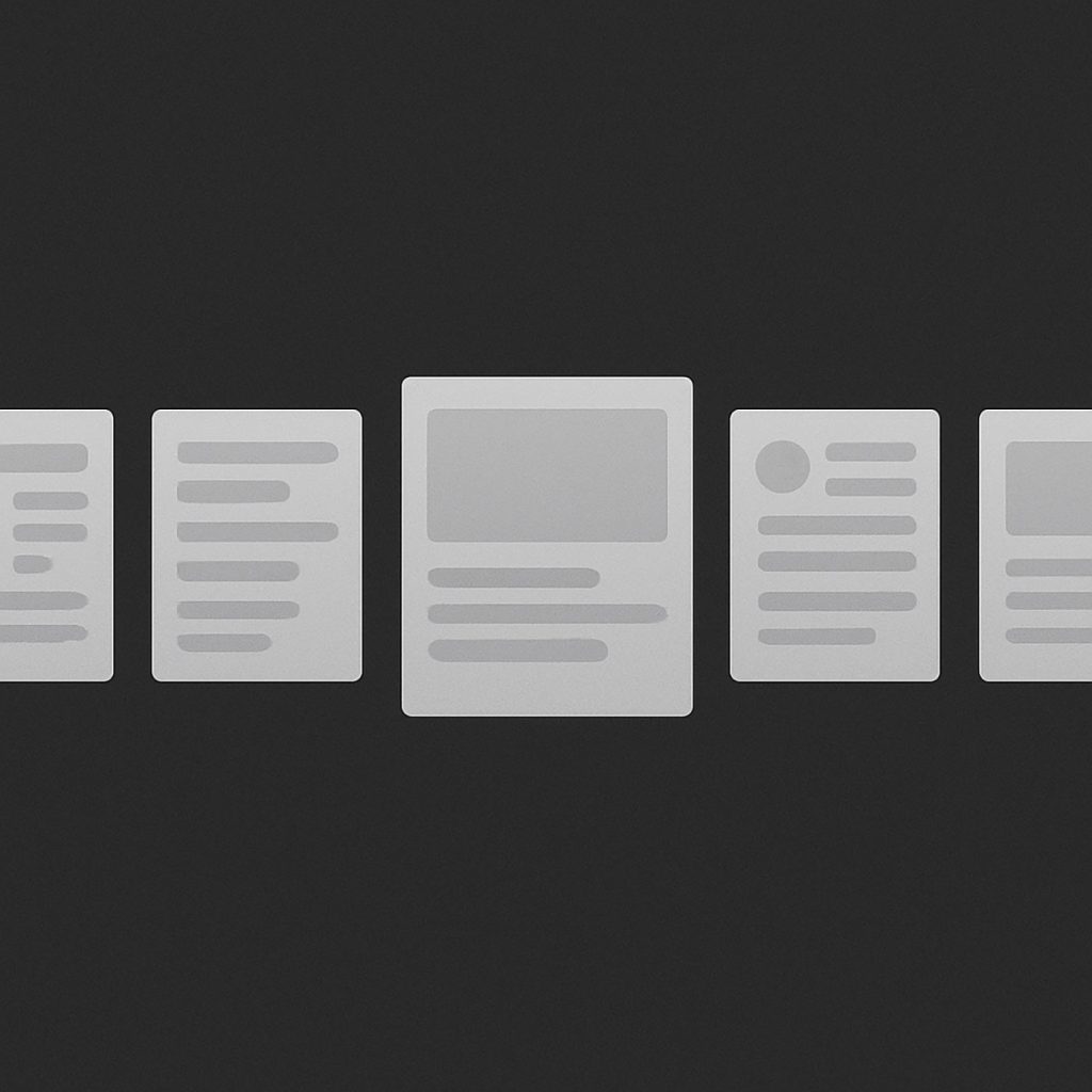
But this has to be done with surgical precision. A good skeleton screen in 2025 needs to match the real UI exactly. Font size, padding, layout density—if your skeleton boxes don’t look like the real thing, it breaks the illusion.
And there’s no excuse for showing a massive rectangle that says “image loading” if the actual image is a tiny thumbnail. Or showing five lines of shimmering “text” when the content turns out to be a single emoji. That kind of mismatch destroys user trust.
Why Frontend Devs Are Frustrated
Ask any seasoned frontend dev in 2025 how they feel about skeletons, and you’ll get a sigh. Because skeletons aren’t just UI components—they’re often compensation for upstream delays.
Here’s how it usually goes:
- Product team wants fast-feeling pages.
- Backend isn’t fast enough.
- Skeletons become the workaround.
- Skeleton components are added everywhere via a design system default.
- No one fixes the actual bottleneck.
It’s the same old story: visual patching over architectural rot.
And the worst part? Skeleton screens rarely get reviewed or tested like real UI. They don’t go through QA. They don’t get performance budgets. They just sit there, shimmering. Silent witnesses to the fact that we stopped caring.
Better Alternatives (That Actually Work)
We have more tools than ever in 2025. Relying on skeletons by default is lazy. Here are more thoughtful approaches that advanced teams are embracing:
Streaming Content
Using frameworks like Remix, Next.js App Router with React Server Components, or edge-rendered HTML, we can start sending partial content immediately instead of waiting for the full response. This eliminates the need for fake placeholders—users get real content faster.
Skeleton-Free Transitional States
Instead of gray boxes, use real layout transitions with opacity fade-ins, subtle scale animations, or motion-based cues that feel native and fluid. No fake data—just elegant state changes.
Optimistic UI
For interactions like button clicks or form submissions, don’t wait for the server. Assume success, show the new state instantly, and roll back if needed. Used properly, this can completely eliminate the need for any loading UI.
Real-Time Prefetching
Modern edge caches, CDNs, and even client-side anticipatory fetching can let you load content before the user even asks for it. If the delay never happens, there’s nothing to mask.
So… Should You Ever Use Skeletons?
Yes. But ask yourself this first:
- Are you solving a user problem—or just covering your own?
- Is your skeleton layout an exact, faithful replica of the final UI?
- Could the content have loaded faster if you spent less time styling the skeleton?
- Is the transition seamless, or does the skeleton blink away like a bug?
- Could you use real progressive loading instead?
If the answer to most of those is “no,” then maybe it’s time to break up with your skeleton.
Use them with intention. Not out of habit.
The Bottom Line
In 2025, a skeleton screen should never be your default loading state. It’s a tool, not a solution. It’s a UX technique, not a performance strategy. And when you rely on it without fixing what’s underneath, you’re just painting a faster horse.
Good UX isn’t about tricking users into thinking something is loading—it’s about delivering actual content, as quickly and smoothly as possible. If you’re faking speed, you’re not solving the problem.
So next time someone says, “Just throw in a skeleton,” pause. Ask why it’s slow. Ask if users even need to wait. Because gray boxes aren’t harmless anymore.
They’re a signal.
And they might be telling your users: this product isn’t as modern as it looks.

The Death of the Double Click: How UX Finally Buried a Relic of the Desktop Era
Let’s be honest: double-clicking is dead. And if it isn’t, it should be. What began as a clever way to differentiate between selection and activation in the ‘80s desktop environment has somehow…

Intent-Based UI Is Replacing Navigation—Are We Designing Ourselves Out of the Interface?
We spent decades perfecting the art of navigation: breadcrumbs, sidebars, hamburger menus, sticky headers, site maps. We crafted taxonomies and ran heatmaps. We obsessed over the user journey like it…
Dear Designers: Stop Using System Fonts Like It’s 2005
Remember system fonts? Good old Times New Roman, trusty Arial, and the unkillable Courier New. Fonts so baked into operating systems, they felt like infrastructure—like sidewalks and salt. For a…
The 10 Foundational UX Principles Every Designer Should Know
If you’ve ever rage-closed an app because it wouldn’t let you “go back” or stared at a form that made you feel like you were applying for citizenship in three…

Designing for Dribbble Killed Real Web Creativity
It started with a shot. Not a launch. Not a live site. Not even a prototype. Just a shot — a single, glossy rectangle of design, cropped, polished, and posed for applause….

What Is Web Design in 2025?
Let’s start with a gentle truth: web design in 2025 no longer means what it used to. And that’s okay. Once, it meant Photoshop mockups and pixel-perfect slices handed to a…