1
Let’s get one thing straight: Simplicity in web design? It’s a lie. We’ve all been told that making things simple is the holy grail of design.
But here’s the truth that nobody talks about: simplicity doesn’t just happen. It’s engineered — often through chaos, complexity, and more hours of work than you care to admit.
You’ve heard the catchphrase “Keep it simple, stupid” (KISS), right? It sounds nice, but in reality, simplicity is the product of hard decisions, hard compromises, and sometimes, massive technical headaches.
Clients demand it, users expect it, but how many of us have actually achieved it without a ton of behind-the-scenes work?
Let’s face it: what looks “simple” on the front-end is often a nightmare on the back-end. And the people who think simplicity comes easy are usually the ones who’ve never tried building anything that works for everyone.
Simplicity = Mediocre Design
This is the uncomfortable truth: Simplified design often means cutting corners. Clients want sleek, minimal designs — but that doesn’t always equal better experiences for users. You end up stripping out essential features because you’re told it’s “too complicated,” or “not necessary.”
Take mobile apps, for example. A lot of them have minimalist interfaces, but that doesn’t mean they’re easier to use. In fact, when you remove too many options or simplify things too much, you end up frustrating users who need more functionality. The trade-off for simplicity often means losing context, removing customization, or leaving out vital details that users depend on.
Why Users Don’t Want Simple, They Want POWER
Here’s a secret: users don’t want “easy.” They want control. They want power. Look at the tools we love to use — they’re not simple, they’re complex and full of layers.
Google, for instance, is deceptively simple on the surface, but dig deeper, and you’ll find sophisticated algorithms and tools that give users total control. Users want to feel in charge, and sometimes that means they need options, depth, and flexibility.
The trick is not to simplify everything but to design smart complexity. Think about it: a powerful tool that hides its complexity until it’s needed. That’s the future of design — not dumbed-down simplicity that treats users like they don’t know what they want, but a system that knows when to give them what they need.
“Easy-to-Use” is a Marketing Lie
Let’s be real for a second: when a client demands an “easy-to-use” site, what they really want is a site that works perfectly — and fast. But here’s where the myth gets exposed: simplicity in design often sacrifices the true needs of the user in favor of an illusion of ease. Wanting to cut out complexity for the sake of quick development? Fine. But let’s not pretend it’s still great design.
Ask yourself this: if you stripped down your design to the bare minimum, would it still provide the experience your users actually want? Or would it just make things harder for them? Too often, clients fail to see the trade-offs involved — like the difference between a sleek interface and one that’s actually usable under all conditions.
The Ugly Side of Simplification: The User Gets Left Behind
Here’s the kicker: Simplicity in web design can be alienating. We’ve all been there. The app that promised to be “intuitive” but felt like it was made for someone else. The site that left you scratching your head because it didn’t provide the features you needed or wanted. Simplifying things too much leaves out power users and alienates those who expect a richer experience.
Let’s not sugarcoat it: the real challenge in design isn’t creating something simple. It’s making something that works for everyone, including people who want to do complex things.
Too often, we simplify design to the point that we forget we’re designing for humans, not robots. Humans are messy, unpredictable, and diverse — and that’s what makes design so interesting. You can’t oversimplify it and still expect to meet everyone’s needs.
Embrace Complexity. Reject the “Simplicity” Scam.
It’s time we stop chasing this unrealistic goal of “simple” design. The truth is, great design is complex by nature. Creating something truly intuitive often requires layers of detail and functionality that aren’t immediately obvious. When you remove those layers in the name of simplicity, you end up with something that’s shallow and ultimately less effective.
So, here’s the challenge: stop making simplicity your goal. Instead, aim for intelligent complexity — designs that are rich, layered, and provide users with the control they crave. Don’t give in to the myth of “easy.” Great design is about knowing when to hide complexity and when to show it off.
Let’s face it: the next time a client asks for simple, be honest with them: simplicity is the product of a lot of hard, complicated work. And that’s the real design secret that everyone’s afraid to talk about.
Conclusion: Complexity is Your Friend — Stop Pretending It’s the Enemy
In a world that’s obsessed with minimalist design and “easy-to-use” interfaces, it’s time we start telling the truth: simplicity is a myth. Stop treating design like it’s about removing everything until it’s just “clean” and “pretty.” Start embracing the complexities that make your designs powerful, functional, and ultimately, more human.
Because when you strip away the fluff and the buzzwords, what’s left is what really matters — and that’s what makes a design truly work.

The Death of the Double Click: How UX Finally Buried a Relic of the Desktop Era
Let’s be honest: double-clicking is dead. And if it isn’t, it should be. What began as a clever way to differentiate between selection and activation in the ‘80s desktop environment has somehow…

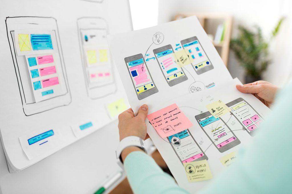
Intent-Based UI Is Replacing Navigation—Are We Designing Ourselves Out of the Interface?
We spent decades perfecting the art of navigation: breadcrumbs, sidebars, hamburger menus, sticky headers, site maps. We crafted taxonomies and ran heatmaps. We obsessed over the user journey like it…
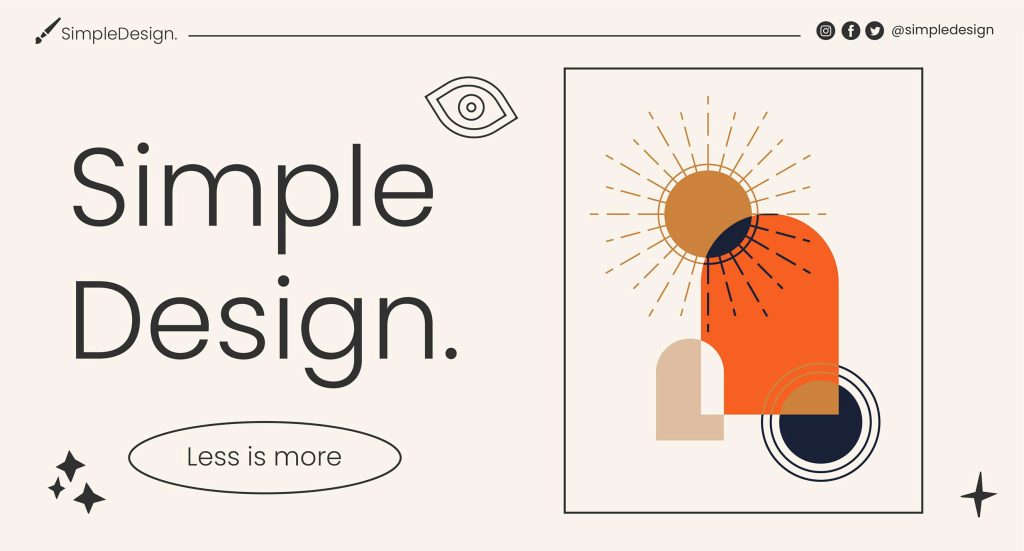
Dear Designers: Stop Using System Fonts Like It’s 2005
Remember system fonts? Good old Times New Roman, trusty Arial, and the unkillable Courier New. Fonts so baked into operating systems, they felt like infrastructure—like sidewalks and salt. For a…
The 10 Foundational UX Principles Every Designer Should Know
If you’ve ever rage-closed an app because it wouldn’t let you “go back” or stared at a form that made you feel like you were applying for citizenship in three…
Designing for Dribbble Killed Real Web Creativity
It started with a shot. Not a launch. Not a live site. Not even a prototype. Just a shot — a single, glossy rectangle of design, cropped, polished, and posed for applause….

What Is Web Design in 2025?
Let’s start with a gentle truth: web design in 2025 no longer means what it used to. And that’s okay. Once, it meant Photoshop mockups and pixel-perfect slices handed to a…