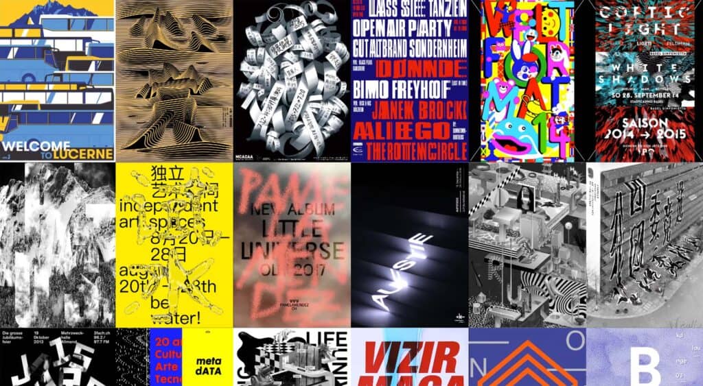
Across all disciplines of design, from fashion to architecture, trends largely define the styles and directions of an industry at a particular time.
Trends are often determined to be a reaction to a previous style. Whether that’s swaying from maximalism to minimalism, or colorful to monochrome, trends by their very nature focus on short termism rather than the larger picture. They also tend to be cyclical, meaning across design industries, a trend is likely to come back around at some point, in some form.
[pullquote]The question therefore presents itself as to why trends exist[/pullquote]
In design industries, there is limited scope for constant progression: Architecture is limited by regulation and the development of new materials; Web design is limited by web technologies and the medium by which it is consumed. Over time these develop, presenting opportunities for new design directions and approaches. However, in the medium term, industries such as web design have remained very much the same for the end user. While we can now view websites on our phones and use modern technologies to produce more complex designs, much of the styles we use now could have been achieved decades ago.
The likes of minimalist and brutalist trends do little to push design forward, and tend to do the opposite, pushing design around in a circle. Even more complex visual animations were achieved over a decade ago—albeit using Flash.
The question therefore presents itself as to why trends exist. It’s not to push an industry forward, nor is it to improve the final output for users, whether it be in fashion or web design. Why trends exist is to maintain visual interest, not just for consumers and clients, but for the designers themselves too.
If we take web design as a case study for trends, we can see that we have essentially stripped websites back of their detailing. While currently this is visually appealing, since it’s on-trend, it actually does little to improve the experience for the end user. This is the website design for Abduzeedo in 2010, via the Wayback Machine.
And here is Abduzeedo in 2018. It follows a number of popular trends; from ridding of any design detailing such as gradients, to replacing key elements like search with less-intuitive solutions.
Is it more usable, or simply more on-trend? It’s harder to scan the latest article posts, more difficult to understand the content hierarchy, and lacking the wonderful, contrasting design visuals and details included in the earlier version.
Abduzeedo is not alone in its reductionist techniques, and similar transitions have occurred across the majority of websites over this period. But what if it had simply remained the same? I can’t speak for other Abduzeedo loyalists, but for me a great design is near-timeless, even in such a fast-paced industry.
Some sites have indeed remained the same over long periods. They have found a structure and design language which resonates with users’ needs. Rather than chopping and changing as the trends grow and subside, they stay firm, trusting in their design decisions and reasoning behind them. An excellent example is The Drudge Report.
It’s not following a minimalist or brutalist design trend. It has looked like this for the best part of two decades. Users of the site love the simplicity and consistency of the design. In an industry defined by cluttered news websites with breaking news alerts, The Drudge Report has taken a step back from the race for user’s attention and stayed true to its original purpose.
[pullquote]Much of it can be traced to boredom[/pullquote]
Of course there are exceptions over this time, namely with the way trends contribute to design systems like Material Design, which continues to develop a current and user-friendly design language for all to use and benefit from. It’s implemented throughout Google’s products, improving user experience through well-defined user interface assets and consistency. But on the whole, design trends are largely about tweaking styles continuously to provide something new to users, consumers, clients, and designers that is fresh and unique. Much of it can be traced to boredom, not just from consumers, but designers too. Who wants to enter a creative industry and turn out the same style app designs, or websites, time and time again? Cityscapes, computers, the web, mobile apps, clothing, they’d all be samish, and lacking in a great deal of emotion or feeling. Not to mention, a market economy is built upon companies continuing to present new products and new designs, regardless of how good an existing one is.
Designers have to consider whether trends are a primary consideration, or whether the user experience should define the styles and direction. This largely comes down to the sub-industry and whether a design is primarily visual or user-orientated. Aspects such as logo or poster design have much greater scope to follow these trends.
Digital product design should always place the user experience over conforming to trends. In many ways trends should be entirely redundant in these cases and have little-to-no influence on design decisions.
