Take a close look at Monetate’s Ecommerce Quarterly Report for Q2 2018 and you might not be happy about the state of mobile websites it depicts.
The good news is that smartphones drive significantly more traffic to websites than all other devices with 52.73%:
But conversions? Ehhhh…
Smartphone conversions lag behind all other devices with 2.03%.
It’s not just conversion rates that are low either. There are also fewer pages looked at, which means engagement rates suffer on the mobile web, too.
It’s no wonder, then, why businesses want to create mobile apps. According to a Criteo Mobile Commerce Growth report from 2017, mobile apps convert at a rate of 3x their web counterparts.
That said, no matter how well users convert on mobile apps, the cost to build and maintain one is out of reach for many businesses. So, what do you do when your client wants to capitalize on this mobile-first world? Tell them to be content with the mobile web for now?
Nope! It’s time to turn their attention to progressive web apps.
What Is a Progressive Web App?
In the simplest of terms, progressive web apps (or PWAs) bridge the gap between the mobile web and mobile apps. They take a basic set of components — an app shell, service workers, and app manifest — then serve them through HTTPS to give users the convenience of the mobile web within an app-like experience.
Google has a bunch of starter guides that will walk you through the process of building a PWA from-scratch, in case you’re interested in learning more.
PWAs are:
Secure
They must run through HTTPS, which makes them inherently more secure than mobile websites that don’t always have SSL certificates in place.
Fast
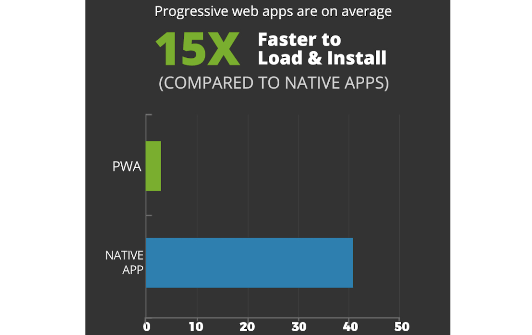
According to this infographic published by AppInstitute, progressive web apps are 15x faster than native mobile apps.
Unlike mobile apps that tend to drain battery power and bandwidth, PWAs don’t have that problem since they’re served over the web.
Searchable
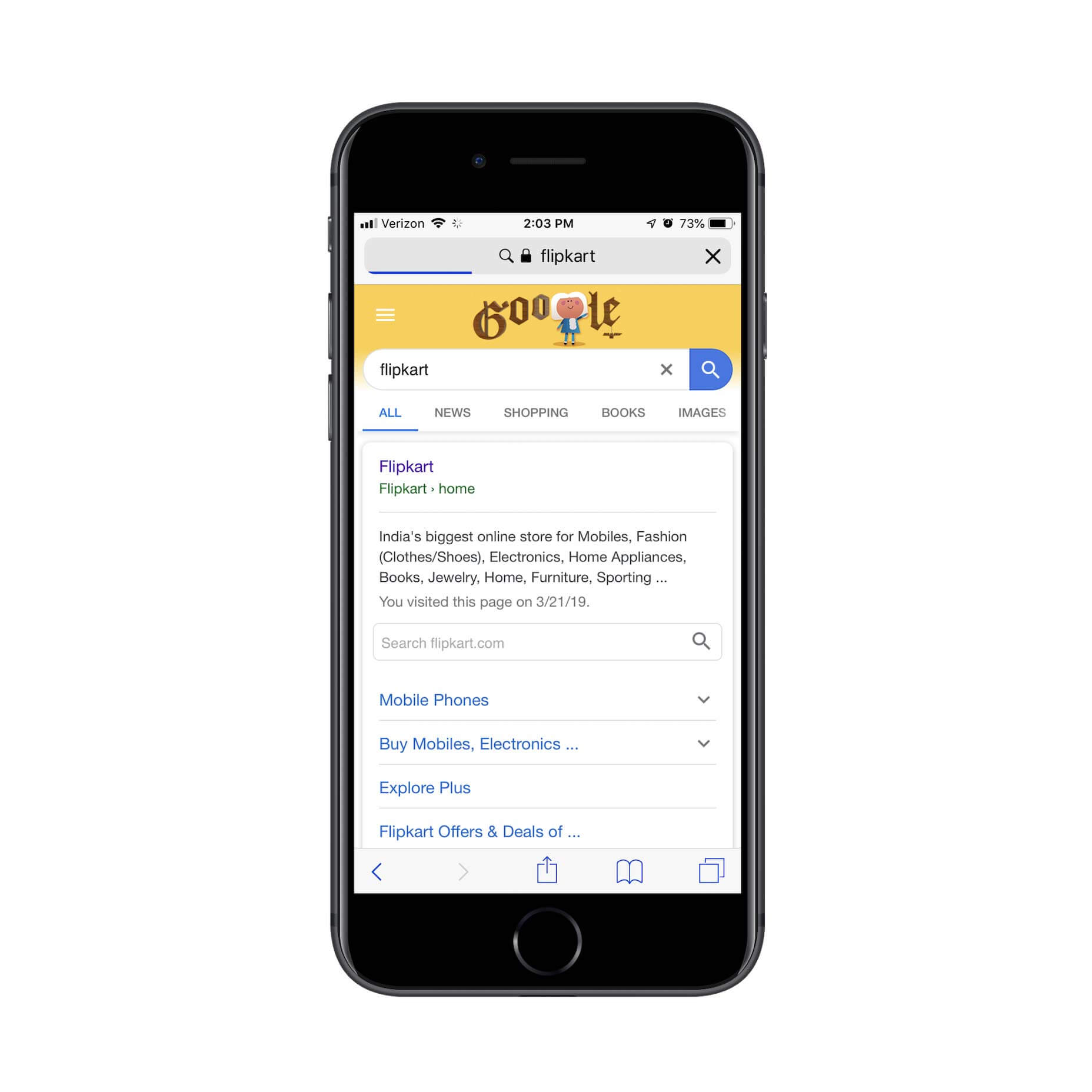
Users don’t have to dig through an app store to find a PWA. They can find them in their mobile search browser as this search for Flipkart’s PWA demonstrates:
That also means less work for you.
Prepping information and screenshots for an app store listing takes time. If you’re already doing SEO for your clients’ websites, then you can just use that for your PWA.
And working with each of the individual app store’s rules and timelines (because you have to submit separately to Apple and Google) is a pain. Whether you’re launching an app or pushing an update through, launch will never truly be predictable as their teams have to review and approve your app first.
PWAs, again, are much easier. You own it all, which means that when someone searches for and finds the PWA in search, the latest and greatest version is what they’ll encounter. There’s no red tape here.
Convenient
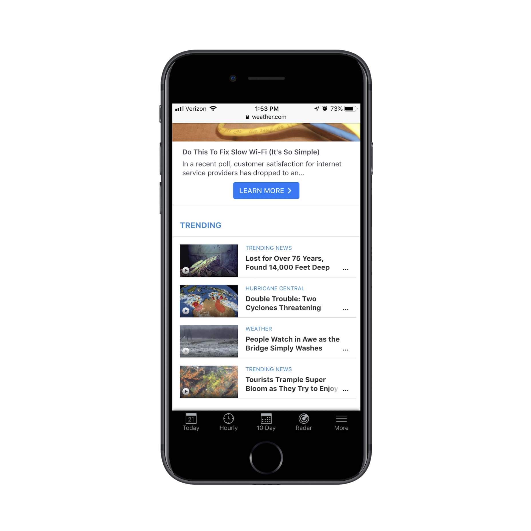
PWAs can be saved to mobile home screens the way apps can, too. For example, here is the Weather Channel PWA:
Users can then save it to their home screen, so that the icon displays alongside their other apps:
If you want to help mobile users get the most out of it, let them know it’s easy to get one-click access to with a small popup notification.
Online / Offline
PWAs are a really great choice for businesses that want to get the mobile face of their company into the hands of a global audience. For visitors that live in remote areas or ones that simply have unreliable Internet access, the offline storage component of PWAs make them the obvious choice over mobile websites.
Feature-rich
Unlike mobile websites which are limited by the technology sitting behind them, PWAs are like mobile apps in that they can leverage a smartphone’s features. While PWAs don’t have the ability to directly integrate with mobile apps, they can sync up with your users’ telephony features (like push notifications).
Great Looking
Building a website that works just as well for desktop as it does for mobile can be a challenge. Thanks to the app shell, a PWA has a significantly improved and upgraded look from a standard website on mobile.
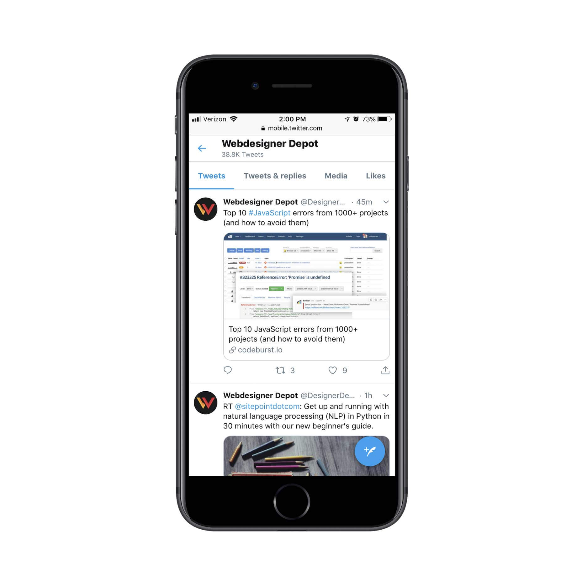
For instance, this is the Twitter Lite interface:
Notice how the stream of content fits beautifully within the borders of the page. Also, check out the header and blue new tweet button. These elements hold firm no matter where visitors go on the Twitter website or how far down the page they scroll.
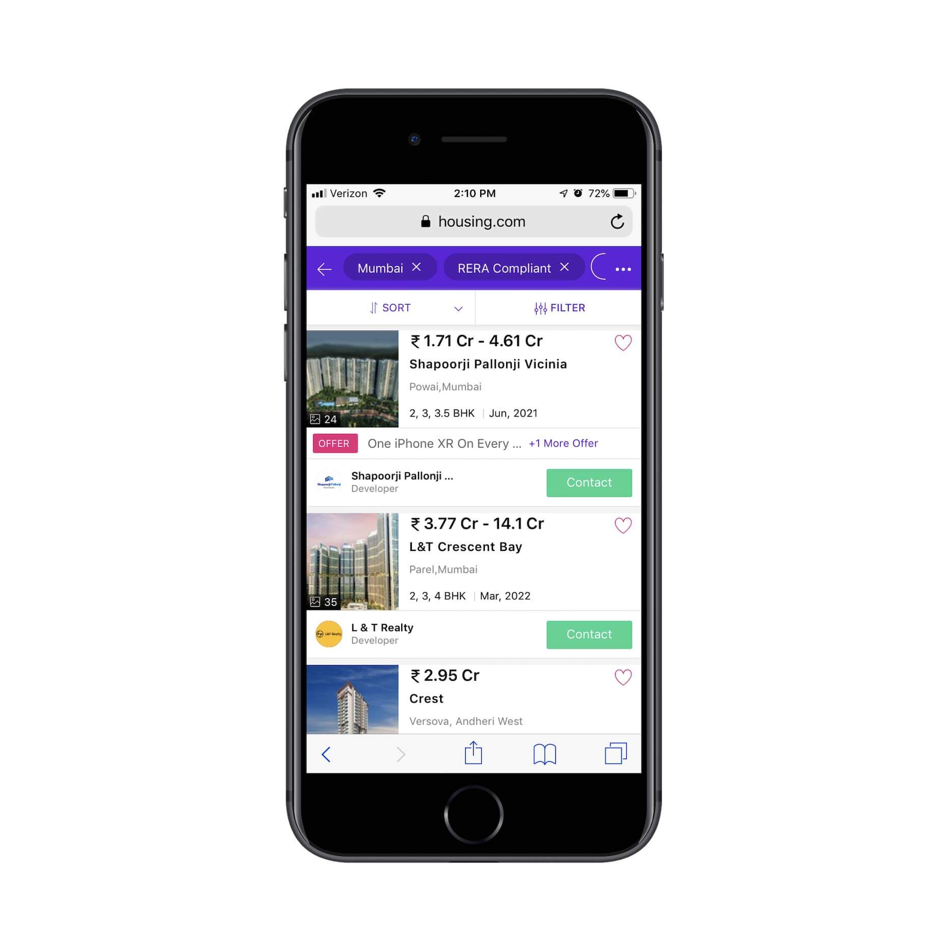
You can also greatly improve the UI of things like internal search and filtering as Housing.com does:
By improving the look and functionality of your web presence with a PWA, you’ll encourage more mobile users to engage.
PWAs Are Engaging!
All of the elements above will certainly help drive up engagement rates and conversions if you’re making the switch from a mobile website to a PWA. There’s plenty of proof online that demonstrates how and why this happens, too:
AliExpress saw twice as many mobile visitors and an 82% increase in iOS user conversion rate alone after switching to a PWA.
Lancome decreased the time it took their mobile web page to become interactive by 84%. In turn, their bounce rate dropped by 15% and they had a 17% boost in conversions.
MakeMyTrip used their PWA’s increased speeds to increase shopping sessions by 160% and conversions by 300%.
Needless to say, your clients don’t need to feel trapped or held back by the constraints of the mobile web. While it’s still important to have a presence there to start, the PWA is where they should be headed next. It’s cheaper and easier to build than a mobile app and there’s a lot to be gained in terms of engagements and conversions.
Featured image via Unsplash


