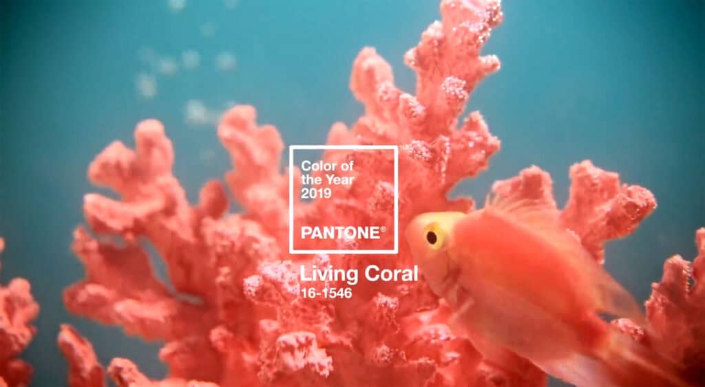
Pantone’s annual quest to dominate the “and finally…” portion of the pre-festive news has kicked off, with the announcement of its Color of the Year for 2019.
The official selection for the coming year is Living Coral, or specifically 16-1546 (that’s #FF6F61 to you and me).
Pantone’s announcement always sets the color agenda for the following 12 months. After all, in 2018 we’ve seen nothing but Ultra Violet color schemes; in 2017 everything was Green; and way back in 2016 everything was Rose Quartz and the Other One. Not true, you say? You’re probably right.
In reality, the designers most affected by Pantone’s announcement are those who were already using Living Coral, or something close, and will now redo their work for fear of appearing to slavishly follow fashion.
The irony from a designer’s point of view is that colors don’t operate in isolation, it’s their combinations that are beautiful, impactful, or communicative.
From a business point of view, what matters is not the substance of your choice, but the choice itself—and of course the way that choice is publicized. Pantone, with its annual press release and its PR friendly choice of color, is (re)establishing itself as the definitive authority on color. It’s a very, very smart strategy. How long before Adobe announces its font of the year, or WordPress announces its plugin of the year.
So what is the significance of Pantone’s selection? Certainly the name is significant; with record levels of coral dying out, the probable loss of the Great Barrier Reef, and whole islands of trash appearing in the Pacific, it’s high time we showed our oceans some love.
On the positive side, its quite a pretty color.
