1
In the ever-evolving world of web design, one thing has become crystal clear: linear design is no longer enough. As designers, we are tasked with creating experiences that are more dynamic, engaging, and intuitive than ever before.
Enter non-linear web design—a concept that moves beyond the traditional “this, then that” approach.
But what exactly does non-linear web design mean, and how can we leverage it to push the boundaries of user experience? Buckle up, because this isn’t your average design discussion.
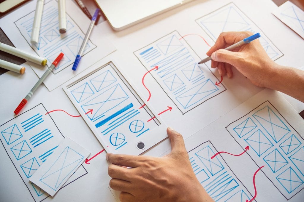
What is Non-Linear Web Design?
At its core, non-linear web design is about breaking free from the constraints of traditional, linear layouts and navigation. In a linear design, users follow a set path through the site.
They begin at the homepage, click through to a category page, then maybe to a product page, and finally to checkout. While this works fine for many sites, it doesn’t necessarily account for users who don’t want to follow that predefined order.
Non-linear design, on the other hand, allows for multiple paths and interactions, letting users navigate through the site in a more organic way.
Think of it as a web of possibilities, where users can hop from one place to another based on their interests, behaviors, or goals. This creates a more personalized, engaging experience, one that puts control in the hands of the user.
Why Should You Care?
In the past, the web was largely dominated by linear navigation systems. Menus, breadcrumbs, and standard page layouts created a predictable flow for users.
While this helped maintain order, it also restricted creativity and flexibility. Fast forward to today, and non-linear design is becoming a central feature of modern, user-centered web design.
But why is it important for us as advanced designers to pay attention? First off, the internet has become an increasingly complex and fragmented space. Users are no longer just browsing—they’re looking for experiences.
Non-linear design offers a way to accommodate these diverse expectations. It’s about creating more interactive, immersive environments that allow users to engage with content in a more fluid, personalized manner. By embracing non-linear design, you’re setting your site up to stand out in a crowded digital space.
Key Principles of Non-Linear Web Design
Before diving into how to implement non-linear design, let’s take a closer look at some of its guiding principles.
1. User-Centric Paths
In a non-linear web, users should feel like they’re in control. Rather than being led down a predetermined path, they should be able to choose their own journey. This is achieved by providing clear, intuitive navigation options and offering multiple entry points to key content.
For example, think about a news site. A linear site might show a homepage with the latest stories in a grid, leading users through articles in chronological order.
A non-linear approach might display stories with interactive elements—like a “most popular” sidebar, related articles that update in real-time based on user behavior, or a personalized news feed driven by past interactions.
2. Dynamic Content
Non-linear design thrives on dynamic content that adapts to the user. The more the site can predict what a user wants, the more engaging the experience becomes. This can be achieved with features like content recommendations, smart filters, and search functions that update based on the user’s activity.
Imagine an e-commerce site where users can filter products by color, price, or brand, but also by personal preferences or previous browsing history. By offering real-time, dynamic content, the user experience feels tailored and unique—exactly what non-linear design is all about.
3. Exploration Over Direction
Rather than pushing users along a strict path, non-linear design encourages exploration. Think of it like a digital version of a maze, but one where there’s no wrong way to go.
The goal is to create a design that invites curiosity and rewards discovery. Instead of a rigid flow, the site should feel like a map with multiple possible routes, each one leading to a different but equally valuable outcome.
For instance, a portfolio website could feature non-linear navigation by allowing visitors to jump between different project categories, case studies, and client testimonials, or by enabling a visual storytelling experience that lets users move through content at their own pace.
4. Interactivity as a Core Element
Interactivity is a hallmark of non-linear web design. It’s not just about clicks and scrolls; it’s about encouraging users to interact with content in ways that feel intuitive and engaging. From hover effects and scroll-triggered animations to gamified experiences and interactive infographics, non-linear design opens up a world of possibilities for creating deeper engagement.
Take, for example, an interactive product configurator on an e-commerce site. Instead of simply browsing through static images of a product, users can actively customize the item, see real-time changes to their selections, and receive personalized recommendations based on their choices. This level of interactivity makes the experience feel more like a conversation than a transaction.
Non-Linear Layouts in Action
So, what does non-linear design actually look like in practice? Let’s dive into some real-world examples of websites that embrace non-linear navigation.
1. Pinterest
Pinterest is a prime example of non-linear design done right. While you can scroll through the homepage and view a feed of pins, the site also allows you to explore content based on your interests, follow specific topics, and save pins to your boards. There’s no rigid path that a user has to follow—just endless possibilities for discovery.
2. Medium
Medium takes non-linear design a step further by blending traditional storytelling with dynamic content. Readers can explore articles through recommendations, hashtags, and personal feeds. They can jump from one topic to another without being confined to a single path. The design allows for both linear reading experiences and spontaneous, non-linear exploration.
3. Spotify
Spotify’s interface is another example of non-linear design. While users can listen to curated playlists and discover new music, they also have the freedom to jump between genres, artists, or moods. The recommendations are personalized based on listening history, but there’s always a way to explore something new. The fluidity of the navigation makes it easy to get lost in the experience.
How to Implement Non-Linear Design
Ready to embrace non-linear design in your own work? Here are a few tips to get started:
- Identify key content areas: Determine what parts of your site should be prioritized and allow for the most freedom of exploration. Do you want users to focus on a specific product, category, or piece of content? Or do you want to encourage them to discover a range of options?
- Offer multiple entry points: Whether it’s through a dynamic search function, personalized recommendations, or clickable visuals, ensure that there are many ways for users to enter different sections of your site.
- Create fluid navigation: Rather than relying solely on traditional menus, incorporate interactive elements that enable users to jump between content in an engaging way. This could be through infinite scrolling, interactive maps, or content hubs with visual appeal.
- Leverage data: Use user behavior and interaction data to refine and personalize the experience. The more you understand your audience, the better you can offer a non-linear journey that feels tailored and responsive.
- Experiment with design: Don’t be afraid to test different navigation models and layouts. Non-linear design thrives on creativity, so experiment with what works best for your content and audience.
The Future of Non-Linear Web Design
As technology advances and user expectations shift, the role of non-linear design will only continue to grow. From AI-driven personalization to voice-activated interfaces, the possibilities for creating more dynamic, non-linear experiences are endless.
Ultimately, non-linear web design isn’t just a trend—it’s a fundamental shift in how we think about the web.
By moving away from rigid, linear layouts and embracing a more fluid, interactive approach, we can create websites that are not only more engaging but also more meaningful. It’s about letting go of control and giving users the freedom to explore, discover, and engage in a way that feels uniquely their own.
So, the next time you sit down to design a website, ask yourself: How can I make this experience less linear and more dynamic? The answers could transform your design process—and the way users experience the web.

Confessions of a Web Design Generalist (a.k.a. The Person Who Does Literally Everything)
There’s a special kind of web designer out there. You won’t always spot them in the wild because they’re usually busy fixing something someone else forgot to do. Or weren’t…

Simplicity in Web Design? It’s All Smoke and Mirrors
Let’s get one thing straight: Simplicity in web design? It’s a lie. We’ve all been told that making things simple is the holy grail of design. But here’s the truth…

20 Footer Design Myths You’re Still Believing (And How to Fix Them
Footers—often treated like the forgotten bottom shelf of your website’s pantry. Designers pour their energy into flashy homepages and slick navigation, leaving the footer to fend for itself with a…

AI by the Numbers: How It Took Over Web Design & Development in 2025
AI isn’t just a neat extra anymore—it’s at the core of how websites are imagined, built, tested, and maintained. It’s replacing tedious steps, automating design iterations, generating entire codebases, and…

UX Fatigue: When Your Website Asks for Too Much (and how to fix it)!
Let’s be honest: we’ve all been there. You click a link, land on a site, and before you can even scroll, the internet throws the kitchen sink at you. First,…

Designing for Discovery: Why AI and Accessibility Are Now UX Priorities
As web designers, we’ve been taught to prioritize human-centered design. But the web’s newest users aren’t people at all – they’re intelligent agents. Whether it’s a voice assistant navigating your…