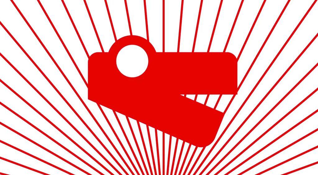
Mozilla’s rebranding project has been going on the entire Summer. Now, as we head into the Fall, the company’s rebranding objective is nearing the final stretch. It’s heading into the long-awaited design-development phase with four, potential designs being the final candidates for the company’s new image.
In a new article on the Johnson Banks’ website (the design consultancy working with Mozilla on the rebranding) the company revealed that only four designs are now in the running for the new Mozilla logo, down from seven in August. In the next couple of weeks, these four choices are going to be narrowed down further still until the final brand-identify recommendation—whatever shape and form that takes—is unveiled in October.
The final, four candidates were selected based upon three, main criteria. They are:
- The principles of good design;
- Mozilla community feedback for the seven concepts unveiled in August;
- Mozilla’s overall branding strategy.
Without further ado, here’s a quick look at the four finalists…
Protocol 2.0
So named because it symbolizes Mozilla’s role at the center of the web, Protocol 2.0 is a logo that essentially places the Internet http:// protocol right into the logo type mark. The beauty of Protocol 2.0 is the flexibility it affords: Mozilla has been experimenting with swapping out certain characters in this proposed work mark, so that emoticons and font characters could suddenly appear in the new logo.
The Flame
Perhaps no symbol is as universally well-understood as fire. The company is considering a flame logo to represent its drive to remain the beacon for the ideal of the equal, open and accessible web for all. Community’s also important to Mozilla, and a flame would symbolize the warmth of community, too.
If you look closer, you’ll also see that this logo contender actually merges the “M” for “Mozilla” with the flame. The final iteration is a pixelated version that lends itself well to animation.
The Burst
The Burst sort of looks like a fireworks display going off, but there is heavy symbolism in this logo contender. It’s been influenced by two schools of thought. First, there’s a new narrative characterized by Mozilla’s advocacy for the health of the web. Second, there’s the visual aspect characterized by the company’s investigation of classic web imagery and data-led ideas.
The number five also figures into this logo, as Mozilla’s gathering data around five, vital measurements, and a capital “M” has five nodes. Hence, the five bursts.
Dino 2.0
Heavily inspired by a previous logo suggestion called “The Eye,” Dino 2.0 utilizes the reptile eye shape forged out of the “O” in the word “Mozilla”. Dino 2.0 sports a noticeable dinosaur’s head that features white type on a red chevron.
Plans call for this logo idea to bite, thanks to moving GIF animations, and showcase a slew of vibrant colors to demonstrate that Mozilla really is for everyone.
Stay tuned in the coming weeks as Mozilla moves closer to finalizing its new brand identity.
