Thanks to Microsoft’s radical redesign of Windows 10, you may not recognize much of the classic operating system’s UI anymore. That’s because the company has decided to go in a new direction, cleaning up the software’s interface for a more minimalist approach.
According to a recent tweet by Tom Hounsell, a Microsoft enthusiast and the developer behind BuildFeed—the Windows build tracker—the redesign removes a few of the classic features of Windows that users are familiar with and replaces them with significant changes, mainly to the open windows and taskbar areas.
It seems that design elements like the title bar and windows borders—mainstays of Microsoft UIs—have fallen out of favor in this latest update. The screen grab by Hounsell shows that Microsoft is dropping both for Windows 10. As for the well-known close, maximize, minimize, and restore buttons, they’ve been fused into the window itself, so any content goes straight to the edge. Overall, this makes for a crisper and simpler appearance that removes any hints of frills and gimmicks in the design.
The taskbar gets a blander look, as it appears to lose color in this iteration.
As for the app icons themselves—something really interesting is going on with them, color-wise. While they’re going to automatically show up black, they’ll return to their ‘regular’ colors when each app is up and running in the OS.
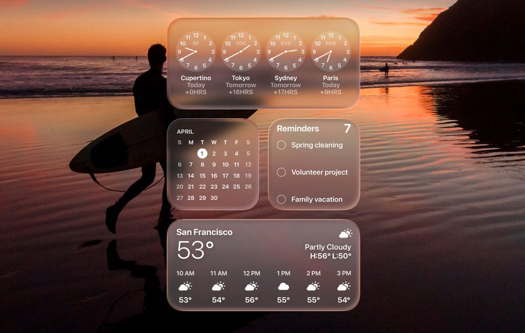
Also of note is the so-called “Acrylic” element that’s actually not as new as the other design changes in this update. This component is essentially just a new approach to the old “Aero,” which was around during the Vista era; it blurred background apps and interface elements.
While the approach is doubtlessly more modern, questions being raised include whether or not longtime Windows users are going to positively receive this new approach, as well as how easily said users will take to the new UI. Needless to say, it’s going to take some time to get used to, both from an aesthetic and functional sense.
Designers and users excited about this preview will have to wait just a bit longer in order to get their hands on a usable version of Windows 10 with this redesign. The company has plans to officially reveal this new appearance in a Windows 10 update later this year.
Project Neon, as this new redesign is internally known at Microsoft, is only the latest in a memorable history of disputable UI-design decisions at the company. Who could forget 2012’s foray into ultra-simple flat design with the Metro Tile unveiling? That radical redesign was the subject of some criticism, as traditional desktop users felt that it was awkward and hard to use while tablet and mobile users generally felt that it was better.
Only time will tell if the company’s Windows 10 design reboot will spark the same type of mixed reviews or will instead be received warmly by a broad base of users this time around.


