Of course, Microsoft is no stranger to a change in style. Calibri was only introduced as Microsoft’s official font in 2007, replacing the contentious Times New Roman type in Word and the standard Arial font in Excel, Powerpoint, and Outlook. Designed by world-leading type designer Steve Matteson, the Aptos font (originally known as Bierstadt) is making its debut after years of rigorous testing and feedback. The change comes alongside Microsoft’s intention to make their software more inclusive, with additional themes, colors, and backgrounds to allow for further creativity.
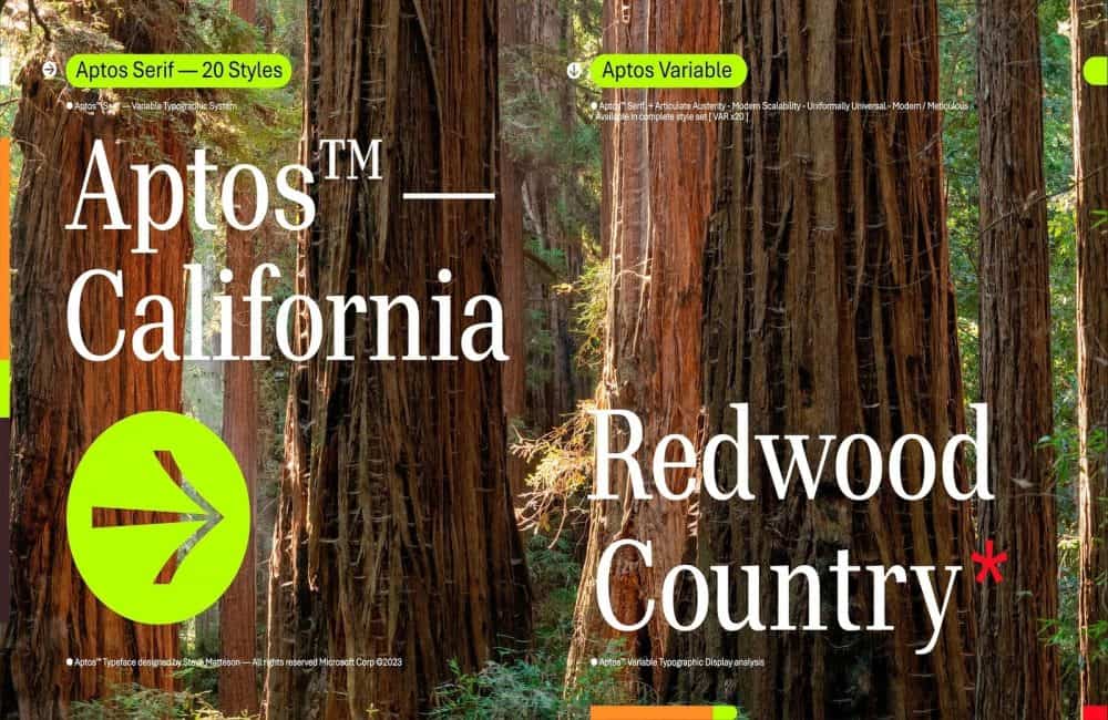
Now for the question on every designer’s mind. How does the new font look? The typeface is simplistic, and the lines are clear-cut, as we’ve come to expect from a sans-serif font. That said, Matteson has endeavored to give the font a “slight humanist touch” by adding softer edges. Understandably, though, the font is still very mechanical, with a focus on readability over creativity.
Overall, the Aptos font is serviceable but nothing groundbreaking. Sadly, fans of decorative script fonts may have to wait a little longer before silky-smooth cursives find their way into Microsoft’s collection of default typefaces.
Robert Reeve
Robert is an experienced marketing professional with extensive experience working with brands to refine go-to-market plans, SEO campaigns, and content marketing strategies. A committed writer with a keen eye on the latest developments, Robert specialises in producing content across all things tech and marketing.
Read Next
FRAKTA Reimagined: A Playful Tribute to IKEA’s Most Versatile Design
If you’ve ever owned an IKEA FRAKTA bag (yes, that iconic blue wonder that seems capable of holding your entire life), then you’ll want to check out IKEA’s latest design-inspired…
Spotify’s Cryptic Tease for 2024 Wrapped Has Everyone Talking
It’s that time of year again—Spotify Wrapped season is just around the corner, and this year, the streaming giant has found a new way to keep us guessing. Instead of…
Figma Releases the Pattern Library
Figma, the industry-leading design platform, has introduced a powerful new resource: the Figma Pattern Library. This library offers a meticulously curated collection of reusable design patterns aimed at streamlining workflows,…
Jaguar’s New Controversial Logo Unveiled
Early this week, Jaguar unveiled a comprehensive rebranding initiative as part of its strategic shift toward an all-electric future. This transformation includes a new logo, updated branding elements, and a…
eBay Unveils the Evo Brand System Playbook
eBay has introduced the Evo Brand System Playbook, a robust, 280-page guide designed to unify and elevate its global brand identity while fostering flexibility across its markets. The playbook, which…
The 10 Best Logos of 2023 – Ranked
We’ve witnessed a plethora of exciting logo designs in 2023. Some have been absolutely awful (we’ll miss you, Twitter). Others have been incredible and a much-needed breath of fresh air…