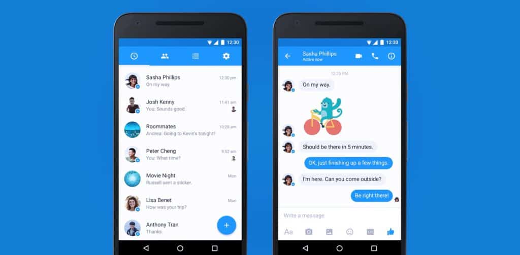
Rumored for the longest time, Facebook Messenger on Android has finally joined the Material Design club, with its latest update.
Taking virtually no one by surprise, this Material Design update is nonetheless welcome news for Android users who’ve been clamoring for a more usable interface on their smartphones. This update immediately applies to all Android users around the globe, making it a full rollout instead of just a careful test of certain markets.
In the interface, users will be able to spot the very noticeable changes straightaway. The most prominent is the vibrant, blue navigation bar on the top of the screen. This features buttons with several functions like settings, groups, chat and more.
[pullquote]This focus on streamlining the design is in line with the big tenets of Material Design[/pullquote]
Where there was a blue bar on the bottom of the interface, now there’s simply a floating action button that users can spot at the bottom right of their screens. This button can be used to add contacts, make calls, perform searches and write messages. This is much greater simplicity and minimalism than all the buttons on the previous blue bar, which included individual buttons for making calls, searching and creating new chats. This focus on streamlining the design is in line with the big tenets of Material Design.
While the app’s usability has been improved by making the user interface simpler, the changes are still mostly visual.
Though this week’s rollout applies to all users around the world, it’s interesting to note that some people have already received a preview of these significant changes ahead of time. As early as January, a select few users have been helping Facebook test these changes to Messenger. At the time, it was uncertain if all users would be able to benefit from these changes, but now it’s clear that this update is global.
David Marcus, Messenger’s lead, explained why it’s taken Facebook a long time to finally debut this design on one of its most widely used and popular apps. According to Marcus, Facebook took an extra long time to apply Material Design to Messenger to ensure that the user experience from the changes would be high-quality. The fact that so many people around the world use Messenger added to the need to be extra careful in the design transition.
