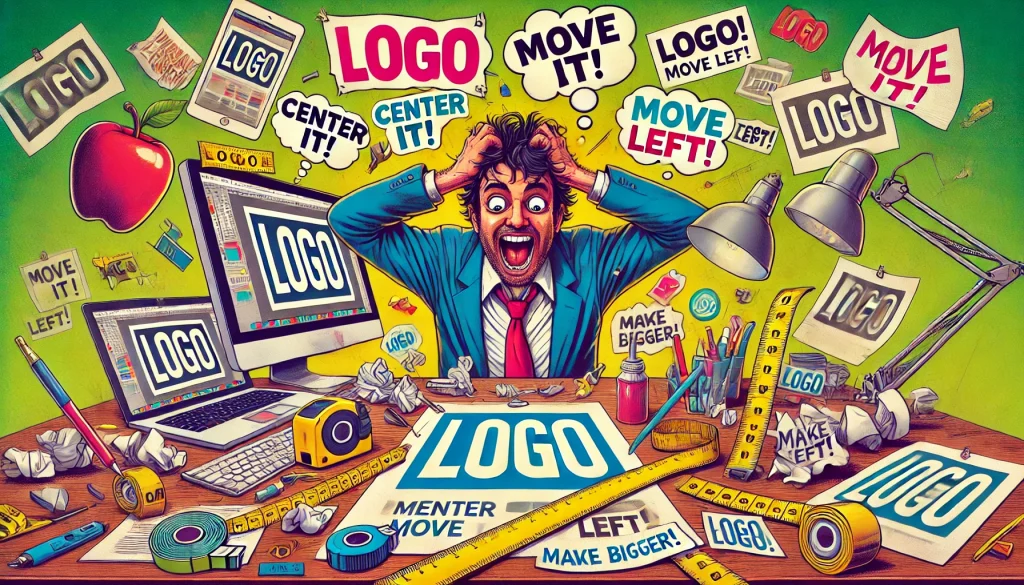
Ah, the age-old cry of “Make the logo bigger!”—a phrase that echoes across boardrooms, email threads, and designers’ nightmares.
For decades, graphic designers have faced this seemingly innocent request from clients who are convinced their logo is the single most important element of any design. But let’s dive into the hilarity of this request and why it might just be the design world’s version of asking a chef to “make the salt saltier.”
Act I: The Grand Entrance
Picture this: a beautifully crafted webpage, sleek and modern, where every element is balanced like a Michelangelo fresco. The client takes one look and says, “Wow, this is amazing! But… can we make the logo bigger?”
Bigger? Bolder? Flashier? They might as well ask you to tattoo the logo on the forehead of every visitor. The designer adjusts it, reluctantly, to the size of a medium-sized pizza.
“Still not big enough,” the client insists.
By the end of the meeting, the logo has grown so large it resembles Godzilla rampaging across your meticulously designed Tokyo of whitespace and typography.
Act II: Science vs. Subjectivity
Designers are quick to pull out studies about visual hierarchy, explaining how a logo that’s too big can overshadow the message. But clients have a counterargument: “People won’t know it’s us!”
Ah yes, because your company’s success clearly hinges on whether your logo is visible from outer space. Forget about compelling copy, cohesive branding, or user experience. It’s all about that sweet, sweet real estate—the Helvetica equivalent of owning a penthouse suite on the design canvas.
Act III: The Slippery Slope
Once the logo reaches gargantuan proportions, it opens Pandora’s box.
- “Can we make it spin?”
- “How about if it follows the user’s cursor around the screen?”
- “Could it emit a subtle glow? Like a lighthouse guiding lost consumers?”
At this point, you’ve gone from crafting a masterpiece to leading an avant-garde art project involving flashing lights and motion sickness.
Act IV: The Compromise
Experienced designers have a strategy: they make the logo slightly bigger—just enough to satisfy the client—then distract them with shiny things elsewhere in the design. “Look at this CTA button! Isn’t it amazing?” they’ll say, as the logo hovers ominously at an almost-reasonable size.
Sometimes, though, the client won’t budge. That’s when designers create a separate “Big Logo Concept” that looks like a Times Square billboard ad. The client immediately realizes, “Oh… maybe that is a little much.” Victory!
Epilogue: The Bigger Picture
The obsession with bigger logos is a testament to the love clients have for their brands. They want to be seen, remembered, and cherished. And honestly, who can blame them? It’s like a parent wanting their child to be front and center in every school play, even if they’re playing Tree #4.
So, the next time a client asks to make the logo bigger, remember: it’s not just about the logo. It’s about making them feel seen and heard. And if that means turning their logo into a blimp-sized beacon of self-assurance, well, at least you’ll have a good story for the next designer meet-up.
And hey, if all else fails, you can always charge by the square inch.
