1
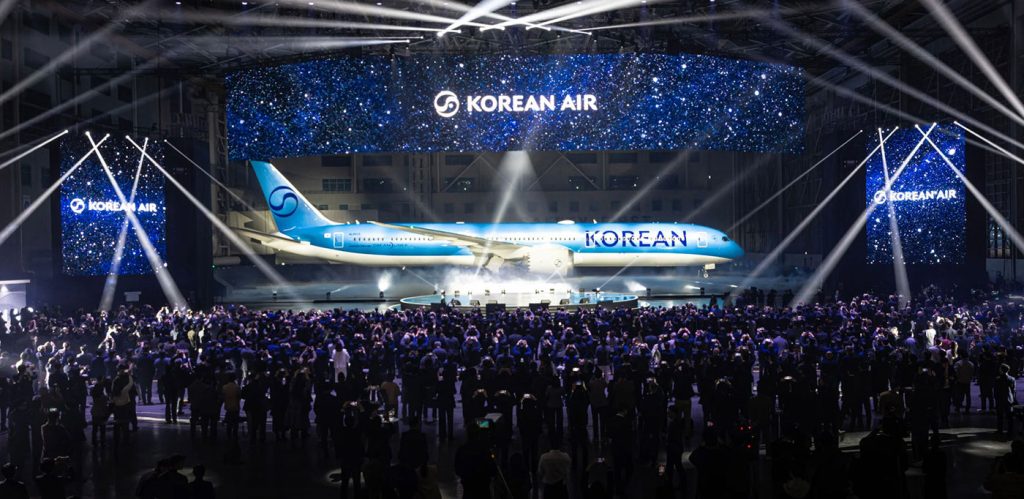
Korean Air has just unveiled a stunning new corporate identity and aircraft livery, marking a major shift in its visual brand.
This update comes after over 40 years, reflecting the airline’s evolution and ambitious future as a global leader in aviation. The refresh is not just a simple logo tweak – it’s a complete overhaul that combines modern design with a nod to tradition.
The new livery is all about clean lines and modern vibes. The metallic sky-blue fuselage looks like it could be straight out of a sci-fi movie, with smooth, flowing curves that give the plane an elegant, dynamic feel.
But don’t worry, they didn’t forget where they came from—the iconic Taegeuk symbol, representing harmony and balance, has been simplified into a cool, monochromatic design. It’s subtle but still packs a punch.
See the insider stories and behind of the new design:
The logotype, simply reading “Korean,” has been redesigned with a bold, clean, and modern typeface, which creates a stronger, more impactful visual presence. Gone is the old, heavy font.
The new “Korean” typeface is sleek, modern, and easy to read, making it stand out without shouting.

To strengthen brand consistency, Korean Air has also introduced a three-dimensional (3D) motif inspired by the flowing curves of the Taegeuk design (see below).
Featuring the airline’s signature light blue with red accents, this motif will appear on key customer touchpoints like check-in screens, mobile SKYPASS cards, and the website.
In areas where 3D applications aren’t practical, two-dimensional (2D) patterns influenced by Korea’s landscapes, Taegeuk curves, and traditional “Jogakbo” patchwork will be used on textiles and printed materials.

When it comes to the aircraft livery, Korean Air’s new look is sleek and polished, reflecting the airline’s forward-thinking values. The most noticeable change is the shift to a more metallic-effect sky-blue color, replacing the traditional white and blue combo.
This choice adds a touch of sophistication, while the fuselage has been streamlined with a flowing curve that replaces the old cheatline design.

The website has also been refreshed with the new look:

With the airline’s first aircraft featuring the new livery already in service, Korean Air is soaring into the future with a reimagined identity that’s both modern and timeless, stylish and efficient – a design that’s bound to turn heads every time it takes flight.
What do you think? Love it or hate it?

The Designer-Developer Handoff Is Still Broken — why?
Let’s be honest: the designer-developer handoff was never really “working”—at best, it limped along with annotated PDFs and passive-aggressive Figma comments. At worst, it bred siloed teams, bloated timelines, and a…

Intent-Based UI Is Replacing Navigation—Are We Designing Ourselves Out of the Interface?
We spent decades perfecting the art of navigation: breadcrumbs, sidebars, hamburger menus, sticky headers, site maps. We crafted taxonomies and ran heatmaps. We obsessed over the user journey like it…
Dear Designers: Stop Using System Fonts Like It’s 2005
Remember system fonts? Good old Times New Roman, trusty Arial, and the unkillable Courier New. Fonts so baked into operating systems, they felt like infrastructure—like sidewalks and salt. For a…
Designing for Dribbble Killed Real Web Creativity
It started with a shot. Not a launch. Not a live site. Not even a prototype. Just a shot — a single, glossy rectangle of design, cropped, polished, and posed for applause….

What Is Web Design in 2025?
Let’s start with a gentle truth: web design in 2025 no longer means what it used to. And that’s okay. Once, it meant Photoshop mockups and pixel-perfect slices handed to a…

Confessions of a Web Design Generalist (a.k.a. The Person Who Does Literally Everything)
There’s a special kind of web designer out there. You won’t always spot them in the wild because they’re usually busy fixing something someone else forgot to do. Or weren’t…