1
Hold onto your designer glasses, because Kiehl’s has just dropped the font equivalent of a mic drop—introducing… “Pubic Display Type.”
Yes, you read that right. This bold new font is here to take body positivity to the next level by literally putting “the body” front and center, with a name that screams (or perhaps whispers?) what the world has been missing: a font that unapologetically celebrates all the bits we usually avoid talking about.
Kiehl’s has taken a hairy situation and turned it into a bold statement with a new font that’s making waves—and maybe a few eyebrows raise.
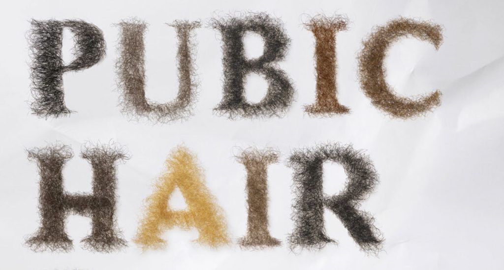
After their 2024 intimate care ad featuring visible pubic hair got censored, the skincare brand decided to get cheeky with their response: introducing the “Pubic Display Type” font, made from real human pubic hair.
Kiehl’s introduced the three new visuals featuring headlines formed entirely from pubic hair:
- “Our photos of models with pubic hair were censored, so we removed the models.”
- “Pubic hair don’t care.”
- “Apologies, we won’t show pubic hair ever again.”
In a world where the natural human body still faces censorship, Kiehl’s is having none of it. The new font is part of their campaign to challenge the beauty standards that make us squirm at something as simple as body hair.

Jon Sáenz, Kiehl’s Global Brand President, said it best:
“Our response to the censorship of our Kiehl’s Personals imagery underscores our commitment to honest conversations about body hair, and our private parts, and challenging outdated societal taboos. Pubic hair is a natural part of the human body, and there is no reason to feel uncomfortable with it. We believe in providing solutions for all skincare needs, without exception.”
With this hairy new addition, Kiehl’s is clearly here to encourage a little less waxing and a lot more honesty. They’ve turned a censorship fail into a full-blown statement—and we can’t help but somehow admire their courage… and creativity?? 🥴
It’s like if Helvetica went on a rebellious spree, decided to loosen up a bit, and stopped worrying about fitting in.

Who knew that all we needed to truly embrace body positivity was a font? Apparently, it was right under our noses the whole time. “Pubic Display Type” is here to redefine beauty standards by taking the taboo out of body talk.
The rounded, playful letterforms are clearly designed to make you rethink what you’ve been taught about self-love and, uh, the human form.
So next time you’re designing a skincare ad or, let’s face it, a ransom note, why not throw in a little body positivity while you’re at it?
So What’s Next? Font-Based Body Liberation? Honestly, we don’t know. Maybe the next big thing will be “Pectoral Serif” or “Bellybutton Bold.”
Kiehl’s is clearly on a roll, and honestly, we’re here for it! 😉

The Designer-Developer Handoff Is Still Broken — why?
Let’s be honest: the designer-developer handoff was never really “working”—at best, it limped along with annotated PDFs and passive-aggressive Figma comments. At worst, it bred siloed teams, bloated timelines, and a…

Intent-Based UI Is Replacing Navigation—Are We Designing Ourselves Out of the Interface?
We spent decades perfecting the art of navigation: breadcrumbs, sidebars, hamburger menus, sticky headers, site maps. We crafted taxonomies and ran heatmaps. We obsessed over the user journey like it…
Dear Designers: Stop Using System Fonts Like It’s 2005
Remember system fonts? Good old Times New Roman, trusty Arial, and the unkillable Courier New. Fonts so baked into operating systems, they felt like infrastructure—like sidewalks and salt. For a…
Designing for Dribbble Killed Real Web Creativity
It started with a shot. Not a launch. Not a live site. Not even a prototype. Just a shot — a single, glossy rectangle of design, cropped, polished, and posed for applause….

What Is Web Design in 2025?
Let’s start with a gentle truth: web design in 2025 no longer means what it used to. And that’s okay. Once, it meant Photoshop mockups and pixel-perfect slices handed to a…

Confessions of a Web Design Generalist (a.k.a. The Person Who Does Literally Everything)
There’s a special kind of web designer out there. You won’t always spot them in the wild because they’re usually busy fixing something someone else forgot to do. Or weren’t…