
1
We spent decades perfecting the art of navigation: breadcrumbs, sidebars, hamburger menus, sticky headers, site maps. We crafted taxonomies and ran heatmaps. We obsessed over the user journey like it was a pilgrimage to conversion. And now
Now users don’t want to “navigate” at all. They expect the interface to understand what they want—before they even know they want it.
Welcome to the age of intent-based UI, where buttons are optional, menus are hidden, and your app should “just know.”
The Death of Navigation as We Knew It
Let’s not sugarcoat it: traditional navigation is dying. Slowly, then all at once.
Why? Because users have been trained—by Google, by TikTok, by AI chatbots—not to seek but to summon. Instead of thinking, “Where do I go to find X?” users now think, “I want X. Give it to me.” The interface is no longer a map; it’s a magic lamp.
That intranet with twelve nested dropdowns? It feels like hiking in the dark. No one wants to navigate anymore. They want the thing. The result. The answer.
We’re not designing journeys anymore. We’re designing desire-fulfillment systems.
From Clicks to Cues: The Rise of Intent-Driven Interactions
This shift from traditional interaction to intent-driven UI is subtle—but transformative. Instead of asking users to choose a path, we guess where they’re going and build the road as they walk it.
You see it everywhere. Spotify doesn’t wait for you to search—it serves you a playlist that fits your mood. Google Maps remembers where you parked and casually offers directions back. TikTok skips the concept of a homepage entirely. You don’t “navigate” TikTok. You dwell. You pause. You signal.
Even tools like ChatGPT or Siri are becoming less about menus and more about interpreting you. You don’t tell them howto do something—you tell them what you want, and they figure out the rest.
Navigation becomes an algorithmic whisper rather than a visible trail. It’s no longer about structure. It’s about inference.
But What If the Machine Misreads Me?
Here’s the rub: when interfaces guess wrong, they fall hard.
When the UI hides options or assumes I want option A when I actually want B, I’m stuck. There’s often no way to backtrack, no clear path to say, “No, actually, I want something else.” It’s like arguing with an overconfident butler who keeps bringing you tea when you clearly asked for coffee.
Clippy was intent-based, too. So is Siri. And we all know how that went.
Intent is a fragile thing. It’s powerful when the system gets it right—but borderline hostile when it doesn’t. That’s the catch: predictive interfaces only work when they’re right. Traditional navigation, even if clunky, gives users a chance to correct course.
What We’re Losing: Cognitive Maps and Autonomy
There’s something deeper we risk losing here: the user’s ability to form a mental model of how a system works.
Classic navigation offers a visible structure. It lets users form a cognitive map: “This is where I am. That’s how I get there. That’s how I go back.” It offers a sense of place, and with it, a sense of control.
Intent-based UIs, by contrast, abstract away the structure. They hide the map and offer a magic tunnel instead—fast, yes, but disorienting. You arrive somewhere, but you don’t know how you got there. Worse, you have no idea how to get anywhere else.
The interface becomes a black box. And when everything is hidden, every interaction becomes a gamble. Sometimes that gamble pays off. But sometimes, it makes users feel lost in a system they can’t navigate, can’t understand, and ultimately—can’t trust.
The Netflix Problem: Curation Without Orientation
Consider Netflix. It’s a masterclass in intent-based UX. It wants you to watch, not browse. So it suggests, it autoplays, it fills the screen with trailers that shout, “This is what you want.”
But the moment you’re not in the mood for what Netflix thinks you want? You’re stuck. There’s no clear catalog, no structured genre list, no map of the terrain. You’re trapped in an algorithmic bubble shaped by last week’s mood.
Intent-based design can lock users into patterns. It works wonderfully until you change your mind—or your identity. Then suddenly, the UI doesn’t recognize you anymore.
It turns out, interfaces that always assume they know us are really bad at letting us grow.
Is This Really What We Want?
There’s a deep irony here. As designers, we keep saying we want to empower users. But intent-based design often ends up taking agency away.
We’re optimizing for efficiency—but at the cost of exploration. We’re streamlining—but we’re also confining.
Ask any UX designer about personalization and AI and they’ll tell you it’s the future. But talk to real users, and you’ll hear stories of frustration. Of interfaces that felt confusing, pushy, or opaque.
We’re not improving UX. We’re replacing it with UX theatre: an illusion of control while the system pulls the strings.
When Intent-Based UI Actually Works
Now, let’s be fair. Intent-based UIs can shine—especially when users want something predictable. If I’m reordering groceries, looking up a flight, or checking a calendar, I want the interface to pre-fill, pre-suggest, and pre-guess. When the task is routine and the goal is clear, predictions feel like magic.
Micro-moments like smart replies in Gmail or Apple’s proactive Siri suggestions? Genuinely helpful. They reduce friction without removing structure.
But they work because they’re layered on top of a solid UI, not in place of one. The moment the interface assumes it knows better than the user, it stops being helpful and starts being presumptuous.
Designing for Ambiguity, Not Certainty
Here’s the hard truth: users aren’t always predictable. They change their minds. They behave irrationally. They explore, experiment, and sometimes click just to see what happens.
Good design doesn’t assume certainty. It embraces ambiguity. It makes room for curiosity. And that means giving users options—even when we think we know best.
Intent should augment the experience—not dominate it. We need to design interfaces that understand, “You probably want this, but just in case, here are the other paths too.”
That’s not inefficiency. That’s respect.
The Future Is Predictive and Permissive
We’re not going back to the days of static menus and site maps. The future will be intelligent, responsive, personalized. But it must also be transparent, accessible, and open-ended.
Imagine an app that makes smart suggestions without hiding the map. A system that learns from you, but still lets you explore. A UI that says, “I think this is what you want—but you’re still the one in charge.”
That’s not just better design. That’s ethical design.
Final Thought
We wanted to remove friction. But somewhere along the way, we started removing freedom. Intent-based UI is seductive—it’s the promise of effortlessness. But if we reduce every interface to what the machine thinks we want, we erase the joy of discovery. The space for mistakes. The ability to go off-script.
If we’re not careful, we’ll design systems that no longer ask, “What do you want to do?”—they’ll just assume. And that’s not interface design. That’s behavioral control.
Let’s not trade usability for obedience. Let’s design for humans, not predictions.
Dear Designers: Stop Using System Fonts Like It’s 2005
Remember system fonts? Good old Times New Roman, trusty Arial, and the unkillable Courier New. Fonts so baked into operating systems, they felt like infrastructure—like sidewalks and salt. For a…
The 10 Foundational UX Principles Every Designer Should Know
If you’ve ever rage-closed an app because it wouldn’t let you “go back” or stared at a form that made you feel like you were applying for citizenship in three…
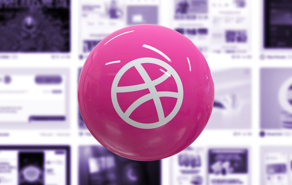
Designing for Dribbble Killed Real Web Creativity
It started with a shot. Not a launch. Not a live site. Not even a prototype. Just a shot — a single, glossy rectangle of design, cropped, polished, and posed for applause….

What Is Web Design in 2025?
Let’s start with a gentle truth: web design in 2025 no longer means what it used to. And that’s okay. Once, it meant Photoshop mockups and pixel-perfect slices handed to a…

Confessions of a Web Design Generalist (a.k.a. The Person Who Does Literally Everything)
There’s a special kind of web designer out there. You won’t always spot them in the wild because they’re usually busy fixing something someone else forgot to do. Or weren’t…
Exciting New Tools for Designers, September 2025
Web design tools that use artificial intelligence are still dominating new and beta launches, while hopefully making your workflows a little bit smoother. One of the most talked about launches…