The first step to getting famous as a video game studio is to make a great game. The second step is to sell the darned thing to a whole lot of people. That is, of course, easier said than done. It’s not enough to throw the game on Steam Greenlight and hope for the best. You have to get people excited. You need hype.
There’s a lot that goes into marketing a game, but this is WDD, so we’re going to focus on one thing: video game websites. Specifically, we’re going to focus on sites that market games to new players. We’ll go over the current game site design trends, general tips for making your own, and some UX concerns that may arise.
I won’t be addressing community sites or forums, video game blogs, gamer social networks or ranking sites, clan websites, or any of the other kinds of game-related sites, because I just don’t have the space. All of those probably deserve their own articles.
The trends
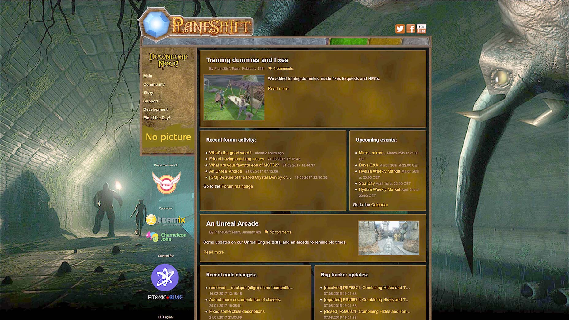
Once upon a time, most video game sites, and indeed most sites, looked a little bit like this:
That’s the site for Planeshift, an ongoing open source MMO project. Okay, I feel a little bad about picking on an OSS project, but theirs was the only site I could think of that still looks like that. And still uses tables for layout.
Their site reflects the product, really: it’s old school. You have to type to talk to NPCs.
Throughout the early 00s, a lot of game sites stayed like this, while others experimented with various trends, most of which incorporated elements of the game’s own UI or branding as part of the website’s UI. There were also, of course, plenty of Flash-based sites meant to reflect the dynamic experience of playing video games as much as possible. (Many of these experiments served their purpose, and have rightly died off. Thus, I have no screen shots.)
In the past few years, sites for marketing video games have started to fall into one really predictable pattern, with most of them adopting the full-screen-section-based-landing-page style.
We need a shorter name for that.
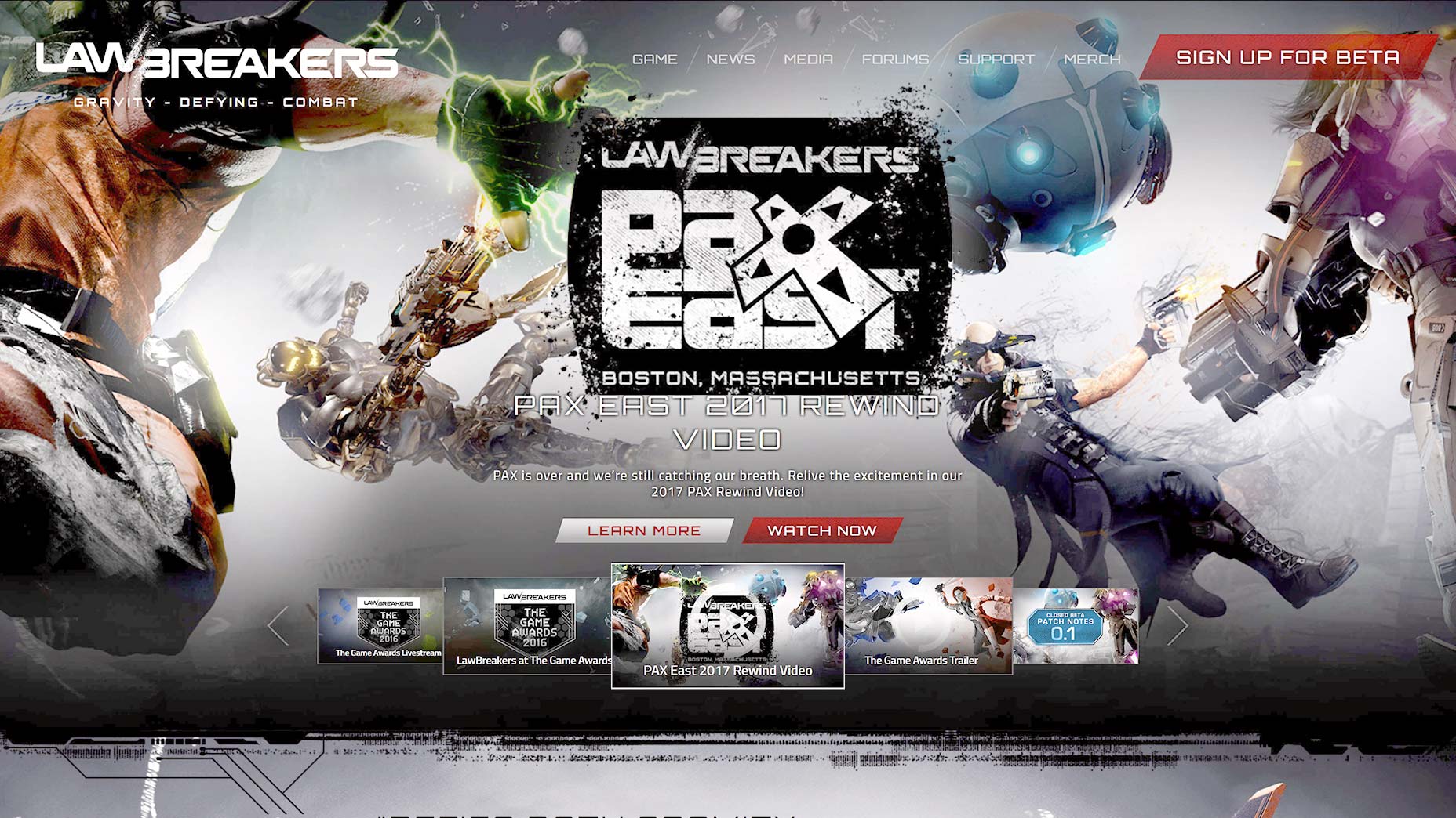
This style is used consistently across companies large and small, it’s used for games from different countries, and it’s used for basically every game genre. It is characterized by the full-screen focus, lots of huge images, some video, and occasionally parallax effects.
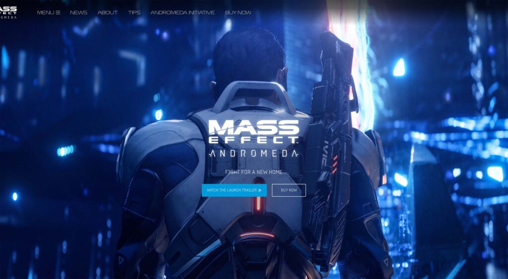
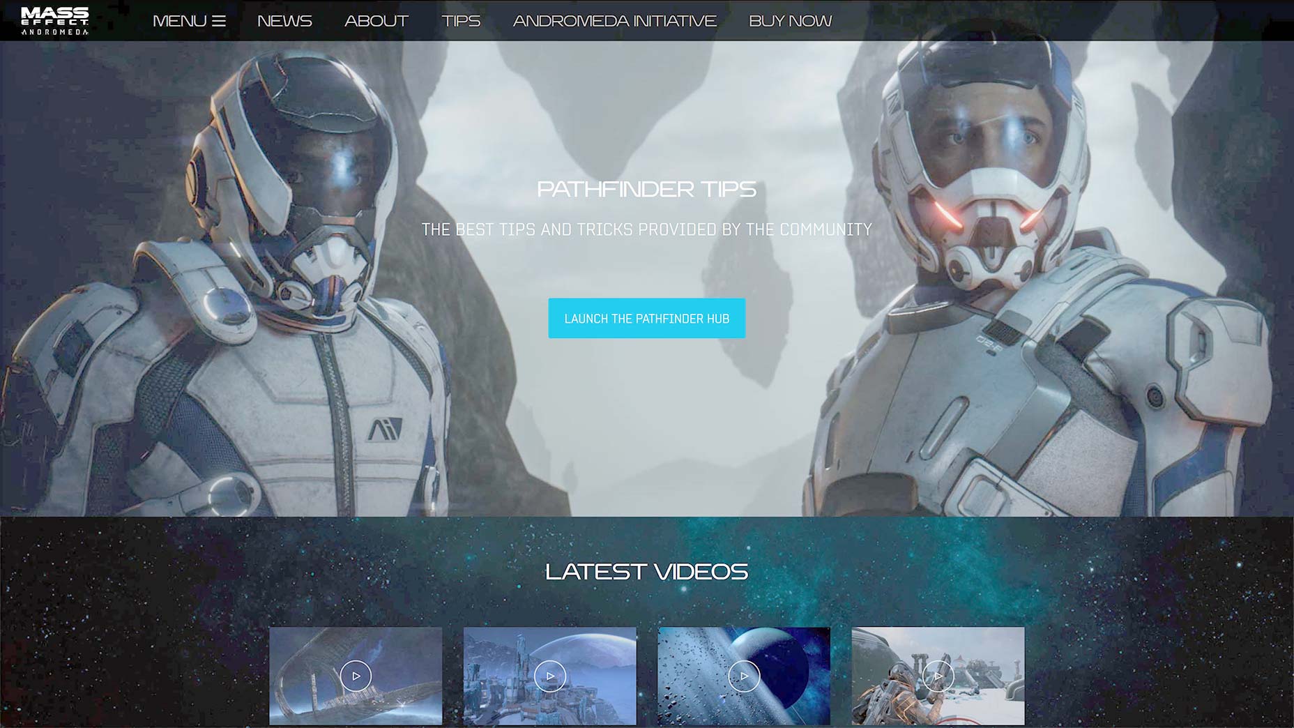
Here’s a small sampling of what I mean:
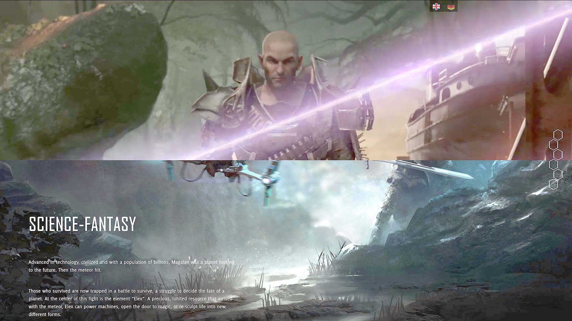
And here are a couple of examples with parallax:
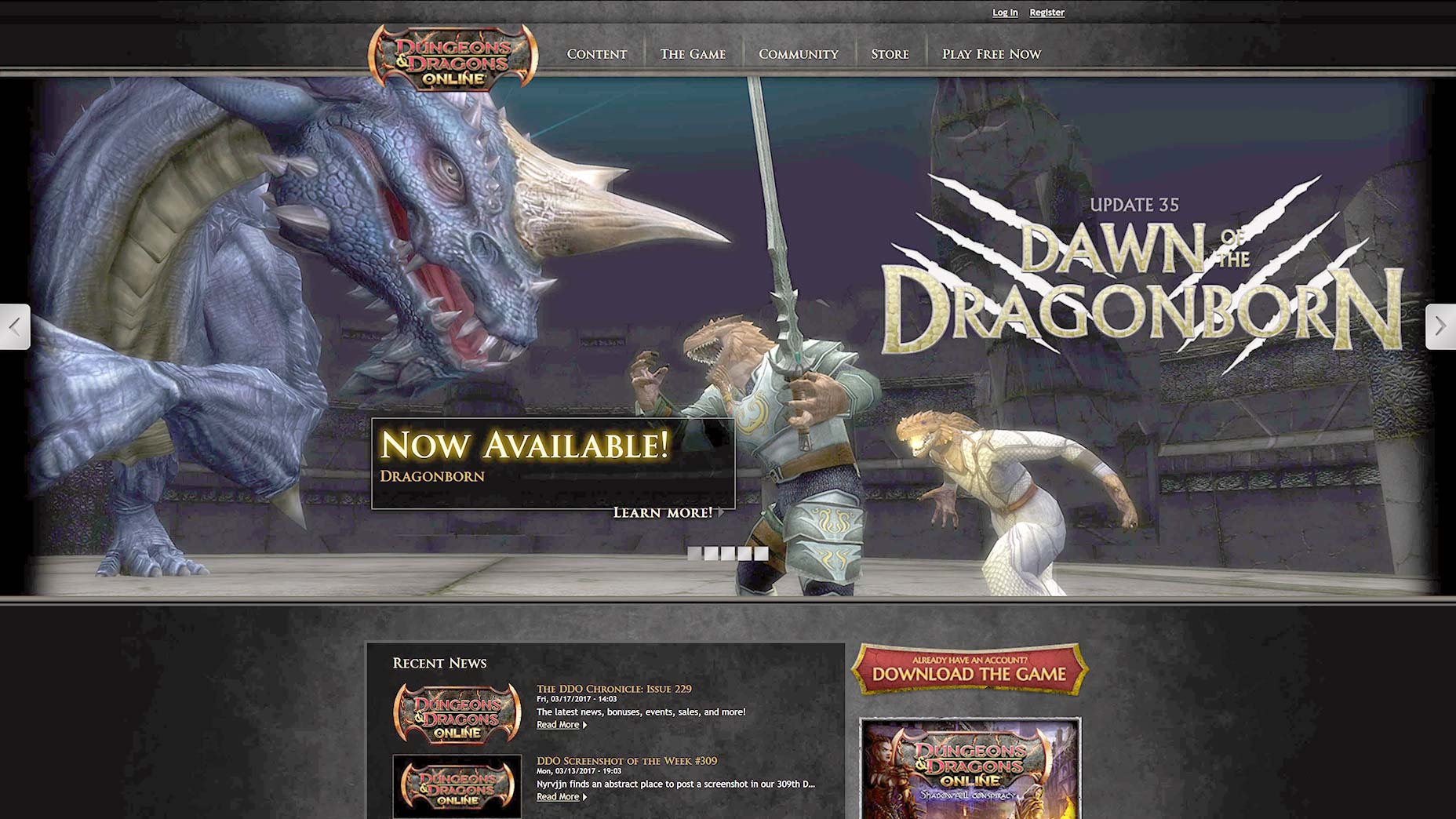
Even with this same-feeling style of design, you can differentiate your site by working elements of the game’s UI and branding into your site’s UI. Have a look at Dungeons & Dragons Online’s website:
Now is this trend a good or bad thing? As usual, I am of the opinion that if it works, if it’s selling your product well, then it’s working as intended. As a customer (read: as a huge nerd), I don’t need the site to be super original, I need it to tell me what I want to know about the game.
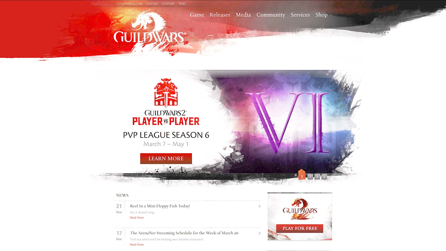
Not everyone does things the same way, though. Some sites throw you straight into the community. Here, Guild Wars 2 is banking on its brand recognition. If you don’t know what it is, you’re probably not that interested. This is a bold strategy, but I wouldn’t recommend it for everyone.
Some other game sites have kept to the old “Gaming Clan” look. Remember when every Photoshop-owning gamer used to make their own “clan website template”? Please tell me I’m not the only one who noticed this trend. Heck, some people are still doing it.
How to sell your game: show off the experience
Okay, so you’ve settled on a landing-page-style template for your site, and you want to sell your game. How do we do that? Well, games are all about the experience. You have to sell the experience that your game provides to the people who will like it best. This is the one big thing. If you take nothing else away from the article, this is what you need to know.
People who play video games tend to play them quite a bit. Over time, they develop a taste for the kinds of experiences that they enjoy the most. (Warning: Sweeping generalizations to follow…) People who play racing games love the illusion of speed, and the challenge of out-performing a smart opponent, whether AI or human. People who play multi-player shooters love that competitive challenge, but they might prefer a slower, more tactical pace, or they might want a run-and-gun game.
People who play single player and co-op shooters want some challenge, but they mostly want to mow down hordes of virtual enemies, whether alone or with their friends. People who play strategy games want to out-think their opponents on what might as well a much more complicated chess board.
[pullquote]You have to sell the experience that your game provides to the people who will like it best[/pullquote]
People who play RPGs might be looking for an action game with a good story, or a world where they can decide what happens to the fate of civilizations, a dating simulator, or some combination of all three (cough Mass Effect cough). People who play horror games want to be scared and challenged at the same time.
Then there are the settings: urban, rural, sci-fi, wild west, and the list goes on for a really long time. People want to know these things. Heck, before I pick up an MMO, I want to know if I can have more than one hotbar.
The point is that you can’t just say, “Our game is totally fun!”, put in a couple of screenshots, and leave it at that. You need to show them, in detail, exactly what kind of experience they’ll be getting. Gamers have been buying games based on hope for a while now, and many of them have been burned before.
The smart game developers give as much information about the game as they can without giving out, say, story spoilers. The more accurately the marketing materials resemble the final product, the better. Every year there are scandals about how games were completely misrepresented before they came out, and that hurts sales.
You might be trying to surprise your players, but more often than not, developers who hide all the details are just hiding a bad or unfinished game. Buying anything is always a bit of a gamble, but right now, finding a truly good game that actually meets the marketing department’s claims feels a bit like winning the lottery. This should not be so.
What to showcase
Start with the gameplay. This is the experience. This is also one of the few times when I’ll say that video is almost necessary on a website. Still images don’t convey enough information about how it feels to play a game.
Heck, even video tends to fall very short, but until we can play demos right on your site, it’s the best we’ve got. Don’t tell them how great the game is. Let them feel it for themselves, as much as possible.
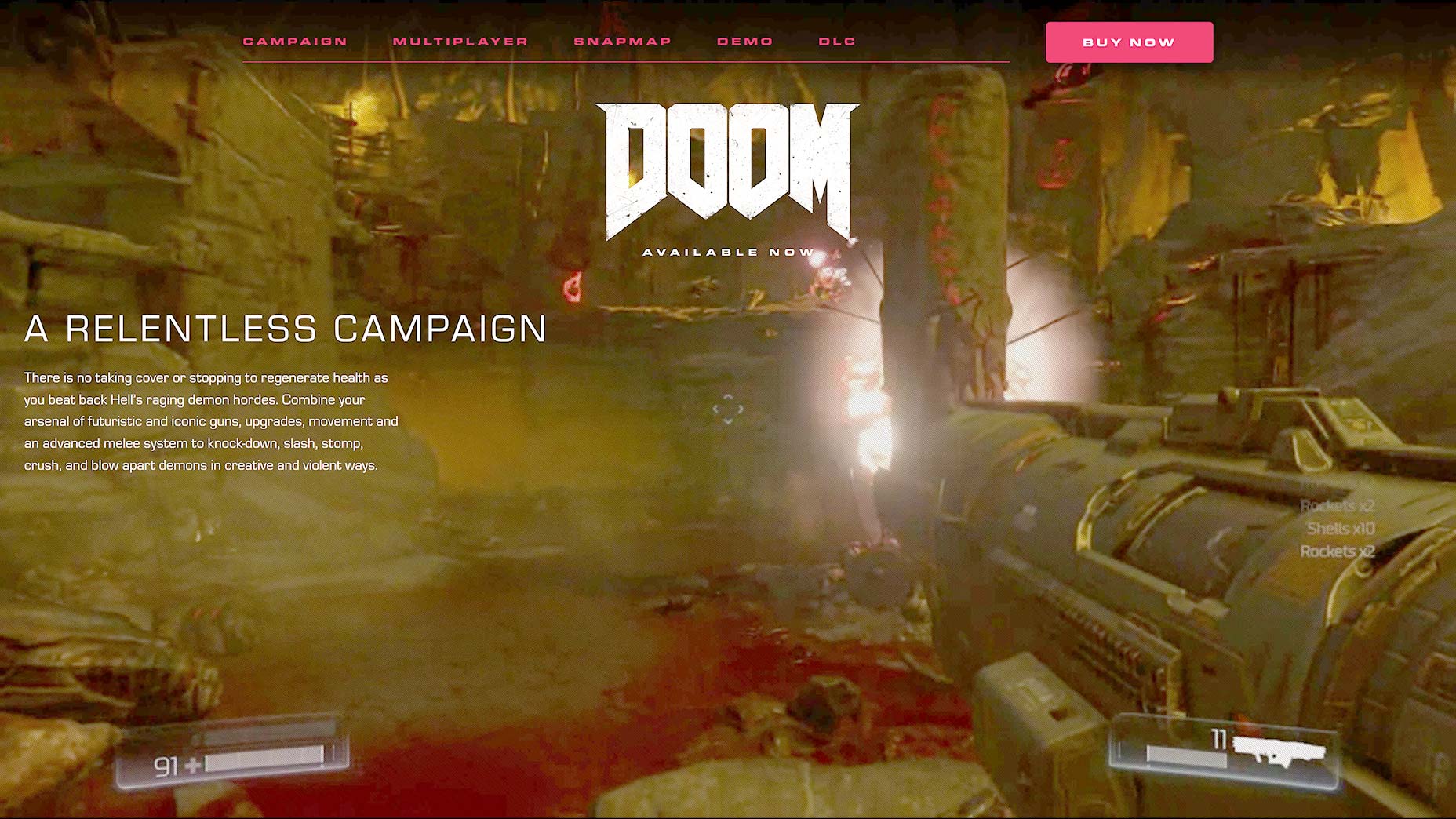
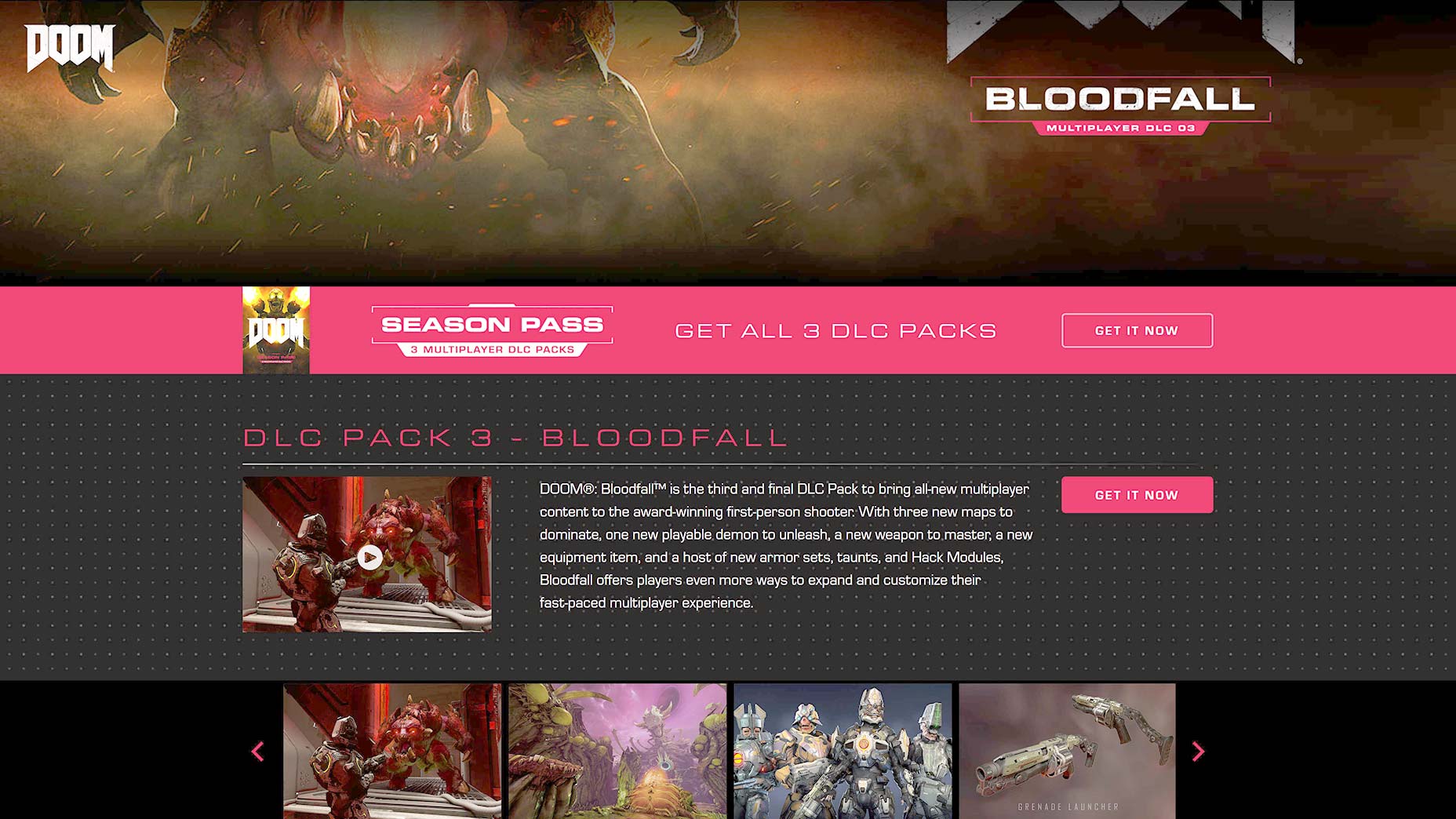
The 2016 release of Doom did this very well. Go to the website for Doom (Fair warning: it’s Doom. There’s virtual gore.), and you’ll see that most of the pages are light on text, heavy on background video. If a picture is worth a thousand words, short videos at 30-60 FPS are like one heck of a novel.
Next, you’ll want to include a clear and immediately available price, or price table. Be very clear about what your buyers get for what price. Some companies try to deliberately make this confusing, and it backfires, all the time.
Get people talking about your game. Be sure to include links to any forums, Facebook pages, or Twitter accounts where people can talk with you about your game, whether it’s out yet or not. People talking to their friends is where a lot of hype comes from
If your game is lore and story-heavy, it can help to include a beginner’s introduction to the story and setting. Just don’t fall into the trap of trying to make the lore into your marketing material. Jumping feet first into a whole new world is a big deal, and if you start throwing too many fantasy names at players who haven’t even bought the game yet, that could backfire. Put some basic lore on the site, but not on the home page.
UX concerns
Selling a game is a bit rough, because in order to properly showcase a game’s experience, you need a fair bit of visual material to get the point across. On the other hand, people with bad Internet play video games too. Just make sure to optimize your video and images as much as possible. Use responsive images, and have the video available in multiple qualities.
And though you might be tempted to animate your UI a lot, like in the days of Flash, I’d keep that to a bare minimum. The sheer amount of visual media will already be hard on some people’s connections. Extraneous UI animation just adds to that burden.
Conclusion
The sites that sell me on a game are the sites that tell me what I need to know, not what they think I want to hear. This is true of all websites in general, but remember that gamers are often far picker than average consumers.
And right now, some simple clarity and honesty is all you need to set yourself apart from, and morally above some AAA game developers. This is not a great state of affairs, but you could make it work for you, by being better than them.
