Inclusive design is a hot topic and choosing an accessible font for your website is important for all brands, not just public bodies and charities. But how can you tell which typefaces are accessible and does this mean a compromise in terms of design? Here are my top tips:
1: Don’t fall into the trap of selecting a design that appears childlike, as there is no need. This may sound obvious but is a very common mistake. Personality is just as important so look for a typeface that balances great design with practicality.
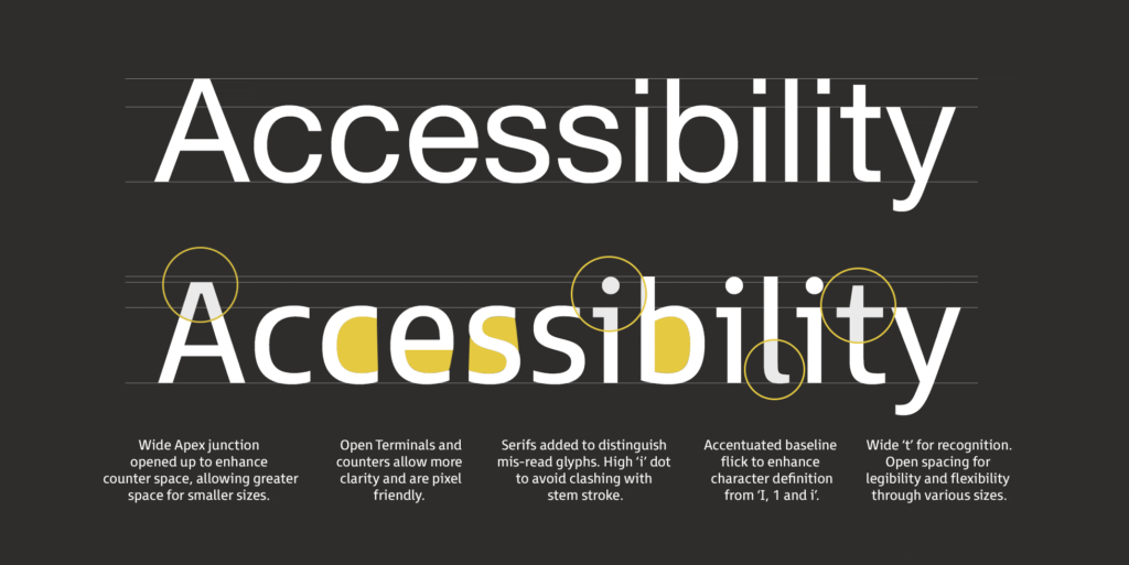
2: It is really important to avoid styles where there is ambiguity between certain characters. The main ones to look out for are the “8” and the uppercase “B”, the capital “I”, lowercase “l” and the “1”. Look for a serif on the lowercase “i” as this also helps to differentiate it from the uppercase “I” at smaller screen sizes. Choosing a typeface with a two-tiered lowercase “a” helps to eliminate confusion with the “o”.
3: If you’re using small amounts of text at 16pt and above (eg. for headings or captions), then a sans serif with large open counters is considered the most suitable.
4: Look for a typeface with a large x-height (this is important for webfont selection). Extended ascenders and descenders will help to make the letter shapes clearer. Ascenders should be slightly higher than the cap height.
5: Look for open counters and terminals as they aid clarity, if they’re too closed they start to fill in at smaller sizes.
6: Numbers need to be distinctive, in particular the “0” from the uppercase “O”. The “6” and “9” should also have open terminals.
7: There is an optimal ratio between the x-height and the stroke width. To achieve maximum legibility the character stem stroke should be 17-20% of the x-height.
8: A wider through bar on the lowercase “t” aids definition.
9: A capital “Q” tail that follows through the main bowl enhances legibility.
10: Spacing between the letterforms should be evenly balanced and rhythmic to aid character recognition.
11: Test the typeface on a dark background to check how it performs. Spacing tends to look tighter, letter shapes appear to “glow” making the font seem heavier than it is, so you may need a lighter weight.
12: Choose a typeface that has a wide range of weights; as rendering on different devices will give varying results and a selection of weights can help to achieve the correct feel.
It’s important to remember that inclusive design shouldn’t mean a compromise in elegance or style. A well designed accessible typeface should be elegant and have personality, but at the same time have legibility at its core, in order to include as many end users as possible.
