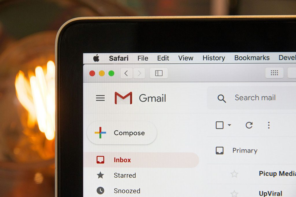
Gmail just celebrated its birthday—April 1st, no less. And no, it wasn’t a prank. Google launched Gmail on April Fools’ Day back in 2004, and two decades later, it’s still the most widely used email service in the world.
Gmail is one of those rare products that’s so ubiquitous, it’s invisible. You don’t sign up for it so much as you inherit it. It becomes your inbox by default.
And before you know it, your life, your appointments, your receipts, and your late-night “forgot my password” requests are all archived neatly inside that familiar red-and-white interface.
But just because Gmail feels familiar doesn’t mean it’s simple.
From a UX perspective, Gmail is a masterclass in contradiction. It’s utilitarian yet overloaded, streamlined yet bloated, intuitive in some places, painfully obscure in others. It’s designed for billions of users but often feels like a product made for power nerds with a spreadsheet addiction. And yet, it works—most of the time.
Let’s dig into the user experience: what Gmail does well, where it breaks down, and what it reveals about how modern UX design handles complexity.
UX by Accumulation
If you’ve used Gmail long enough, you’ve probably noticed something: it never really subtracts. It only adds. Features are layered, never rethought. Chat arrives. Meet arrives. Tasks appear. Sidebar integrations multiply. AI shows up and offers to write your emails.
Meanwhile, the core of the product—the act of checking, reading, and sending email—remains more or less the same.
The result is a dense interface. Gmail is no longer just an inbox. It’s a dashboard. A communication hub. A workspace, whether you want it to be or not.
This isn’t necessarily bad UX—it’s just UX by accumulation. Instead of refining, Gmail expands. Instead of guiding you, it gives you everything and lets you figure it out. It’s functional, sure. But it’s also exhausting.
The Interface That Won’t Let You Leave
There’s a certain stickiness to Gmail’s design. You open a message, and you can do almost anything from there. Write a reply. Start a chat. Add an event. Launch a video call. AI even offers to draft your response for you. All of this happens without leaving the screen.
That kind of self-contained UX sounds efficient, and in some ways it is—but it’s also overwhelming. Gmail assumes you want to live inside your inbox. It creates a gravity well of productivity, where the interface never really lets you go.
And if you’re someone who just wants to check your email and move on with your life? Gmail doesn’t make that easy.
Conversations, But Not Always Clarity
One of Gmail’s signature features is conversation threading, which was genuinely innovative when it first launched. Grouping related messages together makes total sense… in theory. In practice? Not always.
Sometimes, replies get buried. Important messages are hidden unless you know to expand a collapsed thread. Attachments vanish into nested menus. The interface does its best to anticipate what you want to see, but it doesn’t always guess correctly—and that’s when users start losing trust.
There’s a core UX principle at play here: visibility matters. When an interface hides information—even for the sake of tidiness—it runs the risk of making users feel lost. Gmail’s threading system tries to reduce clutter but ends up creating a new kind of confusion.
Labels, Logic, and the Mental Model Mismatch
Let’s talk about labels, because they’re a great example of how powerful UX can also be confusing.
Gmail doesn’t use folders the way most email platforms do. Instead, it uses labels, which means one message can live in multiple categories at once. From a technical perspective, this is brilliant. From a human perspective? It’s chaos.
The problem is that Gmail looks like it uses folders. The left sidebar feels familiar. You “move” things. You “archive” them. It feels like you’re organizing mail into places. But under the hood, you’re just tagging messages. Nothing is really moved. It’s just filtered differently.
This creates what UX designers call a mental model mismatch—when users believe the system works one way, but it actually works another. Gmail never really resolves that. It just expects users to adapt
Search as Savior
Here’s where Gmail really shines: search.
Unlike many of its peers, Gmail’s search bar actually works. You can type full queries—like “has:attachment from:John before:December”—and get exactly what you need. You don’t have to remember where you put something. You just have to remember something about it.
That’s a massive UX win. Gmail understands that most people don’t want to manage email like a filing cabinet. They want to find what they need, when they need it. Search reduces the pressure to organize, and that’s incredibly liberating.
Still, you could argue that great search is also a band-aid. It patches over the clutter. It compensates for a UI that, at this point, is a little too feature-rich for its own good.
The Quiet Creep of AI
Over the past few years, Gmail has become increasingly infused with AI. At first, it was subtle: Smart Compose would gently suggest the next word as you typed. Then came Smart Reply, offering a few one-click responses like “Sounds good!” or “Thanks for the update.” Now Gmail can straight-up draft entire messages for you with Help Me Write.
On paper, these are helpful features. In reality, they land differently depending on your expectations.
Smart Compose is pretty seamless. It’s quiet. You can ignore it. Sometimes it finishes your sentence in a way that feels eerily perfect. Other times, it suggests something weird and you brush it off.
Smart Reply, though? It often feels like Gmail trying to answer for you. The suggestions are fast but generic, and the tone rarely feels quite right. It’s like outsourcing your personality to a polite, corporate robot.
And with “Help Me Write,” the tension deepens. Gmail wants to save you time, but it also risks making communication feel less human. You’re not just delegating tasks—you’re delegating tone, context, and intent. That’s a UX trade-off worth questioning.
Defaults Matter More Than Settings
Gmail gives you lots of control. You can change the density of your layout, rearrange your inbox, hide the chat panel, customize your theme, tweak your labels, and fine-tune your notifications.
But here’s the thing: most people never touch the settings.
What they see on day one is what they’re going to live with for years. That means the default experience is everything. And right now, the default Gmail layout is… a lot. There’s a Promotions tab. A Social tab. A sidebar filled with apps you may or may not use. A “Nudge” system that asks if you forgot to reply. And on top of it all, AI is hovering with a draft ready to go.
Gmail isn’t trying to overwhelm you—but it doesn’t go out of its way to simplify things either.
The Emotional UX of Never Being Done
Gmail’s real UX challenge isn’t about layout or features. It’s about how it makes you feel.
There’s always another email. Always another unread badge. Always another “ping” somewhere off-screen. Even when you archive everything, snooze what’s left, and hit inbox zero, Gmail doesn’t reward you with a sense of peace. It just waits. It’s like an inbox with a pulse.
And that’s not just design. That’s emotional design.
A good UX doesn’t just help you do things—it helps you feel in control. Gmail, for all its power, sometimes makes you feel like you’re just barely holding it together.
Gmail as a Mirror
In the end, Gmail doesn’t enforce a workflow. It reflects yours.
If you’re organized, Gmail can be a well-oiled machine. If you’re chaotic, Gmail becomes a mirror of that chaos. It’s endlessly adaptable, endlessly flexible—and endlessly overwhelming, if you let it be.
The UX isn’t broken. But it’s fragmented. It tries to serve everyone, and as a result, never quite nails the experience for anyone.
And yet… we keep using it.


