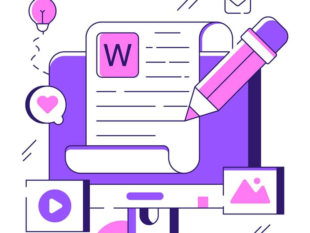
1
When it comes to web design, most of us know that first impressions are critical. But what about the subtle, often overlooked details—things like the way text is formatted?
Does how you present text on a website truly have an impact on your conversion rates? Spoiler alert: it absolutely does.
Let’s break down how effective text formatting, from using bold text strategically to making your content scannable, can transform your website’s performance.
We’ll also touch on how incorporating images, videos, and well-placed whitespace can boost engagement and keep users on your page longer.
Why Formatting Text Matters for Conversions
To understand the impact of text formatting on conversions, let’s first consider the psychology behind web browsing. People have short attention spans. Studies suggest that humans decide whether to stay on a page in under 5 seconds. With that in mind, your goal should be to get your message across quickly and effectively.
So, how do you achieve that? By utilizing a mix of strategic formatting techniques that allow your content to stand out, be easily scannable, and guide users toward making decisions (i.e., conversions).
The Magic of Bold Text and Strategic Emphasis
Bold text does more than make words stand out; it can also serve as a visual cue that helps guide users through your content. When used sparingly and effectively, bold text:
- Highlights key information that you want your visitors to remember (e.g., “50% off” or “Limited-time offer”).
- Breaks up large chunks of text, making it less intimidating and more digestible.
- Creates a visual hierarchy, directing the reader’s eye to the most important elements of your page.
Think of your website as a conversation with your audience. Bold text is like raising your voice to emphasize a point—it draws attention without being overbearing.
But don’t overdo it. Too much bold text can make your page look cluttered, which can overwhelm visitors. So, aim for balance: only bold what truly matters.
Short Sentences = Less Cognitive Load
Now, let’s talk about sentence length. We live in an age of distraction, and long, complex sentences can easily lose your reader’s attention. If you want to boost conversions, shorter, punchier sentences are key. Here’s why:
- Ease of reading: Short sentences are easier to skim, especially when visitors are in a hurry (which, let’s face it, they usually are).
- Clarity: Breaking up ideas into smaller chunks makes it easier for users to understand the value proposition or the action you want them to take (buy now, sign up, etc.).
A good rule of thumb is to keep your sentences under 20 words. This doesn’t mean you can’t be descriptive or detailed when necessary. But for the most part, simplicity wins.
Scannability: A Conversion-Boosting Must-Have
Scannability refers to how easily your visitors can skim your page to get the gist of it without reading every word. It’s all about making your content user-friendly and digestible—and, let’s be real, it’s crucial for increasing conversions.
How do you improve scannability? Here are some quick wins:
- Use subheadings: Break up long blocks of text with bold, engaging subheadings. These act as signposts, helping users navigate your content.
- Bullet points: Use them to present key points in a clear, digestible format.
- Whitespace: Giving your content room to breathe is vital. It prevents the page from looking cluttered and overwhelming.
By making your content scannable, you give your visitors the opportunity to pick out key points and decide quickly whether they want to continue reading—or better yet, convert.
Adding Visuals: Images, Videos, and More
Let’s face it—humans are visual creatures. The web is an increasingly visual-first medium, and using images and videos is a powerful way to keep visitors engaged and move them down the conversion funnel.
Images and videos should never be an afterthought. They serve multiple purposes:
- Conveying emotions: A well-chosen image can quickly communicate the mood or feeling of your brand, increasing emotional engagement.
- Providing context: Images and videos can make complex information easier to understand. For example, explainer videos or product demos are far more engaging and informative than large blocks of text.
- Breaking up content: They serve as a visual break between long sections of text, which keeps your page feeling dynamic and user-friendly.
But remember: Quality is crucial. Avoid using stock photos that feel generic and impersonal. Instead, focus on imagery that is authentic, relevant, and aligned with your brand.
Interactive Elements: Engage Users Beyond Just Reading
Incorporating interactive elements such as hover effects, forms, and calls-to-action (CTAs) can significantly increase user engagement and, ultimately, your conversion rates. Consider:
- Hover effects that provide users with visual feedback when interacting with buttons or links. It adds a sense of interactivity and can encourage users to click through.
- Forms with a clear, concise design: Keep your forms short and straightforward. Too many fields or unnecessary information will only discourage submissions.
- CTAs that stand out, thanks to bold colors, strategic placement, and concise, action-driven copy.
Adding interactive elements not only makes your site more engaging, but it also guides users toward the goal you want them to achieve—whether that’s making a purchase, signing up, or contacting you.
The Power of Videos: More Than Just a Trend
Let’s talk videos. Incorporating videos into your design can seriously enhance conversions, especially if you’re explaining a product or service. Studies show that users are more likely to convert when they can see a demo or visual representation of what they’re buying or signing up for.
A well-crafted product video, testimonial, or even a behind-the-scenes tour of your company can make your business feel more relatable and trustworthy. This builds confidence, which is a huge driver for conversions.
Whitespace: Let Your Content Breathe
Whitespace is often the unsung hero of great web design. By giving your content space to breathe, you create a clean, organized experience that’s easier for users to navigate.
Too many elements crammed together can overwhelm visitors and lead to higher bounce rates.
Whitespace helps:
- Focus attention: It draws users’ eyes to where you want them to go—whether that’s a CTA, an important piece of text, or a key image.
- Improved readability: A clutter-free page makes the content more digestible and less intimidating.
- Encouraging action: A CTA surrounded by whitespace is more likely to stand out, drawing users’ attention to it and prompting a click.
Wrapping Up: Formatting for Conversions
In the fast-paced world of web browsing, visitors won’t stick around if they can’t quickly find what they need or if the experience feels overwhelming.
Formatting text with intention—using bold text, short sentences, and scannable layouts—helps guide visitors through your content smoothly. Add in high-quality visuals, videos, and interactive elements, and you’ve got the recipe for a conversion-boosting design.
Remember: Web design isn’t just about looking good; it’s about getting results.
By optimizing your text formatting, you’ll not only enhance the user experience but also drive higher conversions and ultimately improve your bottom line.

The 10 Foundational UX Principles Every Designer Should Know
If you’ve ever rage-closed an app because it wouldn’t let you “go back” or stared at a form that made you feel like you were applying for citizenship in three…

Confessions of a Web Design Generalist (a.k.a. The Person Who Does Literally Everything)
There’s a special kind of web designer out there. You won’t always spot them in the wild because they’re usually busy fixing something someone else forgot to do. Or weren’t…

Simplicity in Web Design? It’s All Smoke and Mirrors
Let’s get one thing straight: Simplicity in web design? It’s a lie. We’ve all been told that making things simple is the holy grail of design. But here’s the truth…

20 Footer Design Myths You’re Still Believing (And How to Fix Them
Footers—often treated like the forgotten bottom shelf of your website’s pantry. Designers pour their energy into flashy homepages and slick navigation, leaving the footer to fend for itself with a…

AI by the Numbers: How It Took Over Web Design & Development in 2025
AI isn’t just a neat extra anymore—it’s at the core of how websites are imagined, built, tested, and maintained. It’s replacing tedious steps, automating design iterations, generating entire codebases, and…

UX Fatigue: When Your Website Asks for Too Much (and how to fix it)!
Let’s be honest: we’ve all been there. You click a link, land on a site, and before you can even scroll, the internet throws the kitchen sink at you. First,…