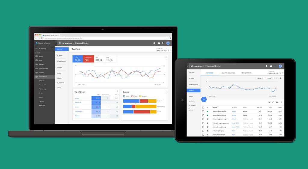
One more Google service has officially been redesigned, and it’s about time. That’s right, Google is redesigning their entire Adwords platform.
It’s been around eight years since the last redesign, and a lot has changed since then. The mobile market has exploded, for one. Therefore, Adwords needs to reflect that, both in its user interface, and in the data it presents to users.
So Google went and interviewed hundreds of its own customers to see what they wanted out of their product. Adwords is a huge source of income for Google, so they really want to get this right. They’re not just, say, taking away the reverse chronological timelines on a widely used service even though their users keep begging them not to (see Twitter and Instagram)…they’re smarter than that.
So what’s changing? The user interface has traditionally focused entirely on the ad words that people have bought, and provides little context at first glance. The new version is intended to provide an overview of how each campaign is doing at first glance. Then, if you want more details, you’ll be able to click through, of course.
The other big change is that the interface will be built with, you guessed it, Material Design. They’re doing this with every service, so it’s no surprise. And it is good news. Whatever you think of the aesthetics, Material Design does lend itself to better usability, when it is implemented correctly.
This will result in a better experience all around, though users on mobile devices should see the biggest changes—consider the fact that the last iteration of Adwords was developed before we even had the first iPad.
Naturally, few users currently have access to the new version. They intend to keep iterating their new design for the next year, slowly rolling out access to all users, and taking feedback along the way.
And that’s why, out of all the companies who know way too much about each of us, Google is by far the most user-friendly.
