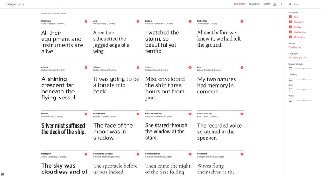
Google Fonts is the latest Google service that’s gotten a design makeover. The directory of free web fonts makes it a cinch for designers to customize fonts, share fonts with their colleagues, and even collaborate on fonts with the original designer.
In a tweet on its official Twitter stream, Google Fonts announced that it had debuted a new look that would streamline browsing for new fonts. People who need fonts for their sites or applications now have a much more accessible service to use.
When you compare the old version of Fonts to the new version, the contrast is notable.The new design is defined by less clutter, more colors, and a cleaner user experience.
Whereas the old version showcased typefaces in rectangular boxes from left to right, the new version makes sensible use of card-based design to both organize and show off Google’s family of open-source fonts. The overall result is a presentation that has to contend with less clutter, which makes it easier for designers, developers and users to navigate through the site to find fonts they like.
The shift of the main content to the center of the page allows the use of white space to be really effective. In the old design, white space was unfocused as different page elements competed for attention.
Minimalism
The new design features less navigation than the old design. Whereas there was a navigation bar that let designers see various typefaces in action based on words, sentences, paragraphs and poster tabs, all of this has been removed in the new rollout. Instead, designers now only get to see the display choices when they hover their cursors on the actual font cards; there, they’ll be greeted with different drop-down boxes for the preview text and styles.
The size-selection dropdown box has been removed and is now a single slider in every card. Further, the filters dealing with different categories and how to sort all the fonts have been moved from the left sidebar to the right sidebar.
Color
Perhaps in keeping with its Material Design sensibilities, Google has also introduced more color into its Fonts service. The old design only featured blue and white, which made the use of white space ineffective since most of the page was white anyway.
[pullquote]A welcome sight for designers who want a hassle free experience[/pullquote]
The new design allows users to pick their color scheme: Clicking on the “change background color” icon will let users choose between pink, black, blue and yellow for the background. All display good contrast, but some background colors work better than others.
UX
The UX is really what matters most at the end of the day. Google Fonts’ redesign has improved the UX to maximum efficiency. When designers are interested in a font, they can click on “see specimen” to arrive on a new page that tells them all the font particulars as well as info on the typeface designer. The old version actually used popup windows to present the same info.
Users also have the option to hide the search bar, which the old design didn’t allow.
All in all, the Fonts update should be a welcome sight for designers who want a hassle-free experience in choosing a new font for their web projects. The clean design helps deliver an improved UX that makes navigation easier.
