Every time someone talks about Brutalism, I have to ask, “Wait, that’s still a thing?” Brutalism is for people who think flat design is a bit too skeuomorphic, and as a community we seem to have agreed that Brutalism takes things a bit too far, and that prettier websites are usually better.
I myself have no issue with Brutalism as such. If I could get away with ignoring fancy UI stuff and focusing solely on accessibility and good UX, well let’s just say I’m tempted. Why not cut out all the fluff and just make it work, first and foremost? Craigslist still does it. Amazon still ain’t pretty. Even Bloomberg took a stab at it.
By the way, Bloomberg is still using an honest to God “marquee!” It’s not as hard on the eyes as some I’ve seen, but you can’t get more brutalist than ‘90s web design.
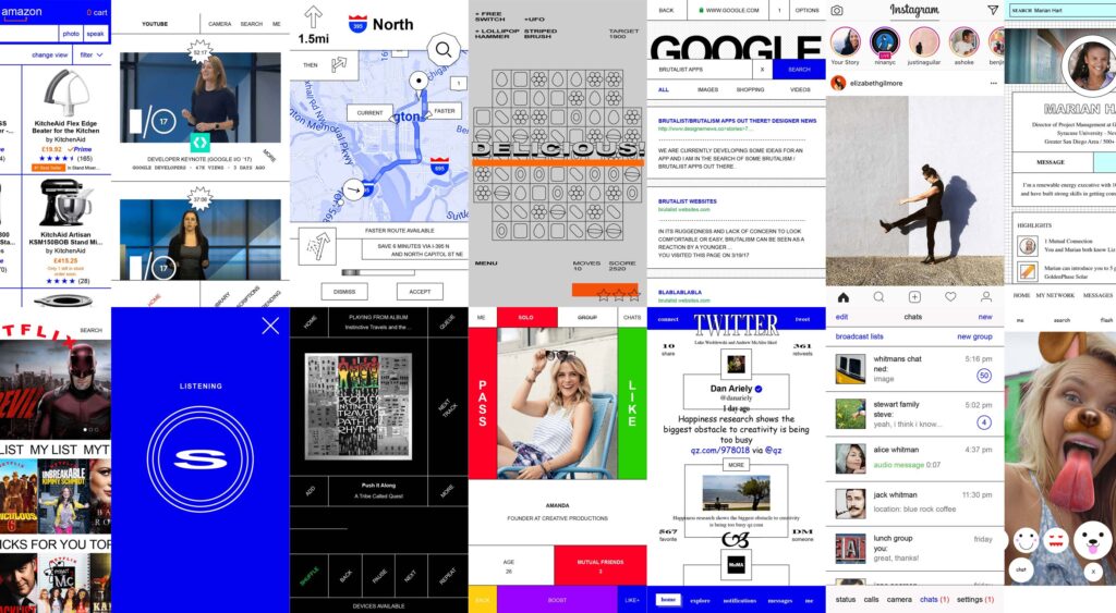
Pierre Buttin thinks sites like Bloomberg have brought brutalism into the mainstream, and that it’s going to be a big thing again. Some experts are suggesting that text-heavy design drives more user engagement, and he wanted to see what it would be like to push that idea to the extreme. Moreover, he wanted to see what that would look like in the normally graphics-and-gradients world of mobile apps.
So he did the only sane thing you can do, as a good designer. He tried it. In fact, he tried it on many of the most well-known apps for mobile phones by redesigning them in the brutalist style. As you can read on the project page, he got his ideas from brutalistwebsites.com. Then he stuck to system fonts, used web safe colors, and mostly tried to recreate the existing UX of every app he redesigned.
Original (left) vs. Brutalist (right)
Original (left) vs. Brutalist (right)
Original (left) vs. Brutalist (right)
Original (left) vs. Brutalist (right)
Original (left) vs. Brutalist (right)
Original (left) vs. Brutalist (right)
Original (left) vs. Brutalist (right)
Original (left) vs. Brutalist (right)
Original (left) vs. Brutalist (right)
Original (left) vs. Brutalist (right)
Original (left) vs. Brutalist (right)
Original (left) vs. Brutalist (right)
Original (left) vs. Brutalist (right)
Original (left) vs. Brutalist (right)
Original (left) vs. Brutalist (right)
Original (left) vs. Brutalist (right)
Original (left) vs. Brutalist (right)
As a UX guy, I have to say he succeeded. The brutalist redesigns in question do nothing to reduce the usability or accessibility of any of these apps. In some cases, I dare say the usability is improved.
The caveat, of course, is that everything looks kind of the same. If the whole world adopted this trend, things would be very usable (assuming no one started doing Brutalism badly…which has definitely been a thing), but very boring. Besides, Brutalism may lend itself to usability, but so do other styles of design. Still, this is a fascinating look into the potential future of some (not all) UIs.


