1
Oh, Hamburger Menu. You mysterious little stack of lines. Once hailed as a sleek solution to messy navigation, you now feel like the flip phone of UX—retro, cryptic, and slightly passive-aggressive.
Sure, you were cool back when screens were smaller, expectations were lower, and users still clicked around like digital archaeologists.
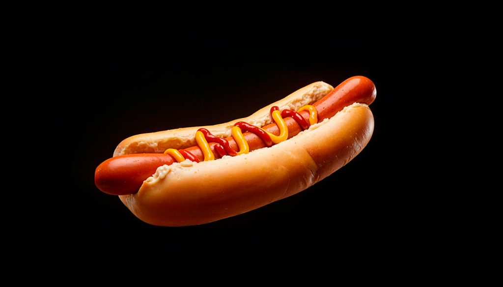
But now? Users have options. Attention spans are shorter than your reveal animation. And guess what—they don’t know what’s behind you. They never did. Most think you’re just a weird logo. Or worse: a hotdog.
You hide things people need, like navigation, account settings, or “how do I get out of this mess?” You’re a magician’s hat that forgets to pull out the rabbit.
Meanwhile, tab bars are thriving. Sticky navs are everywhere. Mega menus are flexing their information architecture like it’s fashion week. You, though? You’re still hiding in the top right corner like a shy ghost.
And don’t even get me started on accessibility. You’ve single-handedly caused more rage clicks than a CAPTCHA on 2% battery.
Look, we had a good run. But it’s time you stopped ghosting the user and started giving answers instead of ellipses.
Maybe keep the three lines—just don’t keep the mystery.
Regretfully yours,
A designer tired of watching users get lost in a sandwich

The Death of the Double Click: How UX Finally Buried a Relic of the Desktop Era
Let’s be honest: double-clicking is dead. And if it isn’t, it should be. What began as a clever way to differentiate between selection and activation in the ‘80s desktop environment has somehow…

Intent-Based UI Is Replacing Navigation—Are We Designing Ourselves Out of the Interface?
We spent decades perfecting the art of navigation: breadcrumbs, sidebars, hamburger menus, sticky headers, site maps. We crafted taxonomies and ran heatmaps. We obsessed over the user journey like it…
Dear Designers: Stop Using System Fonts Like It’s 2005
Remember system fonts? Good old Times New Roman, trusty Arial, and the unkillable Courier New. Fonts so baked into operating systems, they felt like infrastructure—like sidewalks and salt. For a…
The 10 Foundational UX Principles Every Designer Should Know
If you’ve ever rage-closed an app because it wouldn’t let you “go back” or stared at a form that made you feel like you were applying for citizenship in three…
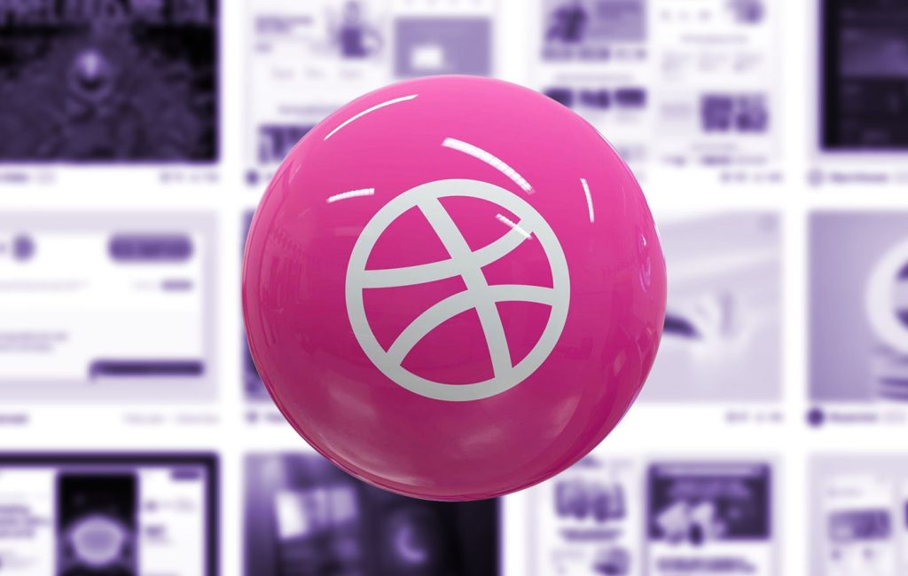
Designing for Dribbble Killed Real Web Creativity
It started with a shot. Not a launch. Not a live site. Not even a prototype. Just a shot — a single, glossy rectangle of design, cropped, polished, and posed for applause….

What Is Web Design in 2025?
Let’s start with a gentle truth: web design in 2025 no longer means what it used to. And that’s okay. Once, it meant Photoshop mockups and pixel-perfect slices handed to a…