7 Top Plugins For WordPress (2025 updated)
Designers understand the importance of pushing boundaries while keeping user experience at the forefront. Yet, not every creative idea is easy to implement through a theme alone—or even with solid…

If you have one workhorse display font that you rely on again and again, make sure it’s a slab-serif.In recent times slab-serifs have become understandably popular; they’ve been used at display sizes for decades and their relatively small stroke contrast means they deliver wonderful legibility on screens.One of the best new slab-serifs we’ve seen in […]
If you have one workhorse display font that you rely on again and again, make sure it’s a slab-serif.
In recent times slab-serifs have become understandably popular; they’ve been used at display sizes for decades and their relatively small stroke contrast means they deliver wonderful legibility on screens.
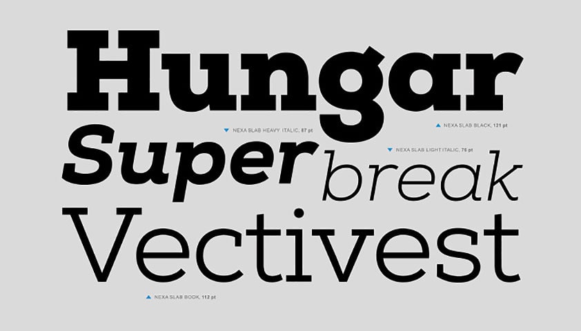
One of the best new slab-serifs we’ve seen in a while is Nexa Slab from Fontfabric, so our sister site, MightyDeals.com, has arranged an incredible 90% discount on this versatile typeface.
Nexa Slab is a geometric slab-serif, great for delivering a clean and clear message. Based on some of the great slab-serifs of the twentieth century, including Monotype’s ever popular Rockwell, there’s also an obvious nod towards neo-grotesques from the same period. Mathematically precise outlines —note the stubby asymmetrical serifs on the legs of the ‘R’ and ‘K’, when a single serif might have been expected — deliver a typeface with a machine-made feel, whilst the very round counters are large and friendly.
The Nexa Slab typeface comes with 24 different fonts: upright, italic and oblique styles each come in eight different weights, thin; light; book; regular; bold; xbold; heavy; and black. Each font has ligatures, fractions, subscript & superscripts and a number of other OpenType features. Delivered as .eot, .svg, .ttf and .woff files, you won’t need to do any converting to deploy them online.
One thing that app designers will certainly appreciate is the inclusion of tabular figures (monospaced variants on numerals that ensure columns of figures line up). As you’d expect with a comprehensive typeface, the fonts also include extensive analphabetic characters for multilingual support.
Nexa Slab’s most distinct character is its lowercase ‘g’; clearly monocular, it shifts towards the double bowel of a binocular g. Together with the lowercase ‘g’, the single-storey lowercase ‘a’ and the slanted lowercase ‘y’ are provided with alternate designs; there is a conventional monocular ‘g’, a double-storey ‘a’ and a rounded ‘y’. Personally I find the default ‘a’, and the alternate ‘g’ and ‘y’ to be the most readable, at least in body text; at display sizes the default ‘g’ adds a certain flair.
The normal price for the complete Nexa Slab typeface is $99, but for a limited time you can get all 24 fonts for just $9. At that price you’d be mad not to. Head over to MightyDeals.com to grab this great slab-serif typeface now.
Have you used Nexa Slab in a project? Do you prefer the default, or alternate characters? Let us know in the comments.