It seems that the 50s are back, not just in advertising and design, but also on clothes, TV shows, and elsewhere.
I honestly think this is one of the most interesting and creative eras for advertisement; some ads are really memorable and funny.
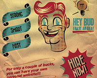
So, inspired by that I decided to make a tutorial on how make a retro poster for a web designer.
After reading the tutorial, you can download the Illustrator source file at the end of the post for reference.
I hope you guys like it and please be sure to share your results and questions with us in the comments….
Here’s a full preview of the poster that we will be creating:
Step 1
Let’s start by opening Adobe Illustrator. Create a 21 x 27 cm (8,27 x 10,73 inches) canvas in CMYK mode with 300 dpi resolution.


When designing a poster/flyer, I like to place some guides on the edges. You can make then visible by pressing command + R / Ctrl + R. Just grab them and place. I used a 1 cm distance on each border.

So, first you should download this texture we’re going to use on the background, you can get it at CG Textures. Place it on the canvas vertically and then hide it for now. We’ll activate it later.

Step 2
The next thing you should do is to download the Flyboy BB font; you can get it here. This will be used for the main title. Using the text tool (T), write “The WebDesigner” in a dark yellow color. The CMYK values can be viewed in the second image bellow.


Make an individual text box for the word “The” and use a blue color on the fill. The CMYK values can be viewed in the second screenshot bellow.


Step 3
Let’s start by creating a rectangular shape with spiked ends that will be used as background to the secondary text. You can create it using either the rectangle tool (M) or the pen tool (M).


Using the selection tool (V) + alt you can copy the original shape. Then go to Transform > Reflect, and choose to reflect on the vertical Axis.


In order to unite the shapes, place both as shown below, then go to the pathfinder panel, and choose the option called Unite.


Here’s another font you should download, Bazar Medium; get it here. So, here I just insert the text “The Hero of the Worldwide Web”.

Using the pen tool (P) I made these little shapes to stylize the text a bit. You can copy and reflect these, so they are symmetrical.


Step 4
I always liked those rounded rectangles used as a sort of ad plate. So, using the rounded rectangle tool, create the basic shape and then using the direct selection tool (A), adjust each point until it looks like the shape below.

Let’s add a linear blue to white gradient. Go to the gradient panel to set the colors as below. Using the gradient tool (G), you can adjust the amount and direction of the gradient.


Halftone is a really stylish effect that can bring that old fashion aesthetic to your layout. Go to Effect > Pixelate > Halftone. Set maximum radius to 10 pixels and make sure all the channels are at 0. This will make the gradient monochromatic.


Using the text tool (T) write the headline “Webdesigner Depot proudly presents” using the Bazar Medium font.

Step 5
Next, let’s draw a retro ribbon shape, use the pen tool (P) and add the previous blue color. It may look a bit like tooth paste, but let’s add some folded edges on it next.

Draw the folded border using the pen tool (P). Duplicate, reflect, and place it on the top.


Add some little stylized lines on each side. This may take some time, but if you duplicate and simply adjust each using the direct selection tool (A) it will be quicker.


Copy and paste it twice, and then let’s add some characteristics like “Strong,” “Smart,” and “Fast.” Again, use the Bazar Medium font.


Step 6
Let’s make a simple arabesque using the pen tool (P), you can also try to do it using the brush tool (B). Then just duplicate and place it below.


Use the line segment tool () to create these lines, then duplicate them like this. Use an italic font to write the following text; I used Gotham Bold Italic on this sample. Using the text tool (T), fill each line with one part of the sentence.


Step 7
Those old promotional splashes can be really funny, let’s draw one. First use the crystallize tool, set the parameters of the tool by just clicking once on it’s icon; you can see them below. Now what you do is create a circle using the ellipse tool (L) and then use the crystallize tool above it. Just make sure you made the circle on the right scale.


Lets add the previous linear blue gradient. Use the gradient tool (G) to place it in the right direction.

Let’s use the halftone effect again. This time let’s use a maximum radius of 16 pixels.


Copy this splash and change its fill to the previous red color. Send it to front.

Use the text tool (T) to write “HIRE NOW” using Bazar Medium. Duplicate the text, pick a black fill and send it to back.


Step 8
This is the last font you will need to download, this one is called Headline. As the name says, it’s really useful for headlines. Get it here. Let’s write “Hey buddy, I have an idea.” This will be our character’s quote.

I also added a few slashes below it, just to make a bit more dynamic.

Step 9
I wanted to draw a light bulb to make things a bit more obvious. So first use the ellipse tool (L). Then make the light effects using the pen tool (P).


Let’s not forget to add the base of the light bulb. Drawing is about abstraction so don’t worry if it’s a bit abstract. Distance will tell what it looks like.


Don’t forget to draw the core and a few lines outside the circle. Make it a bit messy, so it look likes an error on the printing for a more vintage feeling.


Step 10
Our character is the hardest part of this tutorial, but follow my instructions and everything will be a piece of cake. I wanted to make a character similar to those men on the 50s ads, with an “ice cream” hair.
Let’s begin with the eyes. First draw an ellipse using the ellipse tool (L). Draw another ellipse in the border of it, then go to the pathfinder panel and choose the option called Minus Front.


We’re going to use only the pen tool (P) from now on. It’s easy, you will see. So, draw this eye shape, then duplicate and resize it using the the selection tool (V).


Now draw a really simple round nose. The mouth, as you can see, is basically two lines.


Let’s add some wrinkles around the mouth. Add a line in the mouth to represent the teeth.


Add a few lines in each side to shape the tongue and a wrinkle in the middle.

I call this kind of chin by “butt chin,” I think I don’t have to explain why, do I? Just kidding guys. Draw his cheeks using the pen tool (P).


I decided to make a head without the body, so you just draw these lines representing the neck.


The ear is quite simple, just add a small detail to represent the cartilage.

Back to the mouth, make a shape over the tongue using a red fill, then use the blending mode called Multiply. Also take out one of his teeth to add some humor.


While drawing him, I though that a redhead guy would be cool, but he needs a special haircut.
But, first let’s take care of the eyebrows. Just draw the first one, copy, reflect, and place it on the other side.

Let’s add some cool side burns on each side, the left one is thinner, don’t forget it.

The old fashioned “Ice Cream” hair, some may dislike, but it fits perfectly here. Draw it in two parts, like it was combed.


Using the ellipse tool (L) I added some tiny circles on each eye.

You may say the hair is too flat, so let’s add some white highlights to represent reflections.


Draw all around his face, watch for making some holes on parts like the eyes and mouth. Add a yellow to white gradient (the same yellow used all over the tutorial). Adjust the direction using the gradient tool (G). Then go again to Effect > Pixelate > Halftone. Set the maximum radius to 8 pixels.


Step 11
First of all, you got to use the Multiply blending mode on each of the previous elements. Then use the rectangle tool (M) to create this beige radial gradient over the illustration. Then go to the blending modes and choose the one called Multiply.


Another paper texture to download, get it here. Place it over the previous gradient, then use the Multiply blending mode.


And here’s the last texture, get it here. Go to the transparency panel, set the opacity to 70% and choose the blending mode called Color Burn.


Now you can show the background texture from the beginning and it’s done.

The Result
Well guys, I hope you had fun designing it, go on and experiment more often with type, also research about 50’s design, you may find some really interesting samples. You can download the illustrator file here.
Have you followed this tutorial? Share your results and experience below…


