1
There was a time when “performance” lived in the dev team’s backlog, buried somewhere between “optimize bundle size” and “minify JavaScript.” Designers, meanwhile, were in their Figma or Sketch bubbles, pushing pixels, art-directing homepage heroes, and choosing typography like they were curating a museum show. But in 2025, that separation of church and code no longer holds.
If your site has a bad CLS score, your users don’t care who’s to blame. They just feel like something is broken. And they’re right.
Cumulative Layout Shift (CLS), one of Google’s Core Web Vitals, measures visual stability. It’s not about how fast something loads. It’s about how much the page jumps around while loading. It’s a metric that captures disruption, frustration, and broken trust. And here’s the twist: designers—not just developers—are the ones shaping this chaos.
Let’s unpack why CLS is no longer just a performance metric—it’s a direct byproduct of modern design decisions, and it’s time designers took responsibility.
Designers, Meet CLS—Your Silent UX Killer
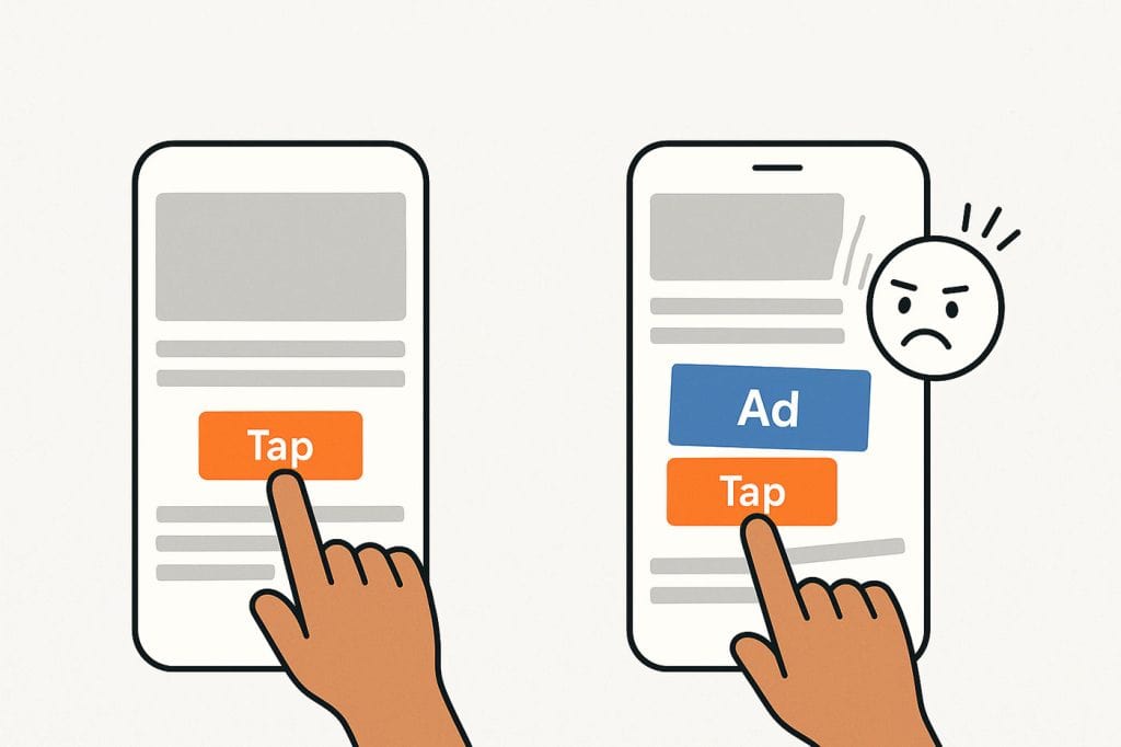
CLS quantifies unexpected movement of page elements while a user is interacting with it. For example, you go to tap a “Read More” link, but the banner image loads late and pushes the link down… and you end up clicking an ad. That frustration you feel? That’s what CLS measures. It’s a user experience tax—paid in rage and bounce rates.
This isn’t some obscure Lighthouse metric buried on page 5 of your SEO report. Google explicitly uses CLS as part of its search ranking algorithm. But beyond SEO, bad CLS erodes credibility, makes interfaces feel unstable, and literally gets in the way of people using your product.
And yet, most designers have no idea it exists—let alone how much their layouts are contributing to it.
The Old Excuse: “That’s a Dev Problem”
The New Reality: “You Designed It Like That.”
CLS is caused when elements shift because their size or position isn’t defined early enough in the render process. This usually happens because content loads asynchronously—images, fonts, ads, widgets. But here’s the kicker: those content blocks came from your design.
Let’s say you design a homepage hero without defining a consistent height. On your retina MacBook with lightning-fast Wi-Fi, it renders beautifully. But on a mid-tier Android on 3G? The image loads late. The heading jumps. The call-to-action slips under the fold. Congrats: you just triggered a high CLS score—and probably a bounce.
Designers control layout, rhythm, and structure—CLS reflects how resilient those choices are in the wild. If your design can’t handle staggered loading or real-world network conditions, it’s fragile.
Visual Decisions That Quietly Destroy CLS
Let’s name names. These aren’t abstract ideas. These are real-world design patterns that are fueling bad CLS scores every day:
Hero Images Without Aspect Ratios
You designed it responsive. You even handed off three breakpoints. But you didn’t reserve space for the image while it loads. So the browser renders an empty box… and when the image finally appears, the whole layout shifts down. It’s a jump scare—every time.
Font Loading with No Fallback Planning
That glorious custom font? Looks fantastic. Until it takes 800ms to load and shifts every heading from fallback to final render. Web fonts are one of the biggest hidden CLS contributors—especially if you’re using variable fonts without preload strategies.
Pop-Ups and Cookie Banners Injected Post-Render
You didn’t design for the cookie banner, the GDPR nag, or the “subscribe now” fly-in. But they still show up, usually injected by a plugin. And if they weren’t accounted for in your design’s layout? The page will lurch like a badly edited film.
Ads, Embeds, and Third-Party Widgets
You know what’s fun? Designing a blog template where the embedded YouTube video has no defined height. That’ll shift your entire content block when it loads. Even more fun? Ads. They come in all shapes, sizes, and behaviors. Designing around them is non-optional if you want to maintain visual stability.
Sticky Elements and Top Bars
Floating navs, announcement bars, or sticky CTAs often appear a few seconds after the page loads. Unless their space is reserved, they will absolutely shove everything down and tank your CLS.
But It Looks Fine on My Machine™
The web is no longer a controlled medium. We’re designing for a jungle of devices: phones, tablets, 4K displays, slow laptops, e-readers, and even edge cases like in-car browsers. What’s smooth on your M3 MacBook is a janky, frustrating mess on a $100 Android in rural Wi-Fi purgatory.
And it’s not just screen size—it’s loading order, asset prioritization, and time-to-first-paint. CLS punishes designs that aren’t built to survive the chaos of real-world conditions.
Mobile CLS: Death by Thumb Misfire
Let’s talk mobile. Layout shifts are far more painful on phones—not just because of screen size, but because users interact while the page is still loading. If something shifts while a user is about to tap, that’s not just frustrating—it’s functional sabotage.
Misclicks lead to form abandonment, mistaken purchases, and rage uninstalls. All of that because a banner image took too long or a font swap pushed a button.
When you combine layout instability with thumb-sized targets and zero loading patience, you get UX anti-patterns that look fine in Figma but fail catastrophically in the real world.
CLS Isn’t Just a Score—It’s a Design Signal
Here’s the truth designers need to hear: CLS is a direct signal of how predictable and trustworthy your layout is.Users want to interact with a page that feels solid—not like it’s going to shift under their fingertips.
A low CLS score communicates polish, care, and control. A high one screams jank, cheapness, and “we didn’t test this properly.”
And in a world where users spend ~3 seconds deciding if your site is worth their time, trust is everything.
CLS-First Design Thinking: A New Layer of Design System Maturity
In 2025, a mature design system isn’t just modular and responsive—it’s CLS-conscious.
Start embedding performance and stability thinking directly into your design workflows:
- Use aspect-ratio-aware components in your design libraries. If your image cards, embeds, or video blocks don’t define space, your layout is fragile.
- Include loading states and skeletons in your mockups—not just for devs, but for alignment with content strategy and UX rhythm.
- Document font fallback behavior in your design specs. Match font metrics where possible to reduce swap distortion.
- Design safe zones for dynamic content. If you’re expecting an ad or alert to show up, design for that spacing from the beginning.
And most importantly: collaborate with developers to prototype layout stability early—don’t leave it for post-launch bug reports and retroactive hotfixes.
Final Thought: The Web Isn’t Static—So Why Are Your Designs?
Design tools are still stuck in the world of static frames. But the web is a moving target—literally. It loads in chunks, rearranges itself based on speed, conditions, personalization, and script order. The future of design isn’t just about how things look—it’s about how things behave as they appear.
A beautiful mockup that shifts violently on first load is worse than a plain, stable page. Why? Because it breaks the user’s trust. And nothing tanks a UX like a layout that moves out from under you.
So next time you push pixels, ask yourself:
“Will this jump?”
Because CLS is your layout’s lie detector. And users can feel it—whether they know what it’s called or not.

Designing Travel: The Zürich Card’s Flexible New Visual Identity
Most city passes look like something you’d shove in your wallet and forget about. The Zurich Card just got the opposite treatment—thanks to Studio Marcus Kraft, it now looks like a piece…

Reddit may soon ask: “Mind if I scan your eye?
Passwords are like the junk drawer of the internet: overstuffed, unreliable, and full of things you meant to replace years ago. We’ve spent decades juggling them—reusing the same ones, forgetting…

How Apple Quietly Brought Skeuomorphism Back to Life
By now, everyone’s talking about Liquid Glass, Apple’s new design language unveiled at WWDC 2025. At first glance, it looks like another glossy facelift—translucent layers, glowing refractions, and all the visual drama of a perfume…

20 Most Iconic YouTube Videos of All Time
YouTube isn’t just where you go to waste hours watching random stuff—it’s the birthplace of viral moments that have changed the internet forever. Since 2005, we’ve witnessed everything from accidental…

OpenAI Codex: Revolutionizing Code or Ripping Off Developers?
OpenAI’s Codex has officially hit the scene today, promising to transform the way we write code. OpenAI’s Codex is a bold leap forward in the world of AI-assisted software development….

Wix releases Wixel: The AI Design Tool That Wants to Do It All (But Can It?)
Wix, best known for its drag-and-drop website builder, is making a play for the design tool market with today’s launch of Wixel—a new standalone platform powered by AI, aimed at helping…