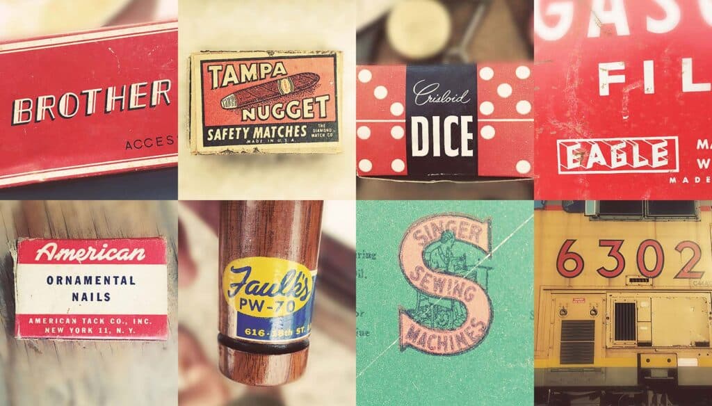
As designers we seem to have lost our courage, churning out identical brand ‘solutions’, posting Dribbble shots of the same regurgitated formula.
Perhaps it’s the lack of control on the web. Perhaps it’s the increasing need for an international outlook, and the consequential safety offered by Helvetica. Perhaps it’s the diminishing respect designers receive from clients whose nephew/cousin/neighbour/husband thinks that Arial is the best font for her new site.
Once in a while it’s great to remind ourselves just exactly why the 1930s were so glamorous, why the 1960s were the heyday of advertising, and just why americana tugs at the heartstrings like nothing else.
If you’re looking for inspiration, to escape the sterility of contemporary design, or are just looking to bathe your eyes in the effortless cool of yesteryear, check out the Tumblr blob typehunting.com by Jonathan Lawrence. A collection of old school lettering, logos and signs, it’s the perfect way to while away a lunch hour.
Here are some of my favorites:
Which of these lettering examples is your favorite? Do you think modern designs are as diverse? Let us know in the comments.
