Over time, developers have wrestled with forcing images into responsive layouts. Media queries and fluid grids are constantly employed to achieve visually flexible images. Achieving such flexible images as pointed out by Ethan Marcotte in the seminal first edition of his book is as easy as: img { max-width: 100%; } The image resources being […]
Over time, developers have wrestled with forcing images into responsive layouts. Media queries and fluid grids are constantly employed to achieve visually flexible images. Achieving such flexible images as pointed out by Ethan Marcotte in the seminal first edition of his book is as easy as:
img { max-width: 100%; }
The image resources being served must be big enough to fill large viewports and high-resolution displays to make this code work effectively. Simply setting a percentage width on images is not enough, the images need to be resized as well, or else huge image resources will be sent to everyone which is a performance disaster.
Another way developers have combated images into responsive layouts is using the suite of new HTML features which allows images to transform in a way that allows users get tailored resources based on their context. These features provide adaptation via allowing authors to mark up multiple, alternate resources like so:
<img size=”100vw”
 srcset=”tiny.jpg 320w,
 Small.jpg 512w,
 Medium.jpg 640w,
 Large.jpg 1024w,
 Huge.jpg 1280w,
 Enormous.jpg 2048w”
 src=”fallback.jpg”
 alt=”To each according to his ability” />
The challenge with this method is that it can be very tedious and complex to always generate multiple alternate resources for every image. Cloudinary can help with the resource generation, but then the markup in our image tag will be overwhelming.
Considering JavaScript
Another method developers employ is using Javascript. JavaScript can directly measure the browsing context and when paired with on-the-fly, server-side resizing, it requests a single, perfectly-sized resource every time with little or no extra markup required. This post explains how to use JavaScript to achieve automatic responsive images.
Now there are challenges with this approach:
Setting up JavaScript infrastructure which might be complex
Inserting JavaScript between users and our page’s core content which might be tricky to do effectively.
Browser vendors use the speculative pre-parser to shed off as many image loads as possible before a page’s HTML has even finished parsing. And for JavaScript to load measured image resources, it must wait for page layout to be complete before it can measure the page.
This means we are faced with a choice if we wish to use JavaScript to load responsive images. Either:
Let the pre-parser do its work and set JavaScript to double-load all of our images, or,
Disrupt the pre-parser by authoring invalid src-less <img>s so that our JavaScript can start loading our pages’ images last, instead of first.
Our major goal is performance, but these options above still present huge compromises that will impede our aim of simply loading appropriately-sized images.
Client Hints to the rescue
All the options we considered above either came bundled with a huge compromise or was just verbose and complicated. What other options do we have? Where can we shift this burden of complexity? I’ve got an idea, let’s put it on the server!
Front-end developers don’t have to sweat it anymore. Make responsive images somebody else’s problem.
Clicking through the link above (or on the photo), you’ll see an image, the URL of which delivers different resources to different users, depending on their context. In browsers that support Client Hints (at the moment, mostly Chrome), 1x devices will receive 1x resources, 2x screens will receive 2x resources. How is this possible? A little tag is placed in the <head> of this page which looks like this:
<meta http-equiv="Accept-CH" content="DPR">
The code above tells the browser to send an extra HTTP header named DPR, thus advertising devicePixelRatio. Those DPR HTTP headers are Client Hints. So, when you send DPR hints with a little meta magic and dpr_auto appended to the URL, Cloudinary is able to deliver different resources to different users depending on their display density.
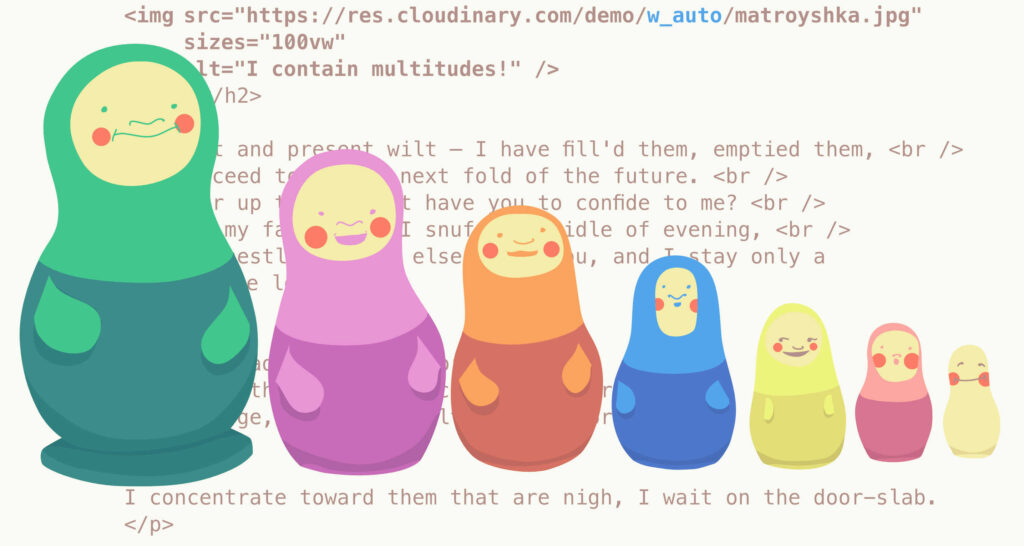
Automatic width
dpr_auto scales images to fit different display densities. Cloudinary provides w_auto which scales images to fit variable layout widths. A typical example is shown below:
<meta http-equiv="Accept-CH" content="DPR, Width">

 […snip…]

<img sizes="100vw"
 src="https://res.cloudinary.com/demo/w_auto/on_the_phone_csmn8h.jpg"
 alt="Obama on the phone with Castro." />
Chill, let me explain what’s happening here.
The meta tag instructs the browser to send another Client hint: Width in addition to DPR.
The img tag includes a sizes attribute which informs the browser about the layout width of the image.
The browser then broadcasts the width to the server via the Width hint
Note: If there is no width and no sizes, w_auto does nothing! Also w_auto images will be scaled based on DPR and width hints, no need to add dpr_auto in the URL.
Advanced w_auto usage
Let’s dive into a further use of Cloudinary’s w_auto parameter. w_auto can take two optional parameters like so:
:100 tells Cloudinary how big the difference between alternate resources should be. This parameter allows you to limit the number of possible responses by defining a rounding step between them. For example, if the target width is 323 pixels, Cloudinary will round up to the nearest hundred and return a 400 pixel-wide resource. Now, if you set the first parameter to :1, resources will be scaled to match the layout width exactly which is generally not a good idea.
:400 refers to the fallback width. If a browser doesn’t send a width hint, this parameter will be used to serve an image resource with that width.For example, in this scenario, browsers that don’t support Client Hints are served a 400 pixel-wide image. In case you are not aware, 400 is a mobile-first default. You can decide to serve a desktop-first default to non-supporting browsers, say 1000.
Note: If you don’t send a width hint or your browser doesn’t support Client hints, and this fallback parameter too is absent, w_auto will deliver images at their original size. Imagine an image that is about 12 megapixels been delivered to a Mobile Safari. This could potentially destroy a front end developer’s career ??.
Next, we’ll talk about one more awesome thing that w_auto can provide for you!
Automatic breakpoints
Four years ago, Jason Grigsby noted that it makes more sense to think about step-size in terms of bytes rather than pixels. Cloudinary went ahead to build the tool that brings Jason’s idea into reality: the Responsive Image Breakpoints generator. The same logic for this tool has been built into w_auto too!
Cloudinary servers can look at your images, see how they compress, and determine byte-size-based gaps between images for you if a special value :breakpoints is provided. This is just the steps parameter.
w_auto:breakpoints is a result of years of smart thinking and tremendous efforts to provide an impressive automatic responsive images solution that is smart not only about the images’ context, but also their particular content. However, :breakpoints require a bit of very technical set up at the CDN layer, so at the moment, you’ll need to contact Cloudinary to set it up for your account.
It is not news that other browsers are slow at implementing new web platform features including Client Hints. Browser vendors mostly want to implement features after they have seen a large demand for them. Authors also don’t want to use features on their web pages until they enjoy a wide browser support.
Cloudinary is advocating for the adoption of Client Hints in a wider range of browsers because dpr_auto and w_auto are, among other things, an attempt to encourage Client Hints usage. Simple, responsive, automated and performant images should be the norm these days!
Developer’s dilemma
Everyone should be thinking about responsive images when working on projects – either new or revisiting old ones. What is the best way to go about it? At the end of the day, the decision still lies with the developer or the team involved. A mark-up based solution will get you most browser support but then automating that could be complicated. JavaScript based solutions on the other end can easily come in handy, but operate within significant performance constraints.
Client hints paves a third option, which is both simple and performant. w_auto and dpr_auto are very useful right now even with the fair browser support of Client Hints.
Implementing dpr_auto and w_auto is just seamless and delivers to around half of your visitors worldwide. They provide incredible performance gains and those gains will grow as browser support improves.
Sign up for a free account today and start accruing performance gains today with automatic responsive image resolution!
[– This is an advertorial post on behalf of Cloudinary –]
WDD staff are proud to be able to bring you this daily blog about web design and development. If there's something you think we should be talking about let us know @DesignerDepot.
Best design tools and resources are those that can lay claim to characteristics that typically include ease of use and related workflow characteristics, future-readiness, easy integration with supporting tools or…
Black Friday 2025 is more than just slashed prices—it’s a chance for web designers and agencies to level up workflows with smarter tools and bolder ideas. From wireframes and prototypes…
Designers understand the importance of pushing boundaries while keeping user experience at the forefront. Yet, not every creative idea is easy to implement through a theme alone—or even with solid…
Let’s be honest—there’s no shortage of WordPress themes that look good on the surface. But when it comes to keeping pace with evolving design standards, performance expectations, and user behavior,…
Let’s be real—our lives are so intertwined with the digital world these days. Whether we’re shopping for the latest gadget, managing our bank accounts, or even just catching up with…
Gone are the days when “pretty pictures” alone could ensure visitor engagement. If your site isn’t responsive, practical, and easy to work with, users will quickly bounce. As a result,…


