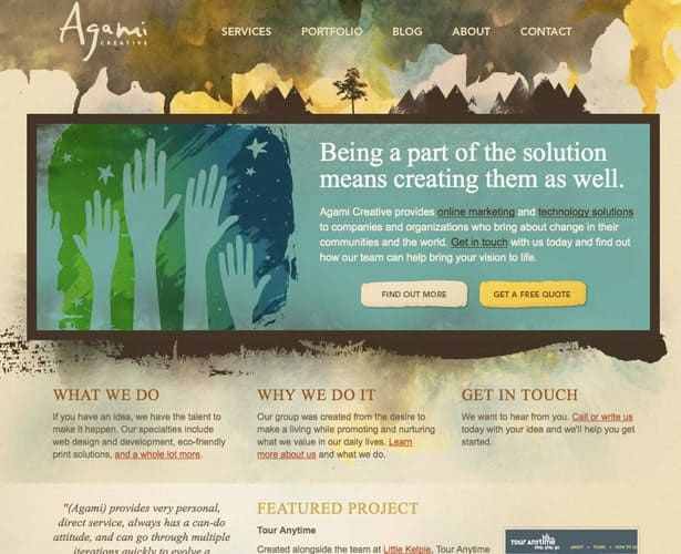
Watercolor is such an old school element. Artists have been using watercolor for hundreds of years, and web designers have adopted the style for good reason.
Watercolor is a great way to add depth, interesting subtle textures and colors. It can really give your site an authentic, natural feel.
The examples compiled in this collection use watercolor in different ways; whether it’s for the main graphic of the site or the more subtle and faint hints that get you to look twice.
Watercolor has been around for a century and I know most of you will say it’s a trend, but you can’t argue with something that has pioneered painting and art.
Agami Creative
Billy Hughes
Binocle
The Croquis
Electric Pulp
Happy Cog
James Lai Creative
Element Fusion
K4 Laboratory
Le Bloe
Magouya
Matt Dempsey
Sergio Design Trends
Toby Powell
Web Designer Wall
Erguvan Platin Evleri
Rockatee Design
Saint Charles Maryland
Small White Bear
Secwepemc Nation Stsmamlt
Sunrise Design
Toggle
Tylor Jerome Reimer
Viget
vSplash
Volkswagen Lifestyle Vehicles
Washtenaw Community College
Weberica
Compiled exclusively for WDD by Chad Mueller. Chad lives in Canada eh!, when he’s not shooting donut shape rubber pucks, he’s running Inspiredology and designing anything to get his creative juices flowing.
Which ones did you like best and why? Please share your views with us and add links to other great examples below…
