1
If you’ve ever used an app that was so beautiful and intuitive it just felt right, you’ve experienced the magic of great UI design. If you’ve ever used a website that made you want to pull your hair out, you’ve experienced the pain of bad UI design.
In the digital world, your user interface (UI) is your handshake, your welcome mat, and your instruction manual all rolled into one. It’s a crucial element for success in the competitive landscape of software and web development.
This definitive pillar post will break down everything you need to know about creating effective UI design—from the foundational rules to the advanced tools the pros use. Let’s get started.
🎨 What is UI Design Anyway? (And Why Should You Care?)
User Interface (UI) design is essentially the art of making software and devices easy to look at and interact with.
Think of yourself as an interior designer for a digital space. You’re responsible for every button, image, text block, and color choice. Your job is to make the interaction between the human user and the computer elegant and seamless.
UI vs. UX: A Simple Analogy
People often mix up UI design and UX design (User Experience design). Here’s the simple breakdown:
| Term | What It Is | Think Of It As… |
|---|---|---|
| UI (User Interface) | How things look. The colors, the typography, the visual style. | The paint and furniture in a house. |
| UX (User Experience) | How things work/feel. The structure, the flow, the logic. | The plumbing and floor plan of that house. |
You need both for a truly great product! A beautiful app that’s impossible to navigate has great UI but terrible UX.
Why Great UI is a Game Changer for Business
Good UI design isn’t just about making things pretty; it’s a smart business decision with massive ROI:
- First Impressions Matter: You have about 50 milliseconds to make a good first impression. A massive 94% of those initial impressions are linked directly to design elements.
- Keeps Users Hooked: Intuitive, appealing interfaces reduce frustration and increase user retention. A messy interface results in bounces.
- Builds Trust: Professional design makes your brand look credible and reliable. Users trust well-designed interfaces more than cheap or amateur ones.
- Boosts Efficiency: A streamlined UI can speed up workflows for internal business tools, saving time and money daily.
⭐ The 5 Pillars of Awesome UI Design
Great interfaces follow a few fundamental truths rooted in psychology and aesthetics. Master these five principles, and your designs will instantly improve and become highly effective.
1. Keep It Clear and Simple (The Clarity Imperative)
The cardinal rule of digital design is clarity above all else. Users should never have to guess what to do next. Your goal is to keep the “cognitive load”—the mental effort required to use your app—as low as possible.
We achieve this with minimalism and intentional design choices. Don’t overwhelm people with endless options. This is Hick’s Law in action: the more choices you present, the longer it takes a user to make a decision. Limit choices to only the essential path.
If an element doesn’t serve a clear purpose or enhance the experience, get rid of it. “Less is more” is a fantastic UI mantra that leads to a calm, focused user experience.
2. Be Consistent (Inside and Out, Every Time)
Consistency builds familiarity and trust. When things are predictable, users feel smart and in control. This is arguably the most powerful principle in UI design.
Strive for internal consistency by using the same button styles, color palettes, and language throughout your entire app or website. If your primary action button is blue and rounded on the homepage, it should be blue and rounded on the checkout page. A design system is a designer’s best friend for maintaining this uniformity across large projects and teams.
Also aim for external consistency by following established industry standards. Users expect certain behaviors based on other apps they use daily. Don’t reinvent the scrollbar or the hamburger menu unless you have a revolutionary reason to do so.
3. Use Visual Hierarchy (Guiding the User’s Eye)
You need to subtly “guide” the user’s eye around the screen. This is visual hierarchy, and it’s how you establish dominance and importance among elements.
You can direct attention using:
- Size: Make important headlines big and bold; make secondary navigation subtle.
- Color & Contrast: Use bright, contrasting colors for the primary call-to-action button to draw immediate attention.
- Placement: Place critical information where users naturally look (studies show an F-pattern or Z-pattern reading behavior on the web).
Structure your design so the most important information pops immediately, followed by secondary details. It’s like choreographing a dance for their eyes, ensuring they consume information in the intended order.
4. Design for Everyone (Accessibility is Non-Negotiable)
Inclusive design means creating products that work for everyone, including people with disabilities. It’s essential for modern web development and a key part of being an ethical designer. It also significantly broadens your potential audience.
Key accessibility tips:
- Ensure Strong Color Contrast: This is vital. Use a contrast checker tool to ensure your text is easy to read against its background. Following the globally recognized WCAG guidelines is essential here.
- Keep Font Sizes Readable: Aim for around 16px minimum for body text on the web.
- Support Keyboard Navigation: Make sure your interface works without a mouse, just by using a keyboard or screen reader.
An accessible interface is a better interface for everyone.
5. Give Instant Feedback (Building Confidence)
Your interface needs to “talk” back to the user. Every interaction should have a clear response so the user knows the system heard them.
Think about the subtle signals: A button should change color when you mouse over it (a hover state). A form submission needs a clear “success!” message, or specific, helpful error messages if something goes wrong. A long data fetch requires a loading spinner.
This continuous feedback loop makes users feel in control and confident in their actions, minimizing confusion and frustration. This is a simple principle that adds a huge amount of polish to a design.
🧠 The Psychology of Design: Using Gestalt Principles in UI
To truly master UI design, you need to understand how the human brain automatically organizes visual information. The Gestalt Principles are a set of laws of perception developed by German psychologists in the 1920s. They explain how we perceive complex images as a sum of their parts.
Applying these principles makes your UI feel intuitively “correct.”
1. Proximity: Grouping Related Items
The principle of proximity states that objects near each other appear to be more related than objects that are spaced farther apart.
- In UI Design: Use proximity to group form fields that belong together (e.g., first name and last name inputs should be close, while the “Submit” button should have slightly more separation). This clearly defines sections of content without needing extra lines or borders.
2. Similarity: Consistency in Action
The principle of similarity states that elements that share similar visual characteristics (shape, color, size, texture, or orientation) are perceived as related or belonging to the same group.
- In UI Design: This is crucial for consistency. All primary action buttons should look the same (e.g., all blue with white text). All secondary links should look the same (e.g., all underlined green text). This helps users instantly understand which elements are interactive and what kind of action they perform.
3. Closure: The Brain Fills the Gaps
Closure states that our brains naturally fill in missing parts of a design or image to create a complete whole. We often perceive incomplete shapes as complete figures.
- In UI Design: We use this implicitly with iconography (a hamburger menu is three lines that we instantly perceive as a single menu icon). It saves screen space and relies on the user’s brain to complete the mental model.
4. Continuity: Smooth User Flow
The principle of continuity states that our eyes are inclined to follow the smoothest path when viewing lines or groups of elements. We perceive a continuous flow rather than individual objects.
- In UI Design: This is vital for navigation and layouts. You want the user’s eye to flow naturally down a list of search results or follow the path of an onboarding flow. Avoid abrupt visual breaks that interrupt this natural movement.
5. Common Region: Explicit Grouping
This principle is related to proximity but stronger. Elements that are located within the same closed region (like inside a box or card) are perceived as grouped together.
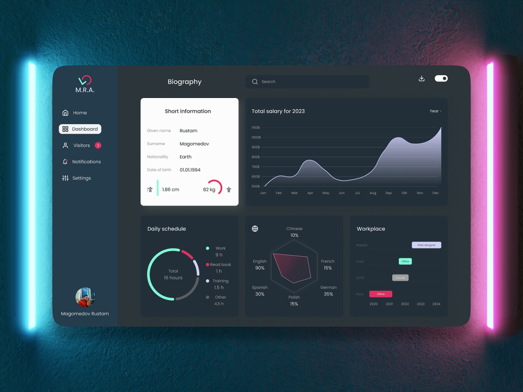
- In UI Design: Think of “cards” on a dashboard (like a weather widget or a news summary). Everything inside that card belongs to that single piece of information. This powerful grouping mechanism is essential for complex layouts.
🛠️ The UI Designer’s Toolkit: The Key Elements You Master
Alright, you know the principles. Now let’s talk about the stuff you actually use to build an interface. Think of these elements as your UI building blocks. Mastering how to use them together is what separates an amateur from a pro.
Let’s open the toolbox.
✍️ Typography: Beyond Choosing Fonts
Typography isn’t just about picking a nice font (though that’s part of it!). It’s about clear communication. If your text is hard to read, your UI fails.
You need to select the right typefaces and establish a hierarchy that guides the eye. Do you need a formal serif font or a clean, modern sans-serif? The font sets the mood, but readability keeps the user engaged.
Aim for reasonable font sizes (around 16px is a good minimum for body text on the web) and use adequate line height so text isn’t cramped.
Pro Tip: Keep it simple. Two font families are usually plenty for a clean, professional design.
🌈 Color Theory & Contrast: The Mood Makers
Color is incredibly powerful. It influences emotion, directs attention, and reinforces your brand identity.
But here’s the most important rule: Color must be used accessibly.
You need to master contrast ratios. This is just a fancy way of saying the color of your text must be easy to read against the color of its background.
Why? Because people view screens in bright sunlight, or they might have color blindness or low vision. Using a WCAG Color Contrast Checker is non-negotiable in modern UI design. This ensures your interface is usable for everyone.
🖼️ Imagery & Iconography: Visual Shortcuts
Visuals process faster than text in the human brain. Use this to your advantage.
- Images: Use high-quality, relevant photography or illustrations that enhance the message, not distract from it. Authentic user photos beat cheesy stock photos every time.
- Icons: Icons act as universal visual shortcuts (e.g., the little house icon for “home” or the magnifying glass for “search”). Ensure your icons are visually consistent in style and weight.
📐 Layouts & Grids: Creating Order from Chaos
Ever wondered why some websites feel balanced and calm while others feel chaotic? It’s all about the grid system.
Grids (like the popular 12-column grid system used in frameworks like Bootstrap) help you align elements into neat columns and rows. They create a hidden structure that makes the final UI feel professional and organized.
And remember the golden rule of modern web development and app design: Mobile-First. Start designing for the smallest screen (a smartphone) first, then scale up to tablets and desktops. This ensures a seamless, responsive design.
👆 Interactive Components: The Digital Building Blocks
These are the elements your users actually touch and interact with every day.
We’re talking about buttons, forms, and navigation menus. These are the fundamentals of any interface.
A good UI designer thinks through all the possible states for these components: the default state, the hover state, the active state, and the disabled state.
For example:
- Make primary buttons visually pop, while secondary actions should be subtle.
- Keep forms simple and provide clear, real-time validation when a user types something wrong.
- Ensure navigation makes sense so users know exactly where they are at all times.
⚙️ The UI Design Process: A Step-by-Step Workflow
Knowing the building blocks is great, but how do you put them together in a professional setting? Following a structured process ensures you build interfaces that solve real problems, rather than just making art.
This shifts us from theory to a practical workflow.
Phase 1: User Research and Defining Objectives
Before you even open your design software, you need to know who you are designing for and why. This is where UI meets UX research.
You’ll interview real people, gather insights, and create user personas—fictional characters that represent your target audience. You need to understand their goals, pain points, and technical limitations.
The key question: What problem are we actually trying to solve with this interface?
Phase 2: Wireframing and Prototyping
Once you know the problem and the audience, you sketch the solution.
- Wireframes: These are like blueprints of your screens. They are low-fidelity (think basic gray boxes and lines). The focus here is on structure, layout, and functionality—not color or branding yet.
- Prototypes: These turn your static wireframes into interactive mockups. You can click through them to test the user flow and spot major issues early on, before committing to visual details.
Phase 3: Visual Design and Branding
Now we make it look good. This is where you apply all those principles of color, typography, and visual hierarchy.
You’ll take the validated wireframes and apply your brand’s style guide. This phase involves creating mood boards, style tiles, and high-fidelity mockups that look exactly like the final product will. This is the core of traditional UI design work.
Phase 4: Testing and Iteration
Your design is never “done.” You must test your high-fidelity mockups with real users.
Observe how people interact with your beautiful design. Are they getting stuck? Is the text clear? Are they missing the main button?
Gather that feedback and iterate. This constant cycle of designing, testing, and refining is crucial for creating a truly excellent product.
Phase 5: Developer Handoff and Collaboration
The final step is getting your design out of Figma and into the real world. You need to collaborate closely with the engineering team.
You’ll prepare design assets, write clear documentation, and use a robust design systemto ensure pixel-perfect implementation. Communication is key here to bridge the gap between design vision and technical execution.
🖥️ Essential Tools for Modern UI Designers
A brilliant artist needs a good brush, and a brilliant UI designer needs the right software. The tech stack evolves constantly, but a few tools have become industry standards for UI design.
Here are the primary tools you need to know:
Design Software: The Digital Canvas
This is where the magic happens. A few key players dominate the market:
- Figma: Currently the industry leader. It’s cloud-based, fantastic for real-time collaboration, and offers everything you need for designing, prototyping, and developer handoff in one single place.
- Sketch: A Mac-only classic that was once the standard. It’s powerful and lightweight, especially popular in agency settings.
- Adobe XD: Adobe’s competitor, which integrates seamlessly with the rest of the Adobe Creative Cloud suite (like Photoshop and Illustrator).
If you’re just starting out in digital design, our recommendation is usually to jump straight into Figma due to its collaborative nature and widespread adoption.
Prototyping and Testing Tools
As we discussed in the process section, turning static designs into clickable prototypes is vital.
Most modern design tools (Figma, Sketch, XD) have robust built-in prototyping features that let you simulate the user flow perfectly. For testing with real users, platforms like UserTesting.com or Maze help you gather quantitative and qualitative feedback efficiently.
Collaboration and Handoff Tools
Getting the design from your screen to the developer’s code editor requires precision.
Tools like Zeplin or built-in functions in Figma automate the handoff process, providing developers with exact measurements, color codes, CSS snippets, and asset downloads. Using a centralized design system in the cloud is the ultimate way to ensure consistency and speed up development time.
✅ Best Practices and Advanced Techniques for Superior UI Design
Even with the best tools and principles, designers often make common mistakes. Here are some advanced best practices to keep your work top-tier and help you design interfaces that truly stand out and perform better.
Mastering the White Space Paradox
White space (or “negative space”) is the empty area between design elements. This is arguably one of the hardest things for new designers to embrace. It is not wasted space; it is a critical design element in its own right.
- Improves Readability: Generous line height and paragraph spacing make large blocks of text less daunting and easier to read.
- Reduces Cognitive Load: Ample space separates different UI components, reducing visual clutter and making it easier for users to process information quickly.
- Creates Elegance: High-end, premium brands (like Apple or luxury fashion sites) use vast amounts of white space to project a feeling of exclusivity, calm, and sophistication.
Don’t be afraid of the void. Use whitespace deliberately to guide attention and give your elements room to breathe.
Designing for Dark Mode
Dark mode is no longer just a trendy feature; it’s an expected option for modern apps and operating systems. Users often prefer it in low-light conditions to reduce eye strain.
Key considerations for dark mode:
- Don’t Just Invert Colors: Simply flipping your white background to black rarely works. Text can become too harsh (vibrating against the black), and colors may lose their accessibility contrast.
- Use Subtle Grays: Instead of pure black (
#000000), use dark gray backgrounds. This allows you to use true black for elevated elements (like pop-up cards or modals) to create depth and visual hierarchy. - Desaturate Primary Colors: Bright brand colors need to be slightly desaturated in dark mode to prevent “eye bloom” (where bright colors seem to glow uncomfortably).
Prioritizing Performance Optimization
Great UI that takes 10 seconds to load is, fundamentally, terrible UI. The user’s perceptionof speed is part of the interface experience.
- Optimize Images: Use the right formats (WebP is a modern favorite) and compress them appropriately. Large images are the primary cause of slow load times.
- Minimize Animations: Use animations subtly. Complex, heavy animations can cause performance lag on older devices, which frustrates users.
- Think Progressively: Use lazy loading for images (only load them when the user scrolls to them) and ensure the core UI loads first, while non-critical elements load in the background.
Avoiding Clutter and Distractions
Stick rigidly to the user’s primary goal. Every time you add an element, ask yourself, “Does this help the user complete their main task?” If the answer is no, it’s probably a distraction. This applies to noisy animations, excessive pop-ups, endless navigation links, and extraneous social media feeds. A focused user path is an efficient user path.
💰 The Business Case for Exceptional UI Design
We’ve talked about the principles and the pixels, but at the end of the day, UI design needs to deliver business value. A superior interface isn’t a luxury; it’s a competitive advantage that directly impacts your bottom line. Understanding this case is essential when talking to stakeholders, CEOs, and engineering leads.
The ROI of Usability
The return on investment (ROI) of good design is quantifiable. Companies that prioritize design consistently outperform their competitors in the stock market. The primary metric is usually user retention and conversion.
- Conversion Rates: A clear, frictionless UI can significantly increase conversion rates (e.g., more people signing up for your service, buying a product, or downloading a report). Streamlining a complex checkout form can reduce cart abandonment dramatically.
- Reduced Support Costs: When an interface is intuitive, users don’t need to call customer support as often. Every time you prevent a support ticket through good UI design, you are saving the company money.
- Brand Loyalty and Advocacy: A delightful user experience fosters emotional connection. Users who love your UI become advocates who recommend your product through word-of-mouth, which is the most powerful—and cheapest—marketing available.
Measuring UI Success
How do you prove that your UI changes made a difference? You need data.
- Quantitative Metrics:
- Task Success Rate: Can users complete core tasks (e.g., booking a flight, changing their password)? Aim for high scores.
- Time on Task: Does your new UI help users complete tasks faster?
- Error Rate: How often do users click the wrong thing or enter invalid data? A good UI minimizes errors.
- Bounce Rate: How quickly do users leave your site after arriving?
- Qualitative Metrics:
- NPS (Net Promoter Score): Measures how likely users are to recommend your product.
- CSAT (Customer Satisfaction Score): Direct feedback on how satisfied users are with the experience.
Bridging the Gap Between Design and Engineering
The most successful products are built by teams where designers and developers speak the same language. The handoff phase of the design process is where millions are often wasted due to miscommunication.
- The Role of the Design System: A robust design system isn’t just for designers; it’s a contract with the engineering team. It provides them with exact code snippets, reusable components, and documentation, ensuring pixel-perfect implementation and saving hundreds of developer hours.
- Continuous Collaboration: UI designers should be available during the development sprint to answer questions, check the implemented designs in a “design QA” (Quality Assurance) phase, and iterate with engineers in real time.
By framing UI design in terms of business impact, measurable metrics, and efficient collaboration, you elevate the role of design from a “nice-to-have” aesthetic layer to a fundamental driver of business success.
💡 Case Studies: Dissecting Excellent UI Design
The best way to learn is by studying the masters. Let’s break down three widely praised interfaces to see those five principles (Clarity, Consistency, Hierarchy, Accessibility, Feedback) in action.
Case Study 1: Spotify (Mastering Dark Mode Aesthetics and Flow)
Spotify is the undisputed king of music streaming UI. Their design is instantly recognizable and highly effective.
What they do well:
- Color as Focus: Spotify uses a dominant dark theme. This isn’t just a trend; it makes the colorful album art pop off the screen. The focus is immediately placed on the content (the music and artists), not the surrounding interface. Their bright green accent color is reserved almost exclusively for the primary CTA (the Play button), creating perfect visual hierarchy.
- Intuitive Navigation: The main navigation is simple: Home, Search, Your Library. It uses clear icons and labels consistently across all platforms (mobile, desktop, web player). This consistency drastically lowers the cognitive load for users trying to find their music.
- Subtle Feedback: When you tap a song to play it, the UI instantly shifts to the “Now Playing” screen, providing immediate visual feedback. The progress bar subtly pulses, and the play/pause button changes state instantly.
Key Takeaway: Use color intentionally to direct user attention and ensure your navigation is simple and consistent across all device types.
Case Study 2: Headspace (Calm, Mindful, and Accessible UI)
Headspace, the meditation and mindfulness app, is a masterclass in designing UI that matches the brand’s intended emotional response: calm.
What they do well:
- Illustrations Over Photos: They use friendly, round, simple illustrations instead of jarring photography. This creates a soft, non-intrusive aesthetic that promotes a feeling of calm and reduces anxiety.
- Generous White Space: Headspace uses whitespace (empty space) incredibly well. The screens feel uncluttered and airy, giving your eyes room to breathe—literally mirroring the act of mindful breathing the app teaches. This maximizes simplicity and clarity.
- Guided Simplicity: The user flow for starting a meditation session is incredibly linear and simple. There are no distractions or complex settings. You tap the session, and you start. It’s an example of perfect UX supported by minimalist UI.
Key Takeaway: The visual style of your UI should always mirror your brand’s personality and intended emotional effect. Use whitespace generously to promote focus.
Case Study 3: Google Maps (Data-Rich UI That Doesn’t Overwhelm)
Google Maps is a fascinating challenge: displaying complex, real-time data (traffic, roads, businesses, transit options) without overwhelming the user.
What they do well:
- Layering Information: They use strong visual hierarchy to layer information. The primary map is muted until you zoom in. Different colors denote different road types or real-time traffic jams. The most important information (your route) is always highlighted in the brightest blue.
- Clear Iconography: Google uses a vast library of universally recognized icons (restaurants, gas stations, hospitals). This global consistency means the UI can be used instantly by speakers of any language.
- Mobile-First Interaction: The bottom sheet navigation on mobile is highly intuitive, allowing users to pull up route details or search results with a simple thumb swipe, rather than using complex top menus.
Key Takeaway: Complex data requires strict adherence to visual hierarchy and clear iconography to remain usable and avoid cognitive overload.
📈 The Future of UI Design: Trends and Technologies
The world of UI design is always evolving. Staying ahead of the curve means keeping an eye on new trends and technologies that will define user experiences over the next decade.
Subtle Motion Design and Micro-interactions
Interfaces are becoming more dynamic and alive. Subtle animations and micro-interactions—like a button bouncing slightly when clicked, a loading bar subtly pulsating, or an icon morphing its shape when toggled—are everywhere.
These aren’t just aesthetic flourishes. They:
- Provide Delight: They make the experience feel polished and premium.
- Provide Feedback: They confirm an action was successful (Building Confidence).
- Mask Latency: They reduce the perceived load time during a system process.
Mastering motion design is a key skill for future UI designers.
Designing for New Devices and Input Methods
We are moving beyond standard web and mobile interfaces. UI designers are now exploring interactions for:
- Augmented Reality (AR) & Virtual Reality (VR): Designing interfaces that exist in 3D space, requiring an entirely new understanding of depth, interaction models, and spatial computing.
- Voice User Interfaces (VUI): Designing interactions for smart assistants like Alexa or Siri, where the “interface” is purely auditory and conversational.
- Wearables and IoT (Internet of Things): Designing highly simplified, glanceable UIs for smartwatches and home appliances, where screen real estate is minimal.
The fundamental principles of clarity and simplicity remain the same, but the technical constraints are entirely new.
AI in the Design Workflow
Artificial intelligence is rapidly changing how we work. AI tools can already automate tasks like removing image backgrounds, generating color palettes that meet accessibility standards, or even testing thousands of design variations to see which one performs best.
AI won’t replace designers, but designers who use AI effectively will be in high demand. It speeds up the repetitive aspects of the job, giving you more time to focus on the strategic, creative, and empathetic aspects of design that AI cannot replicate.
🎓 Conclusion: Mastering the Art of UI Design
Great UI design is a fascinating blend of art, psychology, and engineering principles. The best interfaces are often invisible—they just work, letting the user achieve their goals without frustration or conscious effort.
Mastering UI design is a continuous journey of learning, practicing, and gathering feedback. By applying these foundational principles and utilizing modern tools, you can create digital experiences that not only function flawlessly but also delight your users and help your business succeed.
Keep designing, keep learning, and most importantly, empathize with your users. Happy designing!
🤯 The Top 10 UI Design Questions Everyone Is Asking Right Now
Want to build the next killer app or website? Mastering UI is non-negotiable in 2025. Here are the top 10 burning questions about effective UI design answered in plain English.
1. UI vs. UX: Which one actually matters more?
It’s a classic debate! The truth is, you need both. UI design is how visually appealing and intuitive your buttons and screens are. UX design is about the entire journey and structure.
- UI is the supermodel looks; UX is the functional plumbing. A beautiful app that crashes is bad UX; an ugly app that works perfectly is bad UI. They work hand in hand.
2. Do I seriously need to code to be a UI designer?
Not fluently, no. But understanding basic HTML and CSS is your secret weapon. Knowing how a developer builds your design makes you faster, smarter, and way easier to work with. It bridges the gap between design vision and technical reality.
3. What design software is actually the “industry standard” right now?
Stop asking which is best and just learn Figma. It’s the dominant player in the industry for a reason: it’s collaborative, cloud-based, and handles everything from prototyping to developer handoff in one place. It’s the essential tool for modern digital design.
4. How do I build a portfolio without any work experience?
Redesign something! Take a popular app you love (or hate) and make a case study out of it. Document your process: Why did you change that button color? Who is this redesign for? Showing your thinking is more viral than a single pretty picture.
5. What is a “design system,” and is it just corporate jargon?
It’s your project’s instruction manual on steroids. A design system is a master library of all your reusable components (buttons, fonts, colors, layouts). It ensures every screen looks and acts like it belongs to the same product, making you incredibly consistent and fast.
6. What’s the deal with “cognitive load,” and why should I care?
“Cognitive load” is just a fancy term for how hard your brain has to work to use an app. Great UI keeps this load low by being incredibly simple. If users have to think too hard, they leave. It’s all about prioritizing clarity and minimalism.
7. Is color accessibility just for people with bad eyesight?
No! Color contrast matters to everyone. Have you ever tried to read light gray text on a white background while standing in the sun? That’s an accessibility fail. Following WCAG guidelines makes your app usable for everyone, in every situation.
8. What’s the difference between web design and responsive design?
Web development used to mean designing just for a desktop monitor. Responsive design means your single website layout intelligently shrinks, expands, and rearranges itself to look perfect on a smartwatch, a phone, or a massive desktop screen.
9. What are micro-interactions and why are they everywhere?
Micro-interactions are those delightful little animations you barely notice—like a “heart” icon bouncing when you tap it. They provide instant feedback to the user, make the interface feel alive, and add a layer of polish that keeps people coming back.
10. Will AI take my UI design job in 2025?
Relax, the robots aren’t stealing your job tomorrow. AI is an incredibly powerful tool that will automate boring, repetitive tasks (like optimizing images or generating basic layout ideas). It gives you more time to focus on the human skills AI can’t replicate: empathy, creativity, and strategic problem-solving.

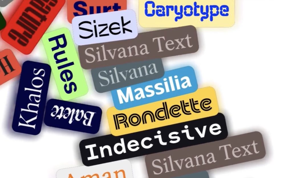
5 Creative Type Foundries You Should Know About
Typography gets much more interesting once you wander beyond the familiar font libraries. These five independent foundries are producing typefaces with enough personality to completely change the character of a…

She Taught the Macintosh to Smile
The original Macintosh had a problem that had nothing to do with processing power: computers were intimidating. They spoke in commands and technical language, and there wasn’t much about them that…
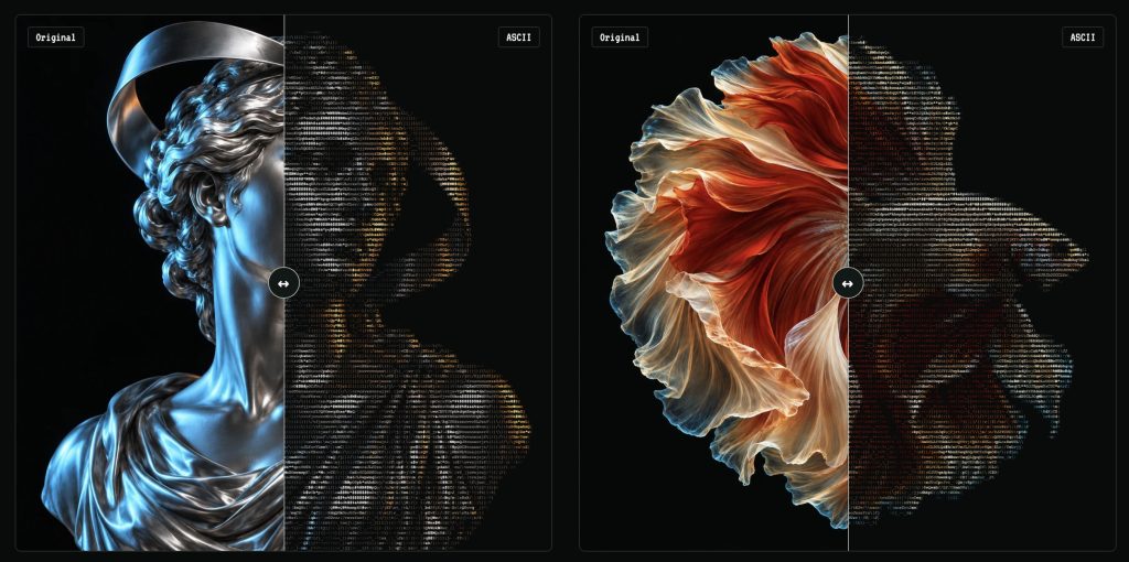
Turn Any Photo Into Retro ASCII Art in Seconds
What if your photo looked like it had escaped from a 1987 computer terminal? Image to ASCII turns JPGs, PNGs, WebPs, and GIFs into surprisingly stylish art made entirely from letters, symbols,…
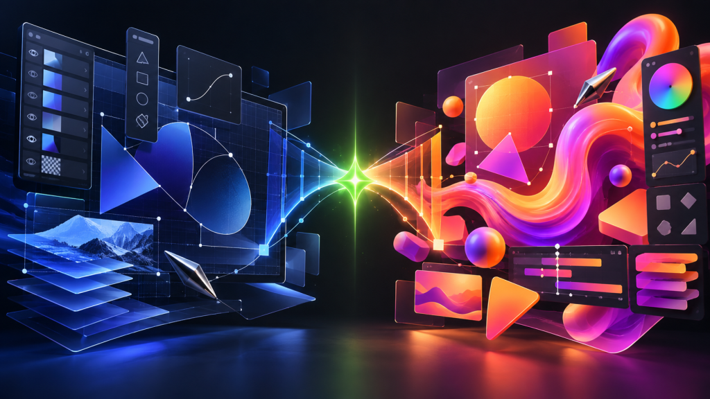
Canva Just Turned Affinity Into Adobe’s Biggest Free Problem
Canva has connected Affinity, Cavalry, Flourish, and Leonardo into a new pro-creative ecosystem—and it is keeping the core Affinity and Cavalry apps free. Adobe is not about to vanish in…
This Weird 1973 Typeface Just Came Back From the Dead
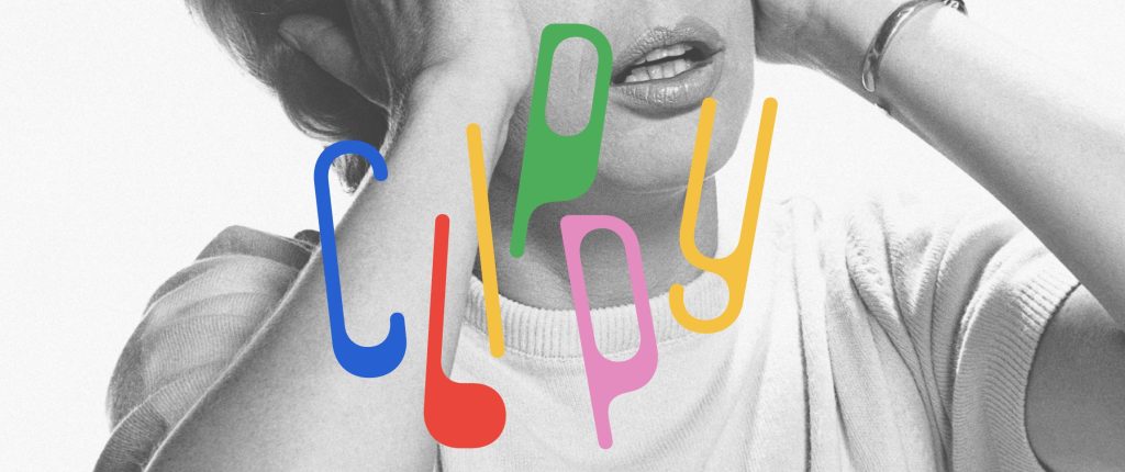
Some typefaces age gracefully. Others disappear for half a century and come back looking strangely perfect for the internet. Clippy definitely belongs in the second category. The wonderfully odd typeface…
AI Can Build Your UI. Now Figma Can Tell It When It Screwed Up.
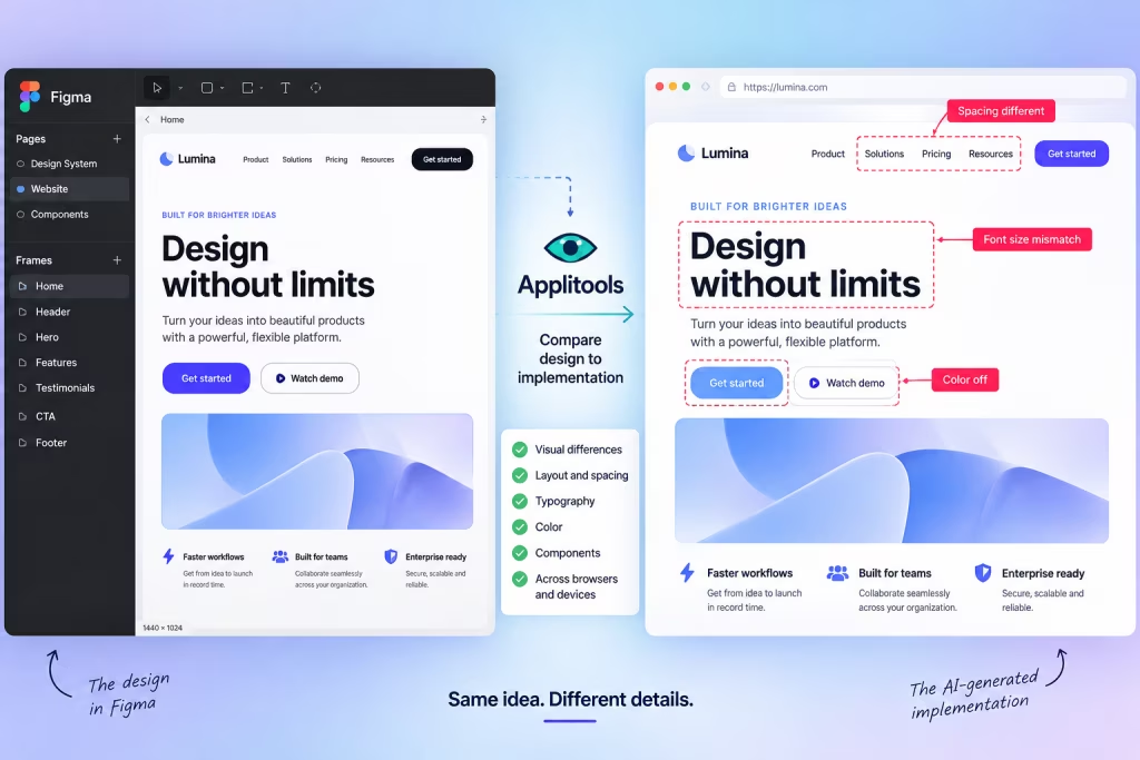
AI coding tools have become remarkably good at turning prompts into working interfaces. The awkward part comes afterward: does the thing they built actually look like the design? A new…